What Is Page Speed Optimization?
Page speed optimization is the practice of reducing the time required for a web page to load and become fully interactive for users, through improvements to server response times, resource delivery, code efficiency, and rendering behavior.
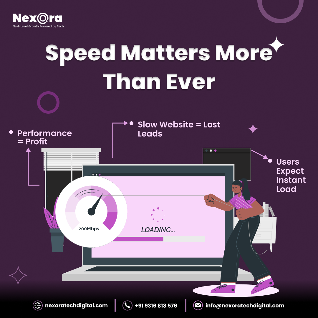
It matters because loading time has a measurable and consistent effect on user behavior: users abandon slow pages, search engines factor speed into rankings, and even sub-second delays produce statistically significant reductions in conversions.
Optimization addresses a layered set of causes - network latency, server processing, asset size, render-blocking resources, and browser parsing - each requiring different technical interventions.
In 2006, Greg Linden, an Amazon engineer, wrote a blog post describing an internal experiment that had become folklore at the company.
A small change to the Amazon home page - adding a feature that showed recommendations before users had finished their search - had been proposed, tested, and nearly canceled after the initial test showed it was slowing the page by 100 milliseconds.
The team argued the feature was valuable. The experiment team argued that 100 milliseconds of delay cost Amazon sales. The data, ultimately, supported the experiment team.
Linden's post noted that a 100-millisecond delay - one tenth of a second, a duration imperceptible to conscious awareness - affected conversion rates meaningfully enough to appear in controlled data.
This observation became the most cited finding in web performance research: that the relationship between loading speed and user behavior is more sensitive than most people intuit.
Subsequent research across many companies confirmed and extended the pattern. Google documented that a 500-millisecond increase in search result generation time reduced traffic by 20%. Walmart found that each 1-second improvement in page load time increased conversions by 2%.
A study by Deloitte found that a 0.1-second improvement in site speed increased consumer spending by almost 10%. The pattern held across industries and continued to hold as network speeds improved - because user expectations improved along with network speeds.
Web performance matters because users leave slow pages. They leave faster than they consciously realize they are leaving. By the time a user can articulate "this page is slow," they have already left in many cases.
Understanding what makes pages slow, and how to address each cause systematically, is the technical foundation of this improvement.
The Architecture of Page Loading
To optimize page loading, you need a mental model of what happens between a user typing a URL and a page being fully usable. This sequence reveals where time is spent and where optimization can reduce it.
The Network Journey
When a browser requests a page, it first resolves the domain name to an IP address through DNS lookup - typically 20-120ms for a fresh lookup.
The browser then establishes a TCP connection to the server, which involves a handshake exchanging several network round trips - adding latency proportional to geographic distance. If the connection is HTTPS (which all modern sites should be), an additional TLS handshake adds more round trips.
Once connected, the browser sends the HTTP request for the page. The server processes the request - potentially involving application logic, database queries, and template rendering - and sends back the response. The time from request to first byte of response is Time to First Byte (TTFB).
TTFB under 600ms is the target. Slow TTFB indicates server-side problems: slow database queries, insufficient compute resources, no server-side caching, or geographic distance between server and user.
The Browser Rendering Pipeline
After receiving the HTML response, the browser parses it and begins constructing the Document Object Model (DOM). While parsing HTML, the browser encounters references to external resources: CSS files, JavaScript files, images, fonts, and more. Each external resource requires an additional network request.
CSS is render-blocking. When the browser encounters a <link> tag for a stylesheet, it must download and parse that CSS before rendering the page - because CSS determines how everything looks. A CSS file that takes 300ms to download delays the first render by 300ms.
Blocking JavaScript halts everything. A <script> tag without async or defer attributes stops HTML parsing completely until the script is downloaded, parsed, and executed. During this time, nothing renders. A JavaScript file that takes 500ms to download and 200ms to execute delays rendering by 700ms.
This sequence - HTML parsing, resource discovery, resource download, CSS/JS processing, then rendering - is called the critical rendering path. Every optimization to the critical rendering path reduces how long users wait before seeing content.
The Core Web Vitals Framework
Google's Core Web Vitals, introduced in 2020 and confirmed as ranking factors in 2021, provide a standardized set of performance metrics that correlate with user experience:
Largest Contentful Paint (LCP) measures when the largest visible content element (typically the hero image or the main heading) finishes loading. LCP under 2.5 seconds is "good." LCP over 4 seconds is "poor." This metric reflects how quickly the page becomes visually complete for the user.
Interaction to Next Paint (INP), which replaced First Input Delay in 2024, measures the time from user input (click, tap, keypress) to the next visual update. INP under 200ms is good; over 500ms is poor. This reflects how responsive the page feels to interaction.
Cumulative Layout Shift (CLS) measures visual instability - how much page content moves around as the page loads. A score under 0.1 is good.
Text that jumps when images load, buttons that move as ads appear, and forms that shift as fonts load all contribute to poor CLS and create the frustrating experience of accidentally clicking the wrong thing because the page moved.
These three metrics represent the aspects of page experience that correlate most strongly with user satisfaction: does the page become visually complete quickly, does it respond to interaction immediately, and does it remain stable as it loads?
"A 100-millisecond delay - one tenth of a second, a duration imperceptible to conscious awareness - affected conversion rates meaningfully enough to appear in controlled data. The relationship between loading speed and user behavior is more sensitive than most people intuit." - Greg Linden, Amazon engineer
| Core Web Vital | Metric | Good Threshold | Poor Threshold | What It Measures |
|---|---|---|---|---|
| Largest Contentful Paint (LCP) | Loading | < 2.5 seconds | > 4 seconds | Visual completeness |
| Interaction to Next Paint (INP) | Interactivity | < 200ms | > 500ms | Response to user input |
| Cumulative Layout Shift (CLS) | Visual Stability | < 0.1 | > 0.25 | Content stability during load |
| Time to First Byte (TTFB) | Server response | < 600ms | > 1800ms | Server and CDN performance |
| First Contentful Paint (FCP) | Loading | < 1.8 seconds | > 3 seconds | First visible content |
Image Optimization: The Highest-Return Investment
For most websites, images are the single largest contributor to page weight. The HTTP Archive's 2024 Web Almanac found that images represent 46% of total byte transfer on the median mobile web page.
Optimizing images is consistently the highest-return performance investment because the gains are large and the techniques are well-established.
Format Selection
The choice of image format is the most impactful single decision in image optimization:
WebP produces files 25-35% smaller than JPEG at equivalent visual quality. It has been supported by all major browsers since 2020. For photographs, product images, and any complex imagery on a website, WebP should be the default format.
AVIF is newer and provides even more aggressive compression - files 50% smaller than equivalent JPEG quality, with excellent perceptual quality. Browser support reached broad availability in 2022-2023. The combination of AVIF as primary with WebP as fallback maximizes compression:
<picture>
  <source srcset="image.avif" type="image/avif">
  <source srcset="image.webp" type="image/webp">
  <img src="image.jpg" alt="Descriptive alt text">
</picture>
SVG for logos, icons, and diagrams.
Vector format means perfect sharpness at any size, and simple SVGs are often just a few hundred bytes. A company logo that would be 40 KB as a PNG might be 2 KB as SVG.PNG for images that require hard-edged transparency (logos with transparent backgrounds, screenshots with UI elements). For everything else, WebP or AVIF are superior.
Continuing to use JPEG for all photography and PNG for everything else, as many websites do, leaves significant performance gains unrealized.
Compression
Within any format, images can be compressed more aggressively than most tools apply by default. JPEG quality settings of 85 are typically the default; quality 70-75 is visually indistinguishable for most web viewing while producing files 30-40% smaller.
Several tools automate optimized compression: Squoosh (by Google, browser-based and free), ImageOptim (macOS), TinyPNG/TinyJPEG (web service), and Sharp (Node.js library suitable for build pipeline integration).
The most sustainable approach is integrating compression into the build or deployment pipeline, so images are optimized automatically rather than requiring manual processing. This prevents the common situation where images uploaded by content contributors are served at their original camera-output sizes.
Responsive Images: Matching Size to Display
Serving a 2400x1600 pixel image to a mobile user whose screen is 390 pixels wide delivers 90% of the image data immediately to waste. The browser downloads the full image, scales it down for display, and discards the excess pixels.
The HTML
srcsetandsizesattributes solve this:<img src="hero-800.webp" srcset="hero-400.webp 400w, hero-800.webp 800w, hero-1600.webp 1600w" sizes="(max-width: 600px) 400px, (max-width: 1200px) 800px, 1600px" alt="Descriptive description of the image" width="1600" height="900" loading="lazy">This markup tells the browser the image is available at three sizes (400px, 800px, 1600px wide).
Thesizesattribute tells the browser how wide the image will be displayed at different viewport widths. The browser selects the appropriate source file, typically the smallest one that is at least as wide as the display size.The
widthandheightattributes prevent Cumulative Layout Shift by reserving space for the image before it loads. Without these attributes, the browser does not know how much space to reserve, causing layout shifts when the image arrives.Lazy Loading
Images that are not visible when a page first loads should not be downloaded immediately. The
loading="lazy"attribute, now supported natively by all modern browsers, instructs the browser to defer loading images until they are near the viewport:<img src="below-fold-image.webp" loading="lazy" alt="Description">This single attribute can reduce the initial page weight of image-heavy pages by 50% or more, because images below the visible area are deferred until the user scrolls near them.
On a page with 20 images, if only 3 are initially visible, lazy loading means only 3 images load on initial page view.Do not lazy-load above-the-fold images. The hero image, logo, and any images visible before scrolling should load immediately because they are the Largest Contentful Paint candidate. Lazy-loading them delays LCP and degrades the most important performance metric.
JavaScript Optimization: The Most Complex Challenge
JavaScript is the most expensive resource type on the web. A byte of JavaScript costs significantly more than a byte of image data: images are decoded and displayed, while JavaScript must be parsed, compiled, and executed, blocking other browser work during this time.
Eliminating Unused JavaScript
Every JavaScript bundle in production should contain only code that is actually executed. Build tools that analyze imports and eliminate unused code (tree shaking) help, but they cannot help if entire libraries are imported for a small subset of their functionality.
The most common source of JavaScript bloat is importing entire utility libraries when only a few functions are needed. If a codebase uses three functions from Lodash (a utility library with hundreds of functions), importing the entire library adds unnecessary weight.
Importing only the needed functions, or writing those three functions directly, reduces the bundle.
Chrome DevTools' Coverage panel shows, for each JavaScript file, what percentage of the code was executed during a page load. Code that is loaded but never executed is a direct target for elimination.
Code Splitting and Lazy Loading JavaScript
Single-page applications built with React, Vue, or Angular commonly bundle the entire application into one JavaScript file. This means a user visiting the homepage downloads code for the admin dashboard, the settings page, the user profile page, and every other feature - regardless of which page they are visiting.
Code splitting divides this bundle into smaller chunks that are loaded on demand:
// Instead of importing everything upfront: import { HeavyChart } from './charts'; // Load it only when needed: const HeavyChart = React.lazy(() => import('./charts'));Route-based code splitting, automatically applied by Next.js and available through configuration in Create React App and Vite, splits the bundle by page.
Each page's JavaScript loads only when that page is visited.Script Loading Attributes
The placement and loading attributes of
<script>tags determine whether JavaScript blocks rendering:
<script>(no attribute) in the<head>: Blocks HTML parsing. The browser stops parsing HTML, downloads the script, executes it, then resumes parsing. Most destructive to load time.<script async>: Downloads the script in parallel with HTML parsing. Executes immediately when downloaded (may interrupt parsing). Appropriate for completely independent scripts.<script defer>: Downloads in parallel with HTML parsing, executes after parsing is complete. Appropriate for scripts that need the DOM.<script>before</body>: Old workaround for avoiding blocking.deferis the modern, cleaner approach.
Third-party scripts from analytics platforms, advertising networks, chat widgets, and marketing tools deserve particular attention. A single Google Analytics tag, a Facebook pixel, a chat widget, a heatmap tool, and an A/B testing script can collectively add 500ms or more to page loading time.
Each should be loaded asynchronously, and their combined impact should be measured.
JavaScript Execution Performance
Downloading JavaScript faster does not help if execution is slow. Long tasks - JavaScript functions that take more than 50ms to execute - block the browser's main thread, preventing it from responding to user interactions and contributing to poor INP scores.
The Performance panel in Chrome DevTools profiles JavaScript execution, showing which functions take the most time. Long tasks are the primary target for JavaScript execution optimization: breaking them into smaller pieces, deferring non-critical work, or moving work to Web Workers.
CSS Optimization
Critical CSS: Inline What the First View Needs
The CSS needed to render above-the-fold content - the header, hero section, and visible navigation - is called critical CSS. Inlining this CSS directly in the HTML <head> eliminates the network round-trip needed to download the CSS file before the browser can render anything:
<head>
  <style>
    /* Critical CSS inlined here */
    body { font-family: system-ui; margin: 0; }
    .header { background: #fff; height: 64px; }
    /* etc.*/
  </style>
  <link rel="stylesheet" href="/styles.css" media="print" onload="this.media='all'">
</head>
The non-critical CSS is loaded asynchronously via the media="print" trick (which loads the file without blocking rendering) and promoted to media="all" once loaded.
Tools like Critical and Critters automate extracting critical CSS from a stylesheet based on the content of specific page templates.
Removing Unused CSS
CSS frameworks like Bootstrap and Tailwind CSS are comprehensive - they include styles for every component the framework supports, most of which a given site will not use.
A Tailwind CSS build without purging unused classes is approximately 2.4 MB; with unused classes removed by PurgeCSS or Tailwind's built-in content scanning, it is typically 5-20 KB.
Caching Strategies
Browser Caching
The fastest network request is one that does not happen. Browser caching stores resources on the user's device so they do not need to be re-downloaded on subsequent page views. For a returning visitor, a well-cached site can load in a fraction of the time of a first visit.
The Cache-Control HTTP header controls caching behavior:
For versioned static assets (JavaScript bundles, CSS files, images where the URL includes a hash or version number): Cache-Control: public, max-age=31536000, immutable. This tells browsers to cache for one year and not check for updates.
When the file changes, the URL changes (because the hash changes), so users automatically get the new version.
For HTML pages: Cache-Control: no-cache or short max-age. HTML references the versioned assets, so it needs to stay fresh while the assets can be cached aggressively.
The combination of long-lived asset caching with versioned URLs (cache busting) and fresh HTML is the standard caching strategy for most websites.
Content Delivery Networks
A CDN places copies of your static assets on servers in dozens of geographic locations worldwide. When a user in Tokyo requests a JavaScript file from a server in Virginia, every packet must travel roughly 11,000 kilometers each way. Round-trip time might be 200ms.
When the same file is cached on a CDN node in Tokyo, the round-trip is a few milliseconds.
CDNs benefit any site with a geographically distributed audience. For a blog with readers across multiple continents, serving assets from a CDN can reduce load time for distant users by 50% or more.
Cloudflare provides CDN services with a generous free tier that includes DDoS protection, SSL, and basic optimization. Major cloud providers (AWS CloudFront, Google Cloud CDN, Azure CDN) provide CDNs with more configuration options. Vercel and Netlify include CDN distribution automatically for sites hosted on their platforms.
Server Performance
Time to First Byte
TTFB - the time from request to the first byte of the server's response - reflects server-side performance: how quickly the server processes the request, queries any databases needed, and begins sending the response.
Slow TTFB has several common causes:
Slow database queries. A page that makes slow or numerous database queries adds that query time to every page load. Adding appropriate database indexes, rewriting inefficient queries, and using query caching (storing results of frequent queries in memory) addresses this.
No server-side caching. For content that does not change per-request (most blog posts, product pages, category listings), generating the full HTML from a template and database queries on every request is wasteful. Server-side caching generates the HTML once and serves the cached version for subsequent requests until the content changes.
Redis, Memcached, and Varnish are common caching layers. Platforms like WordPress with WP Super Cache or Nginx with FastCGI caching serve pre-generated HTML without executing application code at all.
Inadequate compute resources. If a server consistently runs at high CPU or memory utilization, every request waits in a queue. Scaling to more capable hardware or horizontal scaling (multiple servers behind a load balancer) addresses this.
Compression
Text-based resources (HTML, CSS, JavaScript, JSON) compress extremely well. Gzip compression typically reduces text file sizes by 70-80%. Brotli compression, newer and more efficient, achieves another 15-20% reduction over Gzip for the same resource.
Enable Brotli compression on your web server (nginx, Apache, Caddy) or CDN. All modern browsers support Brotli. The compute cost of compression is minimal, and the bandwidth savings are significant.
Measuring Performance
The Lab vs. Field Data Distinction
Lab data is collected by testing tools (Google PageSpeed Insights, Lighthouse, WebPageTest) under controlled conditions: a specific network speed, specific device, specific location. Lab data is consistent and comparable, making it useful for identifying specific problems and tracking progress.
Field data (also called real-user monitoring or RUM) captures what actual users experience on their real devices and connections. Google Search Console's Core Web Vitals report shows field data from real users of your site. This is the data that Google uses for ranking decisions.
The two often differ: a page that scores perfectly in lab conditions may have poor Core Web Vitals in the field because most real users are on slower mobile connections, or because certain third-party scripts load slowly in some regions.
The performance audit workflow:
Check Google Search Console's Core Web Vitals report first, to understand actual user experience. This identifies whether there is a field data problem worth addressing.
If field data shows problems, use Lighthouse or PageSpeed Insights to get lab data and specific recommendations. Lighthouse's opportunities and diagnostics sections identify specific optimizations and estimate their impact.
Use WebPageTest for detailed investigation: waterfall charts showing exactly when each resource loads, filmstrip views showing the page appearance at each second, and comparison testing across devices and locations.
Implement changes, verify improvement in lab data, and monitor field data over subsequent weeks for confirmation.
Performance Budgets
Performance budgets set explicit limits on performance metrics and enforce them in the development process. Common budget types:
- Total page weight: 1 MB for initial load
- JavaScript: 200 KB compressed
- LCP: 2.5 seconds
- CLS: 0.1
Budgets are only effective if they are enforced. Integrating budget checks into CI/CD pipelines - failing builds that exceed defined limits - prevents the gradual performance degradation that occurs when features accumulate without accountability.
See also: Performance vs. UX Tradeoffs, Technical SEO Explained, and How Search Engines Work.
What Google's Engineers and Research Reveal About Page Speed
The connection between page speed and search ranking has been documented through a combination of Google's public research, engineering blog posts, and statements from named engineers - not just marketing claims.
Ilya Grigorik's Foundational Work: Ilya Grigorik joined Google's Chrome team in 2012 as a web performance engineer, and his book "High Performance Browser Networking" (O'Reilly, 2013) became the authoritative technical reference on how network protocols affect web performance.
Grigorik's research demonstrated that TCP slow-start - the protocol mechanism by which TCP connections ramp up throughput gradually - means that small early responses are disproportionately faster than their byte count suggests.
A page that sends 14KB of HTML in the first TCP window (the initial congestion window size) begins rendering before the TCP connection has reached full throughput, while a page requiring multiple round trips before sending visible content incurs full latency overhead for each round trip.
This protocol-level insight is why HTTP/2's multiplexing and server push capabilities produce performance improvements: they reduce the number of round trips required, directly counteracting TCP slow-start's impact.
Google's Speed Update (2018): Gary Illyes announced the "Speed Update" through the Google Search Central Blog in January 2018, confirming that page speed would become a mobile ranking factor.
The blog post was notable for its careful language: "Although speed is now a ranking factor for mobile searches, the intent of the search query is still a very strong signal, so a slow page may still rank highly if it has great, relevant content." Illyes and the team explicitly calibrated expectations - this was a signal affecting the slowest pages most severely, not a signal that would dramatically reorder rankings for average-performing pages.
The Speed Update specifically used real user field data from Chrome rather than synthetic lab metrics, establishing the precedent that Core Web Vitals (formalized in 2020) would follow.
The TTFB Threshold Documentation: Google's documentation for optimizing LCP, maintained in Search Central's web.dev section, specifies that TTFB above 800ms is a common root cause of LCP failures. This threshold was derived from Google's analysis of CrUX field data correlating TTFB distributions with LCP outcomes.
The engineering team found that pages achieving TTFB under 200ms had a substantially higher probability of achieving "Good" LCP (under 2.5 seconds), while pages with TTFB above 1.5 seconds had a near-zero probability of achieving "Good" LCP regardless of other optimizations.
This data-derived threshold - 800ms as the caution level, 200ms as the target - gives developers a specific infrastructure goal rather than a generic "make your server faster" instruction.
Addy Osmani's JavaScript Performance Research: Addy Osmani, a senior engineering lead on Google's Chrome team, published "The Cost of JavaScript in 2019" on web.dev, documenting through empirical measurement that JavaScript's performance cost is not primarily from download time but from parsing and execution.
Osmani's analysis of top web applications found that the parse-compile-execute pipeline for 1MB of JavaScript could take 50-90 seconds on a low-end Android device (2015 Moto G4, used as a representative budget device benchmark), while the same 1MB of images would render in a fraction of that time.
This research established the framework for treating JavaScript as a uniquely expensive resource type and directly influenced the INP metric's emphasis on main thread blocking time.
The HTTP Archive's Annual Web Almanac on Performance: The HTTP Archive's Web Almanac, which analyzes crawl data from millions of websites, documented in its 2023 Performance chapter that the median mobile page weight was 2.1 MB, with JavaScript accounting for 471 KB of that total (compressed).
The Almanac found that 72% of pages had at least one render-blocking resource, and that the median Time to Interactive on mobile was 12.3 seconds. These benchmarks establish what "typical" looks like across the web - and what the competitive performance landscape is for sites trying to differentiate on speed.
Real-World Page Speed Case Studies with Documented Results
Performance optimization case studies with specific, measurable outcomes provide the clearest evidence of page speed's business impact.
Pinterest's 60% Reduction in Wait Time: Pinterest's engineering team published a case study on Medium documenting a performance optimization initiative that reduced perceived wait times by 60% and increased both search engine traffic and sign-ups by 15%.
The primary interventions were implementing server-side rendering for Pinterest's JavaScript-heavy feed, aggressively lazy-loading below-fold content, and implementing resource hints (preconnect, prefetch) for likely next-page navigations.
The Pinterest case is widely cited because it represents a large-scale JavaScript application - the kind where performance optimization is most challenging - achieving substantial improvements through engineering investment rather than simplified architecture.
Zalando's Core Web Vitals Initiative: Zalando, Europe's largest online fashion platform, presented their Core Web Vitals optimization program at Chrome Dev Summit 2022.
Their data showed that fashion e-commerce has particularly severe performance challenges: product pages typically include dozens of high-resolution images, size selector JavaScript, inventory API calls, and recommendation engine widgets.
Zalando's engineering team implemented lazy-loading for product images below the visible area, deferred their recommendation engine from blocking the main thread, and used HTTP/2 server push for critical CSS.
LCP improved from 5.2 seconds to 2.4 seconds (field data, mobile). Zalando reported that pages achieving "Good" LCP had 12% lower bounce rates and 8% higher add-to-cart rates than pages still in the "Poor" category, establishing a direct performance-to-revenue connection in their specific retail context.
Vodafone UK's LCP Optimization: Vodafone UK documented a Core Web Vitals case study published on web.dev in 2021. Their product landing pages had LCP scores averaging 6.0 seconds due to unoptimized hero images and render-blocking third-party tag manager scripts.
After implementing WebP conversion for hero images (reducing image sizes by 42% on average), adding <link rel="preload"> for hero images, and deferring the tag manager script load until after LCP was complete, their LCP dropped to 2.0 seconds.
Vodafone reported an 8% increase in sales per visit, a 15% improvement in lead-to-visit rate, and a 31% improvement in cart-to-visit rate. The Vodafone case is particularly significant because it documents a major telecommunications company achieving measurable revenue impact from what are fundamentally front-end engineering changes.
The Deloitte "Milliseconds Make Millions" Study (2020): Deloitte Digital published a commissioned study analyzing mobile performance data from retail, luxury, and travel sector clients.
The study found that a 0.1-second improvement in mobile site load time was correlated with a 8.4% increase in retail conversion rates and 9.2% increase in average order value.
These figures were derived from analysis of actual commerce transaction data across 37 brands over a six-month period, making it one of the larger datasets available for quantifying performance-to-revenue relationships.
The study's finding that even sub-perceptual improvements in load time (100 milliseconds) affect conversion behavior aligns with Greg Linden's original 2006 Amazon observation and suggests the relationship between speed and behavior is more sensitive than intuition suggests.
Smashing Magazine's Performance Transformation: Smashing Magazine, a web design publication, documented their 2017 migration to a new architecture optimized for performance.
Reducing page load time from 8 seconds to 1.6 seconds (measured at Time to Interactive) produced a 42% increase in page views per visit and a 46% increase in newsletter signups.
The architectural changes included moving from a WordPress CMS to a JAMstack architecture with static site generation, implementing a CDN for global asset delivery, and adopting progressive loading patterns.
The case is frequently cited in web performance discussions because the magnitude of improvement (8 seconds to 1.6 seconds) represents a transformation from technically poor to genuinely fast, rather than marginal optimization at the edges.
Key Page Speed Metrics That Directly Affect Search Rankings
Not every performance metric matters equally for search. The metrics with documented direct connection to Google's ranking algorithm versus those that are diagnostic tools only:
LCP (Field Data, Mobile, 75th Percentile) - Ranking Signal: This is the specific measurement Google uses. Lab-based LCP scores from Lighthouse are diagnostic approximations; only field data from the Chrome UX Report, as displayed in Search Console's Core Web Vitals report, is used for ranking decisions.
The benchmark from CrUX data: the median LCP across the top 1 million websites is 2.7 seconds on mobile. Pages achieving LCP under 2.5 seconds (the "Good" threshold) are in approximately the top 43% of all pages by this metric.
INP (Field Data, Mobile, 75th Percentile) - Ranking Signal: Total Blocking Time (TBT) from Lighthouse is the best available lab proxy for INP, but INP itself requires field data. The CrUX API provides INP data at the origin level.
Benchmark: the median INP for the top 1 million origins is 206ms (just outside the "Good" threshold of 200ms), meaning the majority of sites are in the "Needs Improvement" range for interactivity.
TTFB - Leading Indicator, Not Direct Ranking Signal: TTFB is not itself a Core Web Vitals metric and is not directly used in ranking. However, it is the primary upstream determinant of LCP, making it the highest-leverage infrastructure metric for sites failing LCP.
The benchmark from Google's documentation: TTFB under 800ms is the caution threshold; under 200ms is the optimization target for sites aiming for sub-2-second LCP.
Total Page Weight - Diagnostic Metric, Not Ranking Signal: Total page weight (measured in KB or MB transferred) is a useful diagnostic metric for identifying optimization opportunities but is not directly measured by Google for ranking purposes.
Its relevance is indirect: larger pages take longer to download on mobile networks, increasing LCP and INP. The HTTP Archive benchmark: the median mobile page is 2.1 MB as of 2023, with the 90th percentile at 6.1 MB. Pages significantly above the median for their content type have disproportionate optimization opportunities.
Lighthouse Performance Score - Diagnostic Tool, Not Ranking Signal: Google's Lighthouse performance score (0-100) is explicitly not what Google measures for ranking. John Mueller confirmed in a 2021 Twitter thread: "The Lighthouse performance score isn't the same as what we use for page experience ranking.
We use real-world data from users." The Lighthouse score is nonetheless valuable as a standardized diagnostic tool for identifying optimization opportunities and measuring relative progress over time.
Sources & Further Reading
- HTTP Archive. "State of the Web 2024." httparchive.org. View source
- Google. "Core Web Vitals." web.dev. View source
- Google. "PageSpeed Insights." pagespeed.web.dev. View source
- WebPageTest. "Website Performance and Optimization Test." webpagetest.org. View source
- Grigorik, Ilya. High Performance Browser Networking. O'Reilly Media, 2013. View source
- Wagner, Jeremy. "Use WebP Images." web.dev. View source
- Google. "Squoosh: Image Compression Web App." squoosh.app. View source
- Cloudflare. "What Is a CDN? How Do Content Delivery Networks Work?" cloudflare.com. View source
- Linden, Greg. "Marissa Mayer at Web 2.0." glinden.blogspot.com, 2006. View source
- Deloitte. "Milliseconds Make Millions: How Mobile Speed Helps Drive Business Success." deloitte.com, 2020. View source
- Pinterest Engineering. "Driving User Growth with Performance Improvements." medium.com. View source
Frequently Asked Questions
Why does page speed matter so much for websites?
Page speed impacts everything: SEO and rankings: Google made page speed a ranking factor, first for desktop (2010) then mobile (2018). Slow sites rank worse than fast competitors. Core Web Vitals (loading, interactivity, visual stability) are now explicit ranking factors. Faster sites get more frequent crawling and better crawl budget allocation. User experience and behavior: 53% of mobile users abandon sites taking over 3 seconds to load. Each second of delay decreases page views by 11%, customer satisfaction by 16%, and conversions by 7%. Amazon found every 100ms of latency cost them 1% in sales. Speed is a proxy for quality, users judge slow sites as less trustworthy. Business metrics: Faster sites convert better, have lower bounce rates, higher engagement, more page views, and longer session durations. For e-commerce, speed directly impacts revenue. Walmart found 1 second improvement increased conversions by 2%.Mobile importance: Mobile users have less patience and often worse connections. Mobile-first indexing means Google primarily uses your mobile site’s speed for ranking decisions. 70% of web pages take 7+ seconds to load visually on mobile, there’s massive opportunity. Accessibility: Slow sites are particularly painful for users on slower connections, older devices, or in areas with poor internet infrastructure. Fast sites are more inclusive. Why sites are slow: Common culprits include unoptimized images (often 50-70% of page weight), bloated CSS/JavaScript (unused code, no minification), render-blocking resources, too many HTTP requests, slow server response, no caching, lack of CDN, third-party scripts (ads, analytics, social widgets), and heavy fonts.The compounding effect: Fast sites earn better rankings → more traffic → more links → better authority → even better rankings. Slow sites earn worse rankings → less traffic → fewer links → worse authority → even worse rankings. Speed compounds over time. Target speeds: Aim for under 2.5 seconds for Largest Contentful Paint (when main content is visible), under 100ms for First Input Delay or 200ms for Interaction to Next Paint (responsiveness), and under 0.1 for Cumulative Layout Shift (visual stability). Mobile should be as fast as desktop. Tools like Google PageSpeed Insights, GTmetrix, and WebPageTest help measure and diagnose issues.
How do you optimize images for faster loading without sacrificing quality?
Images are typically the largest contributor to page weight (often 50-70%), so optimization has massive impact: 1) Choose the right format: JPEG: Best for photos and complex images with many colors. Great compression with acceptable quality loss. PNG: Best for images requiring transparency or images with text/sharp edges (logos, icons). Larger file sizes than JPEG. WebP: Modern format with 25-35% smaller files than JPEG/PNG with similar quality. Supported by all modern browsers. Use with fallback for older browsers. AVIF: Newest format, even smaller than WebP (50% smaller than JPEG) with great quality. Growing browser support. SVG: For icons, logos, and simple graphics. Infinitely scalable, tiny file sizes. Perfect for UI elements. Rule: Use WebP or AVIF for photos with JPEG fallback. Use SVG for logos/icons when possible, otherwise PNG.2) Compress aggressively: Use tools like TinyPNG, Squoosh, or ImageOptim to reduce file sizes by 50-80% with minimal visible quality loss. For JPEGs, quality 75-85 is usually indistinguishable from 100 but much smaller. Use “progressive” JPEG format so images load gradually rather than top-to-bottom. Automate compression in your build process (e.g., webpack, gulp, WordPress plugins). 3) Responsive images: Use srcset and sizes attributes to serve different image sizes to different devices. Don’t make mobile users download 3000px desktop images. Example: <img src="small.jpg" srcset="small.jpg 400w, [medium.jp](https://medium.jp)g 800w, [large.jp](https://large.jp)g 1200w" sizes="(max-width: 600px) 400px, (max-width: 1000px) 800px, 1200px" alt="description">. The browser chooses the appropriate size.4) Lazy loading: Don’t load images below the fold until users scroll near them. Use the native loading=“lazy” attribute: <img src="image.jpg" loading="lazy" alt="description">. This can reduce initial page weight by 50% or more. 5) Proper sizing: Never use CSS to resize large images. If displaying 400px wide, upload a 400px image, not 3000px resized with CSS. 6) Use a CDN: Serve images from a content delivery network geographically close to users for faster delivery. Cloudflare, Cloudinary, or Imgix can also handle automatic optimization and format conversion. 7) Dimensions and aspect ratio: Always include width and height attributes to prevent layout shift: <img src="image.jpg" width="800" height="600" alt="description">. Browsers can reserve space before the image loads.Before/after impact: An unoptimized 3MB JPEG photo could become 150KB WebP (95% reduction) by: converting to WebP format, compressing to quality 80, sizing appropriately (not oversized), and serving via CDN with lazy loading. Multiply across 10 images, and you’ve reduced page weight from 30MB to 1.5MB, dramatically faster loading. Tools: Squoosh.app (manual optimization), TinyPNG (batch compression), Cloudinary/Imgix (automatic), ImageOptim (Mac), webpack image loaders (automation). The rule: Every image should be compressed, correctly sized, in modern format (WebP/AVIF), lazy loaded if below fold, and served from a CDN. This alone can reduce page load time by 50-70% for image-heavy sites.
What are the most effective ways to optimize CSS and JavaScript for performance?
Bloated, poorly-delivered CSS and JavaScript can delay page rendering and interactivity. Here’s how to optimize: 1) Minification: Remove whitespace, comments, and unnecessary characters to reduce file size by 20-40%. Use tools like Terser (JavaScript), cssnano (CSS), or build processes (webpack, Rollup, Parcel) that automatically minify. This is table stakes, never serve unminified code to production. 2) Remove unused code: Most sites load far more CSS/JS than they actually use. Use tools like PurgeCSS (removes unused CSS) or Chrome DevTools Coverage tool to identify unused code. Tree-shaking (automatically removing unused code) in webpack or Rollup eliminates dead code. This can reduce bundle sizes by 50-90%.3) Code splitting: Don’t load all JavaScript upfront, split by route or component. Users should only download code needed for the current page. Webpack, Rollup, and modern frameworks (React, Vue, Next.js) support automatic code splitting. Example: a blog post page doesn’t need admin panel code. 4) Critical CSS: Inline only the CSS needed to render above-the-fold content in the HTML. Load the rest asynchronously. This ensures first paint happens instantly without waiting for full CSS download. Tools like Critical or Critters automate this. 5) Defer and async: Use async for scripts that don’t depend on other code (analytics, ads). Use defer for scripts that should execute after parsing but before DOMContentLoaded. Both prevent render blocking. Example: <script src="analytics.js" async></script>. Default behavior (neither attribute) blocks rendering, avoid for non-critical scripts.6) Reduce dependencies: Every library adds weight. Do you really need the entire Lodash library for two functions? Moment.js for date formatting (use date-fns or native Intl instead, 10x smaller)? jQuery when vanilla JavaScript works? Aggressively minimize dependencies. Use bundle analyzers (webpack-bundle-analyzer) to visualize what’s in your bundle and identify bloat. 7) Compress with Gzip or Brotli: Server-side compression reduces text file sizes by 70-90%. Brotli offers 20% better compression than Gzip. Enable in your web server config (nginx, Apache) or via CDN. All modern browsers support this. 8) Caching: Set long cache times (1 year) for CSS/JS files with versioned filenames (e.g., app.v2.js). Browsers won’t re-download unchanged files. Use cache-busting by changing filenames when code changes.9) Reduce third-party scripts: Ads, analytics, social widgets, A/B testing, and chatbots add huge performance costs. Audit what’s truly necessary. Delay non-critical scripts until after page load or user interaction. Use facade techniques (load YouTube player only when user clicks play). Limit the number of third-party domains. 10) Modern JavaScript: Use modern ES6+ syntax and let browsers that support it download smaller bundles. Use tools like @babel/preset-env to create multiple bundles for modern vs legacy browsers. Modern browsers get smaller, faster code.Before/after example: A site loading 500KB of JavaScript and 200KB of CSS could reduce to 150KB JS and 40KB CSS by: minifying (20% reduction), removing unused code (60% reduction), code splitting (load 30% initially), Brotli compression (additional 80% transfer size reduction). Combined with caching, subsequent page loads require almost no JavaScript/CSS download. Tools: webpack-bundle-analyzer, Chrome DevTools Coverage and Performance tabs, Lighthouse, Rollup, Terser, cssnano, PurgeCSS. Philosophy: Every line of CSS/JavaScript has a performance cost. Less code is faster code. Question every dependency and remove aggressively.
How do browser caching and CDNs improve page speed?
These two techniques dramatically reduce loading time for repeat visitors and geographically distributed users: Browser caching: Stores downloaded resources (images, CSS, JS, fonts) locally on users’ devices. When they revisit your site, their browser uses cached resources instead of re-downloading, instant loading. How to implement: Set cache-control HTTP headers on your server. Example: Cache-Control: public, max-age=31536000 (1 year for static assets). Headers explained: max-age: How long (in seconds) browsers should cache the resource. public: Can be cached by browsers and CDNs. private: Only browser can cache (for personalized content). no-cache: Revalidate before using cached version. no-store: Don’t cache at all (sensitive data).Cache strategy by resource type: Static assets (images, fonts, CSS/JS with versioned filenames): Cache for 1 year (max-age=31536000). When you update, change the filename (cache busting). HTML pages: No cache or short cache (5-10 minutes) since content changes. Use ETag for validation. API responses: Depends on data freshness needs, cache if appropriate, revalidate if needed. Cache invalidation: The hard problem. Use versioned filenames (app.v2.css) so new versions have new names, forcing fresh downloads. Or use query parameters with version numbers (?v=2). Impact: Second page view can be 80-90% faster with proper caching. Images, fonts, and libraries downloaded once serve for months.Content Delivery Networks (CDNs): Distribute your content across servers worldwide. When someone in Tokyo requests your page hosted in New York, the CDN serves it from a server in Tokyo instead, much faster. How CDNs work: You upload content to the CDN or configure it to cache from your origin server. Users’ requests route to the nearest CDN edge server. If cached, served instantly. If not, CDN fetches from origin, caches, and serves. Subsequent requests for same content served from cache. Benefits: Reduced latency: Serving from nearby servers is 3-10x faster than cross-continent requests. Light travels only so fast, physics limits response times. Reduced origin load: Your server handles fewer requests since CDN serves cached copies. Increased reliability: If your origin server goes down, CDN can serve cached content. DDoS protection: CDN handles traffic spikes and malicious requests.Popular CDNs: Cloudflare (free tier available, easy setup), Fastly (performance-focused, used by large sites), AWS CloudFront (integrated with AWS), BunnyCDN (affordable, simple), Netlify/Vercel (automatic for sites hosted there). Setup: Typically involves changing your DNS to point to CDN servers. CDN becomes a proxy between users and your origin. Most CDN providers handle this automatically. Cache invalidation on CDNs: Most CDNs offer purge/invalidate functions to clear cache when you update content. Automatic purging may be available with integrations. Impact: International users can see 50-70% faster load times with a CDN. Especially critical for global audiences. Combined power: Browser caching + CDN means first visit is fast (CDN), subsequent visits are instant (browser cache). Return visitors often see sub-second load times. For static sites or content that changes infrequently, this combination delivers near-instant experiences globally.
What is lazy loading and when should it be used?
Lazy loading delays loading resources until they’re needed, typically when they’re about to enter the viewport (become visible). This dramatically reduces initial page weight and speeds up initial load. Primary use cases: 1) Images below the fold: Don’t load images users might never see. Load them as users scroll down. This is the most common and impactful lazy loading use case. Implementation: Use the native loading attribute: <img src="image.jpg" loading="lazy" alt="description">. All modern browsers support this. For older browser support, use JavaScript libraries like lazysizes or native Intersection Observer API. Impact: Can reduce initial page weight by 50-70% on image-heavy pages, improving Largest Contentful Paint significantly.2) Iframes and embeds: YouTube videos, Twitter embeds, maps, and other iframes should lazy load. Many are heavy (YouTube iframe is 500KB+). Use loading=“lazy” on iframes or facade techniques (show thumbnail image, load real iframe on click). 3) Non-critical JavaScript: Delay loading analytics, chatbots, social widgets, A/B testing scripts until after main content loads or after user interaction. Use dynamic imports in JavaScript: button.addEventListener('click', async () => { const module = await import('./heavy-feature.js'); [module.in](https://module.in)it(); });. This keeps the initial bundle small.4) Offscreen content: Accordion sections, tab content not visible by default, modal content, lazy load these since users might not access them. 5) Infinite scrolling: Load next page of content only when users scroll near the bottom, rather than loading all pages upfront. When NOT to lazy load: Above-the-fold content: The first screen users see should load immediately. Lazy loading these delays First Contentful Paint and Largest Contentful Paint, hurting performance. Critical resources: CSS, JavaScript needed for initial rendering shouldn’t be lazy loaded. Small resources: The overhead of lazy loading can outweigh benefits for tiny images (<10KB). Carousels/sliders: First visible slide should load immediately; subsequent slides can lazy load.Implementation best practices: Use native loading=“lazy” first: Simplest, fastest, no JavaScript needed. Provide placeholders: Use low-quality image placeholders (LQIP) or colored backgrounds while content loads to prevent layout shift. Set dimensions: Always include width and height to reserve space and prevent Cumulative Layout Shift. Threshold distance: Load content slightly before it enters viewport (e.g., 100-200px before) so it’s ready when users scroll there. Most libraries/native lazy loading handle this automatically. SEO considerations: Search engines handle lazy loading well now, but test in Google Search Console to ensure images are indexed. Include alt text and proper markup.Common mistakes: Lazy loading above-the-fold images (makes page slower). Not reserving space (causes layout shift). Loading threshold too small (content not ready when users scroll). Lazy loading everything including critical CSS/JS. Using heavy JavaScript libraries when native browser lazy loading suffices. Testing: Use Chrome DevTools Network tab to verify images load only when scrolling. Check Core Web Vitals, lazy loading should improve LCP for images below fold without hurting it for above-fold content. The impact: Properly implemented lazy loading can improve initial load time by 40-60% on image/media-heavy pages. It’s one of the highest-impact, lowest-effort optimizations. The key is being selective, lazy load non-critical content, load critical content immediately.
How do you measure and monitor page speed performance effectively?
Effective performance monitoring uses both lab testing and real-user monitoring: Lab testing (synthetic): Simulated tests in controlled environments. Tools: Google PageSpeed Insights: Tests mobile and desktop, provides Core Web Vitals scores and specific recommendations. Uses Lighthouse under the hood. Start here, free, comprehensive, actionable. Lighthouse: Built into Chrome DevTools. Provides detailed performance audits, accessibility, SEO, and best practices scores. Run locally for quick iteration. WebPageTest: Most detailed testing. Choose different locations, devices, connection speeds. Shows waterfall charts, filmstrip views, and deep diagnostics. Great for advanced optimization. GTmetrix: Combines Lighthouse with additional tests. Monitors performance over time. Historical tracking available.What to measure: Core Web Vitals: Largest Contentful Paint (LCP <2.5s), First Input Delay / Interaction to Next Paint (FID <100ms, INP <200ms), Cumulative Layout Shift (CLS <0.1). These directly impact rankings. Time to First Byte (TTFB): How quickly server responds. Should be under 600ms. Indicates server, database, or hosting issues. First Contentful Paint (FCP): When first content appears. Speed Index: How quickly content is visually populated. Total Blocking Time: How long main thread is blocked. Time to Interactive (TTI): When page becomes fully interactive. Total page weight: Total bytes transferred. Request count: Number of HTTP requests. Lab testing benefits: Consistent, repeatable, great for diagnosis and iteration before deployment. Limitations: Doesn’t reflect real user experience (connection variability, device differences, geographic distribution). Use for development and QA, but don’t rely solely on it.Real-User Monitoring (RUM) - Field data: Measures performance experienced by actual users. Tools: Google Search Console (Core Web Vitals report): Shows field data for your site’s real users. This is what Google uses for rankings, most important metric. Chrome User Experience Report (CrUX): Public dataset of real Chrome user experiences. Powers Search Console data. Available via PageSpeed Insights. Custom RUM: Web performance APIs (PerformanceObserver, PerformanceTiming) let you collect metrics from real users and send to your analytics. Services like SpeedCurve, Calibre, or custom implementations. Why RUM matters: Your lab tests might show fast performance on fast connections and modern devices, but real users on 3G with old phones may experience completely different performance. Field data reflects reality.Setting up monitoring: 1) Baseline: Run tests from multiple locations and devices to understand current performance. 2) Set targets: Based on Core Web Vitals thresholds and competitor analysis. 3) Track over time: Set up automated tests (daily/weekly) to catch regressions. Tools like Lighthouse CI, SpeedCurve, or GTmetrix offer automated monitoring. 4) Monitor deployments: Test performance before and after major changes. Integrate into CI/CD pipelines. 5) Real-user monitoring: Implement RUM to track actual user experiences. 6) Segmentation: Analyze by device type, connection speed, geography, page type. Mobile may be slower than desktop; product pages may be slower than blog posts.Red flags to watch: LCP increasing: Images/content getting larger, slower server responses. High CLS: Ads or dynamic content causing layout shifts. Poor INP: Heavy JavaScript blocking interactions. High TTFB: Server, database, or hosting problems. Increasing page weight: Creeping bloat over time. Regression after deployment: New code slowing things down. Performance budgets: Set limits (e.g., total JS under 200KB, total page weight under 2MB, LCP under 2.5s) and fail builds that exceed them. Prevents regressions. The complete picture: Use lab testing for development and diagnostics, real-user monitoring for understanding actual performance, and continuous monitoring to catch regressions. Focus optimization efforts where field data shows real users struggling. Aim for all three Core Web Vitals passing the “good” threshold (75th percentile) for both mobile and desktop.