Practices: Florence Nightingale did not save lives by treating patients. She saved lives by drawing a chart.
In 1858, Nightingale presented her "coxcomb diagram"-a polar area chart she developed and popularized for this purpose-to Queen Victoria and Parliament. The visualization showed, with devastating clarity, that soldiers in the Crimean War were dying primarily from preventable infectious diseases, not battlefield wounds.
The blue wedges representing disease deaths dwarfed the red wedges of combat deaths. The contrast was so visually stark that the conclusion was impossible to dismiss.
The data had existed before Nightingale's chart. Military statisticians had compiled the mortality numbers. Physicians had reported on conditions in hospitals. But nobody had acted until the information was made visible in a form that made the pattern immediate and emotionally undeniable.
Sanitary reforms during the war had reduced the death rate in military hospitals from 42% to 2%, the very results her later presentation drew on. A visualization drove one of the most significant public health improvements of the 19th century.
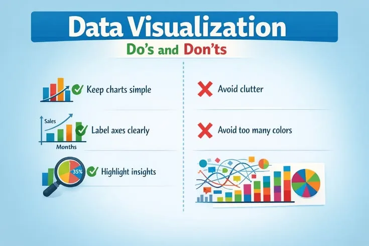
Data visualization is not decoration. It is the bridge between analysis and action. A well-designed visualization makes patterns obvious, comparisons intuitive, and insights memorable in ways that tables of numbers never can.
A poorly designed visualization obscures, misleads, or overwhelms-sometimes causing more harm than the absence of visualization would have caused.
'Above all else, show the data. Every non-data element in a visualization - every background color, every ornamental grid line, every decorative border - is visual noise that the viewer must process and ignore before reaching the information. Remove everything that does not help the viewer understand the data.'
- Edward Tufte, author of 'The Visual Display of Quantitative Information' (1983)
What Makes a Visualization Effective
Edward Tufte, in The Visual Display of Quantitative Information (1983)-still the most influential book on data visualization ever written-distilled effective design to a single principle: "Above all else, show the data."
An effective visualization is:
Clear: The message is understandable within seconds. A viewer should not need to study the chart, read a lengthy caption, or consult external context to understand what it is showing. If the primary insight requires more than ten seconds to extract, the visualization has failed its primary purpose.
Accurate: The visual representation faithfully corresponds to the underlying data. The relative sizes of visual elements correspond to the relative magnitudes of the data they represent. No truncation, distortion, or selective presentation changes the impression the viewer forms.
Efficient: Every visual element serves the data. Background colors, decorative borders, 3D effects, and ornamental grid lines add visual noise without adding information. Their presence actively interferes with comprehension by giving the eye additional elements to process and ignore.
Purposeful: Designed for a specific audience making a specific decision. A chart for an executive presentation differs from a chart for a technical team deep-dive, which differs from a chart for a general-audience report. The same data demands different visualization for different contexts.
Honest: Does not mislead through selective framing, truncated axes, cherry-picked time windows, or visual tricks that distort perceived magnitude.
Accessible: Readable by people with color vision deficiency (approximately 8% of men and 0.5% of women have some form of color blindness), and legible at varying sizes and resolutions.
The five-second test: show the visualization to someone unfamiliar with the data. Ask them to describe what they see after five seconds. If they cannot articulate the key finding, the visualization needs redesign.
| Chart Type | Best For | Common Misuse |
|---|---|---|
| Bar chart | Comparing discrete categories | Using when a line chart would better show change over time |
| Line chart | Showing change over time | Connecting non-continuous categorical data |
| Scatter plot | Showing correlation between two continuous variables | Using with too many data points without aggregation |
| Pie chart | Showing part-to-whole with 2-3 categories | Using with more than 4 slices, making comparison impossible |
| Heatmap | Showing patterns across two categorical dimensions | Using without clear color scale or legend |
| Box plot | Showing distribution and variance | Presenting to non-technical audiences without explanation |
Choosing the Right Chart Type
The most common mistake in data visualization is selecting a chart type based on aesthetics, novelty, or what the visualization tool offers by default rather than what the data and the analytical purpose require.
Different relationships in data require different visual encodings to be communicated accurately.
Comparison Across Categories: Bar Charts
When comparing discrete categories at a point in time, bar charts are almost always the right choice. Human visual perception is accurate at comparing lengths along a common baseline in ways that it is not accurate at comparing angles, areas, or volumes.
Vertical bars (column charts) work for small numbers of categories (typically under 8) with short labels.
Horizontal bars are better for larger numbers of categories, for categories with long names (country names, product names, job titles), and when the ranking of values is the primary message.
Sorted by value rather than alphabetically enables immediate pattern recognition. A bar chart sorted by descending value communicates which categories are largest and the relative gaps between them in a glance. The same data alphabetically sorted requires the viewer to mentally reorder to understand the distribution.
Example: When the New York Times visualizes Senate or House margins by state or district, they consistently use horizontal bar charts sorted by margin of victory. The pattern which states are safely partisan, which are competitive-is immediately visible. An alphabetical arrangement by state name would obscure the pattern entirely.
Change Over Time: Line Charts
Line charts are the canonical choice for temporal data because the connecting lines visually encode the relationship between consecutive time periods. The horizontal axis represents time; the vertical axis represents the measured value; the slope of the connecting line communicates rate of change.
Guidelines:
- Keep consistent time intervals on the horizontal axis. Irregular intervals create visual distortions in the implied rate of change.
- For count data (number of events, number of customers), start the y-axis at zero. A bar showing 1,000 customers that doesn't include zero cannot be compared meaningfully to one showing 1,100 customers.
- For rate data (percentages, ratios, indices), a non-zero baseline is often appropriate if clearly labeled, since the absolute level matters less than the change.
- Include reference lines for targets, historical averages, or prior period values to provide context.
- Limit to 4-5 lines before the chart becomes too cluttered to read. When more series are required, consider small multiples (separate charts sharing consistent scales).
Distribution: Histograms, Box Plots, and Violin Plots
When the distribution of values is the insight-not just the average or total-standard bar charts are inappropriate.
Histograms divide the range of values into equal-width bins and show the frequency of observations falling in each bin. They reveal the shape of the distribution: is it roughly symmetric? Right-skewed? Multi-modal? Does it have long tails?
Example: Airbnb's pricing analytics use histograms to understand listing price distribution. A simple average price ($150/night) obscures that the distribution is heavily right-skewed-most listings cluster at $80-120, but a long tail of luxury properties extends to thousands per night.
The histogram makes this visible; the average conceals it.
Box plots (box-and-whisker charts) summarize distribution in a compact form: the box represents the interquartile range (25th to 75th percentile), the line inside shows the median, the whiskers extend to the data range excluding outliers, and outliers are plotted individually.
Box plots enable comparison of distributions across many categories simultaneously.
Violin plots combine the summary information of box plots with a density curve that shows the full shape of the distribution, providing more information than either alone.
Part-to-Whole Relationships: Stacked Bars and Treemaps
Pie charts are the most overused and most reliably ineffective chart type. Human visual perception is poor at comparing angles and arc lengths. Research consistently shows that people are less accurate at reading pie charts than bar charts showing identical data.
When should you use a pie chart? Almost never, and only when: (1) you have 5 or fewer slices, (2) one slice represents a dominant majority (>60%) whose visual dominance is itself the message, and (3) you label each slice directly rather than relying on a color-coded legend.
Stacked bar charts communicate part-to-whole relationships more accurately than pies, while also enabling comparison across multiple groups or time periods. The total bar height allows comparison of totals; the segment proportions allow comparison of composition.
Treemaps visualize hierarchical data as nested rectangles, where the area of each rectangle corresponds to its value. They work well for large numbers of categories organized hierarchically (e.g., company revenue by division, subdivided by product line) where both the total and the composition matter.
Relationship Between Variables: Scatter Plots
Scatter plots reveal relationships between two continuous variables. Each observation is a point; the x-position encodes one variable, the y-position encodes the other.
Effective scatter plot design:
- Add a trend line (linear regression or LOESS) to highlight the overall relationship direction and strength
- Use color to distinguish up to 3-4 categories within the scatter (more categories create unresolvable color conflicts)
- Annotate interesting outliers with text labels-the outlier points often contain the most actionable insight
- Report the correlation coefficient or R-squared when the strength of the relationship is important
- Log-scale axes for data spanning multiple orders of magnitude (populations, revenues, frequencies)
Example: The Gapminder visualizations created by Hans Rosling-most famously showing life expectancy versus income per capita across countries-use scatter plots with bubble size encoding a third variable (population) and animation showing change over time.
These visualizations made visible the dramatic improvement in global health over decades that raw statistics had failed to communicate.
Design Principles for Every Chart
The Data-Ink Ratio
Tufte's data-ink ratio is the proportion of a chart's visual ink devoted to actual data versus everything else. A chart with many gridlines, decorative borders, 3D effects, and a heavy legend has a low data-ink ratio. The same data presented with minimal visual scaffolding has a high data-ink ratio.
Tufte's prescription: maximize the data-ink ratio within reason. Remove every element that does not convey data information. What should be considered for removal:
- Background colors and gradients (add visual noise, zero information)
- Heavy grid lines (light, subtle guide lines are acceptable if they help reading values; heavy lines compete with the data)
- 3D effects (distort perception, never improve understanding)
- Decorative borders and boxes around charts and legends
- Redundant legends when direct labeling is possible
- Axis labels that repeat information visible elsewhere
What remains after this reduction is a chart where every visual element is earning its presence.
Direct Labeling vs. Legends
When multiple lines, bars, or areas are shown, a legend requires the viewer to match colors between the legend and the chart-a cognitive step that slows comprehension. Direct labeling, placing the label at or near the data series itself, eliminates this step.
For a line chart with four trend lines, placing the country or metric name at the right endpoint of each line allows instant identification. For a bar chart showing multiple segments, labeling each segment within the bar is faster to read than a separate legend box.
Direct labeling is particularly important in presentations, where the audience has limited time and cannot reference back to a legend while following the presenter.
Color as a Functional Tool
Color in visualization is a tool for communication, not decoration. Functional principles:
- Purposeful: use color to encode meaningful information (category membership, magnitude, status) rather than to make charts look appealing
- Restrained: limit categorical palettes to 3-5 distinct colors; more colors than this create confusion rather than clarity
- Consistent: assign the same color to the same category across all charts in a report or dashboard; a reader who associates blue with "North America" and encounters a chart where blue represents "Europe" must actively re-learn the encoding
- Sequential: use light-to-dark gradients for ordered continuous data (a choropleth map showing unemployment rate should shade consistently from light for low to dark for high)
- Diverging: use a two-color gradient with a neutral midpoint for data that has a meaningful middle value (profit/loss, above/below average, change from baseline)
- Accessible: avoid red-green combinations, the most common form of color blindness; test charts in grayscale to verify that color-encoded information is still distinguishable without color
ColorBrewer (colorbrewer2.org), developed by cartographer Cynthia Brewer at Penn State, provides scientifically validated palettes for different data types that are both perceptually effective and accessible to color-blind viewers.
Annotation and Context
A number without context is not insight. Effective visualizations annotate their charts to provide the context viewers need to interpret what they're seeing.
Event annotations: mark significant external events on time series charts. A revenue chart that shows a spike in month 8 without noting that month 8 was when the company was featured by a major publication is incomplete. The annotation turns a visible anomaly into actionable understanding.
Goal and benchmark lines: reference lines showing targets, industry averages, or prior year values allow viewers to assess performance relative to relevant standards without requiring separate charts.
Outlier call-outs: identify interesting individual points with text labels. The most interesting data is often in the exceptions, and callouts direct attention to the points worth examining.
Example: The Financial Times' COVID-19 data visualizations, which reached broad audiences during the pandemic, were notable for their extensive annotations.
Policy interventions (lockdowns, reopenings, vaccine rollouts) were marked on case and death curves, allowing viewers to visually assess the relationship between interventions and outcomes. The annotations transformed raw trend data into a narrative of cause and effect.
How Visualizations Deceive
Understanding how charts mislead is as important as understanding how to design honest ones. Both accidental and deliberate manipulation follow predictable patterns.
Truncated Y-Axis
Starting a bar chart's y-axis at a value other than zero magnifies apparent differences far beyond their true magnitude. Two bars representing values of 98 and 100 look nearly identical when the y-axis runs from 0 to 200. On an axis starting at 96, they look dramatically different.
This technique has been widely documented in political advertising, public health communication, and financial reporting. A cable news network displays a chart of unemployment over 12 months with the y-axis starting at 6%, making a change from 6.4% to 6.2% look like a dramatic decline.
A drug company shows clinical trial outcomes on an axis starting just below the lowest observed value, making a modest improvement look transformative.
Rule: Bar charts must start at zero. Line charts may use non-zero baselines when the absolute level is less important than the trend, but this should be explicitly labeled and accompanied by the absolute values.
Cherry-Picked Time Windows
Selecting a favorable start or end date for a time series chart can create an impression of trend that contradicts the longer-term reality.
A stock that has recovered 40% from its lowest point in years can be presented as showing strong growth if the chart starts at the trough. The same stock shown over five years might reveal that it has lost 30% of its value over the longer period. Both presentations are technically accurate; both create profoundly different impressions.
Defense: Show the full relevant time period. When truncation is necessary due to space constraints, clearly label the start date, provide context for what precedes it, and avoid time windows that were chosen to optimize the visual impression.
Dual-Axis Charts
Charts with two y-axes-one for each of two different variables-invite systematic misinterpretation. Because the two scales are independently chosen, the apparent relationship between the two series can be manipulated arbitrarily by adjusting either scale.
A dual-axis chart showing ice cream sales and drowning deaths can be drawn to show perfect correlation, no correlation, or inverse correlation simply by rescaling one of the axes. There is no objective "correct" scaling.
Any visual relationship the chart appears to show is an artifact of design choices rather than a property of the data.
Better alternative: Two separate charts sharing a common x-axis allow viewers to compare patterns without implying a strength of relationship that the data may not support.
Area Distortion
When representing quantities as circles or bubbles, the area of the circle should scale linearly with the data value. Since area grows with the square of the radius, the radius must scale with the square root of the value. Doubling the radius quadruples the area, creating a 4x visual impression for a 2x data difference.
This error is common in visualizations that use circles to represent population, revenue, or market share. When radius rather than area is scaled to the data value, larger values are dramatically overrepresented visually.
Hans Rosling's bubble charts at Gapminder scale bubble area correctly, which requires explicit implementation since many visualization tools default to radius scaling.
Presenting Data for Different Audiences
The same analytical finding requires different visualization for different audiences, different purposes, and different media.
Executive Audiences
Executives need to extract the key finding in under 30 seconds and decide whether it requires action. Design accordingly:
- One chart, one message. Multiple charts on a single slide create the cognitive burden of determining which to look at first and how they relate.
- Use KPI cards for single important numbers with directional indicators (arrows, color coding) that communicate whether performance is favorable or concerning.
- Annotate the key takeaway directly on the chart: "Conversion rate is 12% above Q3 target, driven primarily by search channel improvement."
- Provide context (benchmark comparisons, trend) but keep it minimal.
- Include a clear implication or recommended action when one exists.
Technical Audiences
Data scientists, engineers, and analysts often need the full methodological context to evaluate findings appropriately:
- Include confidence intervals, sample sizes, and p-values where relevant
- Show multiple views of the same data (distribution alongside trend, individual points alongside summary)
- Explain the analysis approach in the visualization title or caption
- Interactive exploration is valuable-technical audiences will want to examine assumptions
- Complexity is acceptable when it serves understanding
General Audiences
Public-facing data visualization (journalism, public health, consumer reports) must account for broad variation in data literacy:
- Familiar chart types only-bar charts, line charts, and simple scatter plots. Novel or complex chart types require explanation that general audiences may not have patience for.
- Conclusion-oriented titles: "Sales increased 15% in Q3" rather than "Sales by Quarter." Tell the reader what the chart shows, not just what variables are plotted.
- Generous annotations explaining context, methodology, and implications
- One insight per visualization; multiple insights require multiple charts or a narrative structure connecting them
- Avoid jargon in axis labels and legends
Presentation vs. Report Context
A chart designed for a live presentation-to be seen at a distance, glanced at briefly while the presenter speaks-requires different design than a chart in a written report that readers will examine closely.
Presentation charts: much larger text (the minimum readable font size projected on a screen from 30 feet is substantially larger than in print), single clear message, minimal detail, visible from the back of the room.
Report charts: can accommodate more detail, multiple data series, reference lines, and smaller text that readers can examine at their own pace. Can include methodology notes and statistical details that would be distracting in a presentation.
A chart optimized for one context fails in the other. The most common failure mode: elaborate, information-dense report charts dropped into presentation slides without redesign.
The Ethics of Visualization
Every design choice is an editorial choice. Decisions about chart type, axis scale, color, annotations, and time windows all shape the impression the viewer forms. This responsibility is not optional.
Alberto Cairo, in How Charts Lie: Getting Smarter about Visual Information (2019), outlines the ethical obligations of anyone creating data visualizations:
- Show the data faithfully, even when the truth is inconvenient for the organization, client, or preferred conclusion
- Provide sufficient context for accurate interpretation-a chart that shows only part of the picture, even if it shows that part accurately, can mislead as surely as an inaccurate chart
- Acknowledge uncertainty rather than presenting false precision; data has error bars and limitations; hiding them misleads
- Design for your audience's actual literacy level rather than assuming universal statistical sophistication
- Never exploit visual perception biases (dual-axis charts, truncated axes, area distortion) to manipulate the impression viewers form
Nightingale understood that visualization was persuasion. She chose her chart type, her colors, and her design deliberately to maximize impact on policymakers. But her persuasion was honest: the data truly showed that disease killed more soldiers than combat, and her visualization made that truth impossible to ignore.
The best visualizations do not tell people what to think. They make the data so clear that the conclusion becomes inescapable.
See also: Dashboards That Actually Work, Interpreting Data Correctly, Analytics Mistakes Explained
What Research Shows About Data Visualization Effectiveness
The empirical study of data visualization - how humans perceive and decode visual representations of information - has produced a body of findings that should inform every practitioner's design choices.
The foundational work was conducted by William Cleveland and Robert McGill, whose 1984 paper "Graphical Perception: Theory, Experimentation, and Application to the Development of Graphical Methods," published in the Journal of the American Statistical Association, established a hierarchy of visual encodings based on human perceptual accuracy.
Their controlled experiments showed that humans are most accurate at reading values encoded as position along a common scale (bar charts), then length, then angle, then area, and least accurate at reading values encoded as color saturation or volume.
This hierarchy directly explains why bar charts outperform pie charts for comparison tasks and why 3D charts are nearly always inferior to their 2D equivalents.
Edward Tufte, whose 1983 book The Visual Display of Quantitative Information remains the most cited work in the field, built his prescriptive framework on a combination of perceptual research and aesthetic principles derived from the history of statistical graphics.
His data-ink ratio concept was not merely aesthetic preference - it encoded the finding that visual complexity has cognitive costs.
Subsequent research by Kosslyn (1994) and Zacks and Tversky (1999) quantified these costs: higher chart element density increases both processing time and error rates in value extraction tasks.
Tufte's prescription to remove non-data ink was, in effect, a practical instruction to minimize cognitive load.
Alberto Cairo, whose books The Functional Art (2012) and How Charts Lie (2019) are now standard texts in data journalism programs, has contributed research connecting visualization design to comprehension and deception.
Cairo conducted reader comprehension studies showing that annotations on charts - labels, callouts, and explanatory captions - increased correct interpretation rates substantially compared to unannotated versions of the same charts.
His work has been influential in the data journalism community: publications including The New York Times, The Guardian, and the Financial Times have incorporated his annotation principles into their graphics standards.
Cairo's finding that readers typically form an initial interpretation of a chart within the first two to three seconds - before reading title, legend, or annotations - has made the "five-second test" (show the chart to someone unfamiliar with the data for five seconds, then ask what they saw) a standard usability test for visualization quality.
Research by Cindy Xiong, Lisanne van Weelden, and Steven Franconeri, published in 2019 in IEEE Transactions on Visualization and Computer Graphics, examined how chart design influences the causal inferences viewers draw.
Their finding was striking: identical data presented in a bar chart versus a line chart produced different causal attributions in study participants.
Line charts led viewers to infer continuous trends and causal relationships between adjacent data points; bar charts led to categorical, discrete comparisons.
This research provides empirical grounding for the conventional wisdom that line charts should be used for temporal data: the visual encoding actively suggests the kind of relationship (continuous change over time) that temporal data typically represents.
Real-World Case Studies in Visualization
The Financial Times COVID-19 Charts: Annotation as Journalism. The Financial Times' John Burn-Murdoch became one of the most visible data journalists of 2020 through his COVID-19 case trajectory visualizations.
Burn-Murdoch's charts were distinguished not by novel chart types but by systematic annotation: policy interventions (lockdowns, reopenings), variant emergence, and vaccine rollout milestones were marked on case and death curves, allowing readers to visually assess the relationship between events and outcomes.
The FT's methodology was to show the data without implying conclusions - annotations marked events, but the visual relationship between event markers and subsequent curve changes was left for readers to interpret.
The charts were shared millions of times and were cited by policymakers in multiple countries. They represent a case study in how annotation transforms raw trend data into accessible public health communication.
The Upshot's Electoral Maps: Choosing Uncertainty-Honest Presentation. The New York Times' data journalism unit The Upshot, led by Nate Cohn and Amanda Cox (who has since moved to the U.S.
Census Bureau), developed a "live needle" election forecast visualization in 2016 that displayed the probability distribution of outcomes rather than a single point estimate.
The visualization was designed to communicate uncertainty rather than false precision - it showed not "Clinton will win" but the probability landscape across possible scenarios.
The design choice was deliberate: Cohn and Cox have written about the journalistic responsibility to communicate uncertainty honestly rather than collapsing probability distributions into single numbers that imply certainty.
The needle caused controversy because its visual form (a quivering meter) was emotionally distressing to viewers in a way that numbers were not - which itself demonstrated Cairo's point that visual form shapes emotional response, not just intellectual comprehension.
Hans Rosling's Gapminder: Animated Data as Narrative. Hans Rosling's animated bubble charts, first presented at TED in 2006, represented a case study in using unfamiliar chart type to reveal a pattern that conventional presentation had hidden.
Rosling showed 200 years of life expectancy and income data for 200 countries simultaneously, animated over time, with bubble size encoding population. The animation revealed that the conventional "developed world vs.
developing world" binary was obsolete - that the global distribution of life expectancy and income had shifted fundamentally over the 20th century, with most countries having converged toward longer, healthier lives. The 2006 TED talk has been viewed over 15 million times.
Rosling's methodology was subsequently adopted by the BBC and national statistical offices in Sweden and the UK for public communication of demographic data. The key design principle: the animation created a narrative arc that static charts cannot, making the change over time the story rather than a footnote.
USA Today's Signature Style: A Cautionary Example. USA Today, founded in 1982, pioneered a style of bold, colorful, simplified infographics that influenced a generation of newspaper data visualization.
Their signature "Snapshots" - simple charts with large type and bright colors designed for quick reading - were widely adopted.
But the style also embedded what Tufte called "chartjunk": decorative elements, unnecessary 3D effects, and stylistic complexity that reduced rather than enhanced comprehension.
A series of reader comprehension studies conducted in the 1990s and documented in Howard Wainer's book Graphic Discovery found that readers of USA Today-style graphics consistently made more interpretation errors than readers of equivalent data presented in simpler form.
The USA Today example has become a standard reference in visualization courses for the tension between aesthetic appeal (which drives readership) and comprehension accuracy (which is the visualization's actual purpose).
Common Visualization Mistakes and What Evidence Shows
Mistake 1: Misusing Pie Charts. The research on pie chart comprehension has been consistent across multiple laboratories and decades: humans are poor at comparing angles and arc lengths.
William Cleveland and Robert McGill's 1984 experiments established that bar chart reading produces less error than pie chart reading for comparison tasks.
A 2012 meta-analysis by Skau and Kosara in Computer Graphics Forum confirmed that pie charts with more than two or three segments produce substantially higher error rates than equivalent bar charts.
Despite this, pie charts remain among the most commonly used chart types in business presentations. The reason is psychological rather than analytical: pie charts are visually familiar and seem to communicate wholeness (the pie represents 100 percent of something) in a way that bars do not.
This is a case where intuition about what "feels right" conflicts directly with evidence about what communicates correctly.
Mistake 2: Truncating Axes to Mislead. Alberto Cairo documented in How Charts Lie that truncated y-axes are among the most commonly used visual deception techniques, appearing regularly in political advertising, financial marketing, and health communication.
The technique works because human perception naturally assumes bars represent the full range from zero - a cognitive shortcut that truncation exploits.
Cairo's reader studies showed that viewers took significantly longer to detect axis truncation than to process the chart's ostensible message, meaning that by the time a careful reader noticed the manipulation, they had already formed an impression based on the distorted visual.
The ethical and practical prescription is simple: bar charts should start at zero. When compressed axes are necessary for line charts (because the absolute level matters less than the trend), explicit labeling of the axis range is required.
Mistake 3: Color-Coding for More Than Five Categories. Research by Colin Ware, summarized in his 2004 book Information Visualization: Perception for Design, established that humans can reliably distinguish approximately seven plus or minus two values in pre-attentive visual processing - the instant, effortless perception that happens before focused attention.
For colors specifically, reliable categorical distinction drops to four to six colors under realistic chart-reading conditions.
Charts that use ten or twelve colors to encode categorical data produce lookup tasks rather than visual comparisons: viewers must repeatedly match data points to legend colors rather than perceiving patterns directly.
The correction - limiting categorical color encoding to four or five distinct categories and grouping the rest as "other" - sacrifices some data completeness in service of comprehension, a trade-off that visualization research consistently shows is worthwhile for communication tasks.
Sources & Further Reading
- Tufte, Edward. The Visual Display of Quantitative Information. Graphics Press, 2001. View source
- Cairo, Alberto. How Charts Lie: Getting Smarter about Visual Information. W.W. Norton, 2019. View source
- Knaflic, Cole Nussbaumer. Storytelling with Data. Wiley, 2015. View source
- Few, Stephen. Show Me the Numbers: Designing Tables and Graphs to Enlighten. Analytics Press, 2012.
- Brewer, Cynthia. "ColorBrewer: Color Advice for Maps." colorbrewer2.org. View source
- Bostock, Mike. "D3.js: Data-Driven Documents." d3js.org. View source
- Wickham, Hadley. ggplot2: Elegant Graphics for Data Analysis. Springer, 2016. View source
- Schwabish, Jonathan. "An Economist's Guide to Visualizing Data." Journal of Economic Perspectives, 2014. View source
- Nielsen Norman Group. "Data Visualization for Users." nngroup.com.
- Rosling, Hans. "The Best Stats You've Never Seen." TED Talk, 2006.
- Nightingale, Florence. Notes on Matters Affecting the Health, Efficiency, and Hospital Administration of the British Army. Harrison and Sons, 1858.
Frequently Asked Questions
What makes a data visualization effective?
Effective visualizations are: (1) Clear, message is immediately understandable, (2) Accurate, faithfully represents data without distortion, (3) Efficient, shows data with minimum ink and clutter, (4) Purposeful, designed for specific audience and goal, (5) Honest, doesn’t mislead or manipulate, (6) Accessible, readable by people with color blindness or other accessibility needs, (7) Actionable, enables decisions or understanding. Good visualizations make patterns obvious, comparisons easy, and trends clear. Bad visualizations confuse, mislead, or require extensive effort to understand. Test: can someone understand the key message in 5 seconds? If not, simplify. Visualization is communication, prioritize clarity over cleverness or aesthetic complexity.
How do you choose the right chart type for your data?
Chart selection guide: (1) Comparison, bar charts for comparing categories, (2) Trend over time, line charts for temporal data, (3) Distribution, histograms for showing data spread, (4) Part-to-whole, pie charts (sparingly) or stacked bars for proportions, (5) Relationship, scatter plots for correlations, (6) Geographic, maps for location-based data, (7) Ranking, horizontal bar charts for ordered lists, (8) Flow, Sankey diagrams for showing movements. Avoid: 3D charts (distort perception), dual-axis charts (confuse comparisons), pie charts with many slices (hard to compare), and radar charts (difficult to interpret). When in doubt: start with simplest chart that shows your data. Bar and line charts handle most situations. Choose based on what comparison or pattern you want audience to see.
What are common ways data visualizations mislead?
Misleading techniques: (1) Truncated y-axis, makes small differences look large, (2) Inconsistent scales, comparing charts with different scales, (3) Cherry-picked timeframes, showing only periods supporting conclusion, (4) Area distortions, using area for linear data (exaggerates differences), (5) 3D effects, distort perception of values, (6) Pie charts at angles, make slices look different sizes, (7) Dual axes, imply relationships that may not exist, (8) Inappropriate chart types, using wrong visualization for data type, (9) Missing context, no baseline or reference points, (10) Overcomplicated, confusion hides unfavorable data. Intentional or accidental, these erode trust. Always: start y-axis at zero for bar charts, use consistent scales, show full relevant time period, and keep visualizations simple and honest.
What design principles make visualizations clearer?
Design principles: (1) Maximize data-ink ratio, remove unnecessary elements, (2) Use color purposefully, highlight important data, not decoration, (3) Avoid chart junk, no 3D effects, gradients, or unnecessary gridlines, (4) Direct labeling, label data directly rather than using legends when possible, (5) Readable fonts, large enough and high contrast, (6) Whitespace, give elements room to breathe, (7) Consistent formatting, same colors/styles mean same things, (8) Clear titles, explain what data shows, not just name variables, (9) Sort data, order by value not alphabet for easier pattern recognition, (10) Annotations, point out key insights viewers should notice. Edward Tufte’s principle: ‘Above all else show the data.’ Every visual element should serve understanding; remove anything that doesn’t.
How should you use color in data visualizations?
Color usage: (1) Purpose, use color to highlight important data, not decorate, (2) Restraint, limit palette to 3-5 colors maximum, (3) Meaning, consistent colors across visualizations (e.g., red always means the same category), (4) Accessibility, avoid red-green combinations (colorblind-friendly), use patterns in addition to color, (5) Contrast, ensure sufficient contrast for readability, (6) Sequential, use gradients for ordered data (light to dark), (7) Categorical, use distinct colors for unordered categories, (8) Diverging, use two-color gradients for data with meaningful midpoint (positive/negative), (9) Neutral grays, de-emphasize less important data. Test visualizations in grayscale to ensure they work without color. Never use color as the only way to distinguish data. Bad color choices make visualizations unusable for 8% of male population with color blindness.
What makes a good dashboard versus a bad one?
Good dashboards: show most important metrics prominently, use visualizations appropriately for each metric type, provide context (trends, comparisons), enable filtering/drilling down, load quickly, update automatically, have clear hierarchy guiding attention, and match user workflow. Bad dashboards: display too many metrics creating overwhelm, use flashy but uninformative visualizations (gauges, speedometers), lack context making interpretation difficult, are slow to load, require manual updates, have no clear focus, and include metrics no one uses. Dashboard design process: (1) Understand user decisions and workflows, (2) Identify 3-5 most important metrics, (3) Provide summary view with drill-down capability, (4) Test with actual users. Dashboards fail when designed to show all available data rather than support specific decisions.
How do you present data to different audiences effectively?
Audience-specific approaches: Executives, show summary, key insights, actionable recommendations; minimal detail, high-level trends. Technical teams, include methodology, detailed data, statistical measures; more complexity acceptable. General audiences, simple charts, avoid jargon, provide clear context and interpretation. Stakeholders, focus on impacts, comparisons to goals, business implications. Adjust: level of detail, technical complexity, amount of explanation, emphasis (business vs technical), and visualization types. Always: know your audience’s data literacy, understand what decisions they need to make, provide appropriate context, highlight what matters most to them, and be available for questions. One visualization rarely serves all audiences, create different views for different needs. Test understanding: can audience correctly interpret and act on your visualization?