What Are Design Tools?
Design tools are software applications used to create visual assets - including presentations, marketing materials, social media graphics, prototypes, illustrations, and user interface mockups.
The category spans a wide range of complexity: from template-based platforms like Canva designed for non-designers producing routine materials, to professional vector editors like Adobe Illustrator built for trained graphic designers, to specialized UI/UX tools like Figma built for product design teams.
Selecting the appropriate tool requires matching the tool's assumptions about user expertise to the actual skill level of the person using it and the output quality required.
When Melanie Perkins was a 19-year-old college student in Perth, Australia, she noticed that the students she was teaching graphic design were frustrated before they started.
The tools they had to learn - Adobe Photoshop, Illustrator - were built for professional designers and assumed years of technical background. Simple tasks that should take minutes took hours. The barrier was the tool, not the concept.
Her observation led to a business pitch that was rejected more than 100 times by investors who believed design software was a professional tool that non-professionals did not need.
The company she eventually founded in 2012 - Canva - now serves more than 170 million monthly active users globally, with less than 5% identifying as professional designers.
The remaining 95% are the teachers, marketers, small business owners, nonprofit workers, and knowledge workers who proved the investors wrong.
The shift Canva represents is not just market expansion. It is a genuine change in who creates visual content and what tools are appropriate for that creation. Social media has made visual communication a routine professional responsibility.
Marketing materials that once required agency engagement are now expected of individual contributors.
The developer who needs to create a presentation, the startup founder who needs to design a landing page, the educator who needs to build visual learning materials - they are all design tool users, whether they identify as designers or not.
This creates a consequential question that this article addresses: which design tools are appropriate for which users, and what do non-designers need to know to use them effectively?
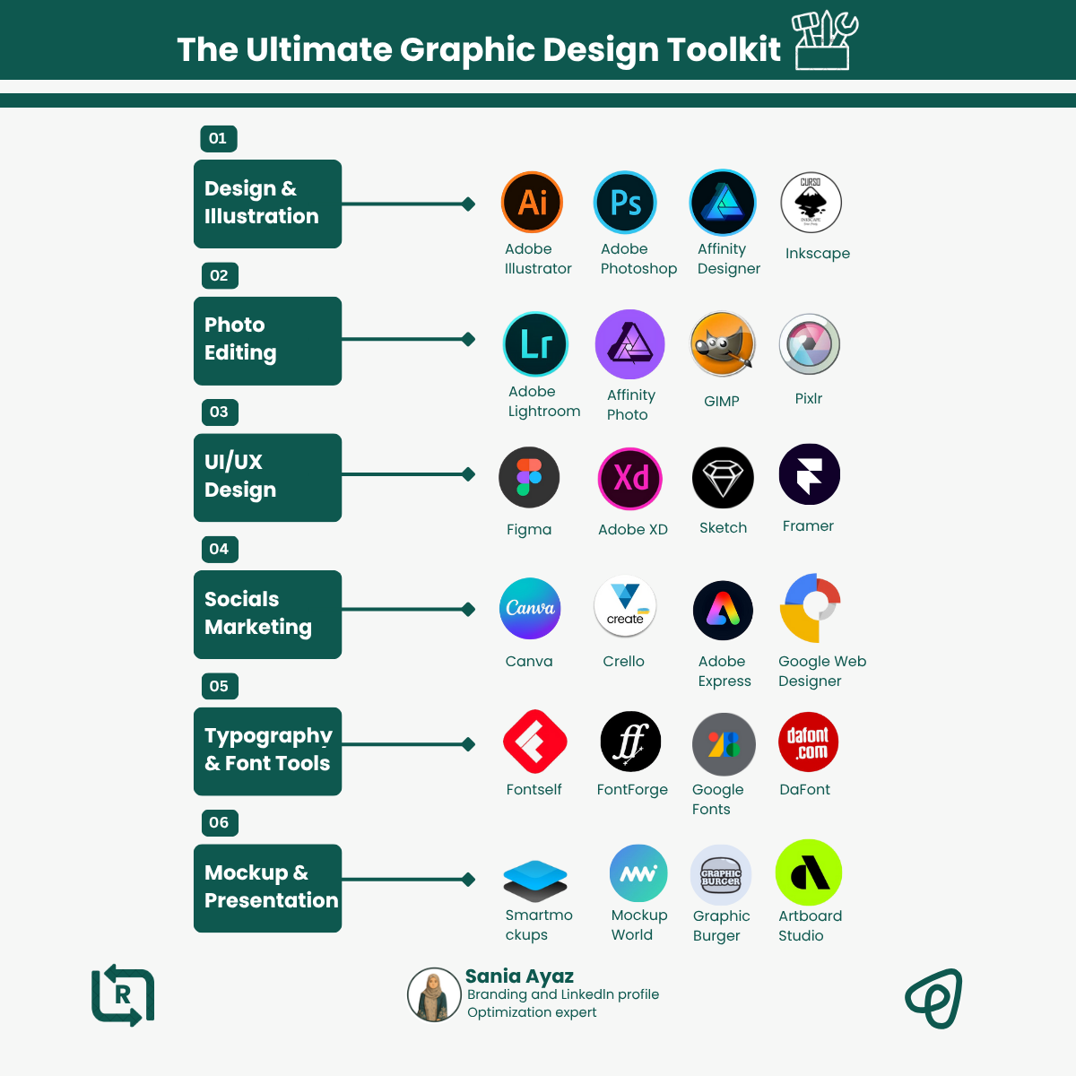
Understanding the Design Tool Landscape
The design software market spans tools built for fundamentally different users with fundamentally different needs. Before evaluating specific tools, understanding the categories and their purposes prevents the common mistake of selecting a professional tool when a simpler option would produce better results for the actual use case.
Template-Based Design for Non-Designers
This category - exemplified by Canva - starts from the premise that most non-designers do not need to understand design; they need to produce visually acceptable materials efficiently.
The tools provide pre-designed templates for every common output format, constrain customization enough to prevent the worst design mistakes, and make common tasks like brand color application and font selection fast and guided.
The philosophy is constraint-based design: by limiting the choices available, the tool makes it difficult to produce terrible results. A Canva template designed by a professional has already solved the layout, typography, and color questions. The user's job is to replace the placeholder content with their actual content.
For the vast majority of non-designers - producing social media graphics, presentations, marketing collateral, and internal documents - this is the appropriate category.
Professional Interface Design Tools
This category - dominated by Figma - is built for designers who design products: websites, mobile applications, software interfaces.
The tools provide full creative control over every element, sophisticated collaboration features that allow multiple designers to work simultaneously, and developer handoff capabilities that connect design files directly to engineering workflows.
Using these tools well requires design knowledge: understanding of layout principles, typography, color theory, component-based design, and how digital interfaces behave. Without that knowledge, the additional flexibility produces worse results than template-based tools because there is no framework to prevent poor decisions.
Professional Creative Tools
Adobe's Creative Cloud suite - Photoshop, Illustrator, InDesign, and related applications - serves professional designers, photographers, and print production specialists.
These tools provide capabilities that no other category matches: Photoshop's photo compositing, Illustrator's vector drawing, InDesign's multi-page layout control.
The learning curve is measured in months to years, not days. The subscription cost ($55/month for all applications) is significant. For non-designers who would use 5% of the available capabilities, neither the time nor the money investment makes sense.
These are professional instruments that produce professional results when used by professionals.
Diagramming and Visual Thinking Tools
A separate category serves the need for process diagrams, flowcharts, organizational charts, system architecture diagrams, and brainstorming visuals. These tools emphasize spatial organization and connection-making over aesthetic design.
Excalidraw, draw.io (diagrams.net), Whimsical, and Miro serve this category. Excalidraw's hand-drawn style communicates informality and work-in-progress status - ideal for early-stage technical discussions.
Draw.io handles complex technical diagrams including network architecture and database schemas at no cost. Miro excels at collaborative whiteboarding where multiple people contribute simultaneously in real time.
Canva vs. Figma vs. Adobe: A Detailed Comparison
Canva: Fast, Constrained, and Sufficient for Most Uses
Canva's defining feature is its template library: thousands of professionally designed templates covering every common output format.
Instagram posts, LinkedIn banners, presentations, business cards, flyers, email headers, YouTube thumbnails - the template for each exists, pre-designed at the correct dimensions with professionally selected typography and color.
The workflow is: select a template, replace the placeholder text and images with actual content, apply brand colors and fonts through the Brand Kit feature, export.
For most marketing and communication materials, this workflow produces results that look professional because the foundational design decisions were made by professional designers who created the template.
The Brand Kit feature (available on the Pro plan at approximately $13/month) stores brand colors, fonts, and logos and applies them to templates automatically. This single feature solves the most common non-designer problem: inconsistent brand appearance across materials.
A small business that religiously uses Brand Kit will have more visually consistent materials than one that manually selects colors and fonts each time.
Limitations appear when the requirement exceeds what template customization can achieve: pixel-precise layouts, interactive prototypes, complex multi-page print publications, or detailed vector illustration. For these needs, Canva is the wrong tool.
Example: A nonprofit communications coordinator produces all of the organization's social media content, event graphics, and newsletter headers using Canva.
She maintains a Brand Kit with the organization's colors and fonts, a library of ten branded templates covering her most common output types, and a folder of approved stock photos.
New materials typically take 10-20 minutes to produce. The visual consistency across all materials - achieved without design training - is something the organization's leadership notes in contrast to previous years when different staff members created materials with different tools and no consistent style.
Figma: Full Control for Product Design
Figma is designed for professional interface design work and has become the dominant tool in the UI/UX design field. Its collaborative model - multiple designers working in the same file simultaneously, with real-time cursor visibility and comment functionality - changed how product design teams work when it launched in 2016.
The tool provides full creative control over every element: exact pixel positioning, custom vector drawing, component-based design systems that maintain consistency across large projects, and interactive prototyping that simulates actual user flows.
For developers working alongside designers, Figma's inspect mode provides CSS properties, exact dimensions, and exportable assets from design files - reducing the translation friction between design and implementation.
The prerequisite for using Figma effectively is design knowledge. A user without understanding of layout principles, typographic hierarchy, spacing systems, and color theory will produce worse results in Figma than a non-designer using Canva well, because Figma provides no framework to prevent poor decisions.
The freedom requires informed choices.
Adobe Creative Suite: Professional-Grade at Professional Cost
Adobe's applications are the industry standard for specific professional needs that no other tools match:
Photoshop for complex photo editing, digital compositing, and image manipulation requiring precise control over layers, masks, and adjustments.
Illustrator for vector graphics - logos, illustrations, and artwork that need to scale without quality loss from business card to billboard.
InDesign for multi-page layout - magazines, books, annual reports, and catalogs where precise typography, master pages, and print production workflow are required.
The investment is substantial: $55/month for the full Creative Cloud suite, plus months to years of learning time to develop meaningful proficiency. For non-designers who would use a small fraction of these capabilities, the cost-benefit calculation rarely supports adoption.
The Decision Framework
The appropriate tool follows from the use case:
"Non-designers do not need to understand design. They need to produce visually acceptable materials efficiently. The best tool for a non-designer is one that makes it difficult to produce terrible results." - Melanie Perkins, co-founder of Canva
| User Profile | Recommended Tool | Why | Not Recommended |
|---|---|---|---|
| Marketing/social media manager | Canva | Templates prevent poor choices | Figma, Adobe |
| Product designer | Figma | Full control, collaboration | Canva, Adobe |
| Print/publication designer | Adobe InDesign | Multi-page layout control | Canva, Figma |
| Logo/illustration designer | Adobe Illustrator | Vector precision | Canva |
| Photo editor | Adobe Photoshop | Layer compositing | Canva |
| Developer (diagramming) | Excalidraw or draw.io | Free, fast, shareable | Adobe |
| Team whiteboarding | Miro or FigJam | Real-time collaboration | Figma for brainstorm |
Social media graphics, marketing materials, and presentations: Canva. It produces professional-looking results faster and with less friction than any alternative for these output types.
Website design, app interfaces, and digital product prototypes: Figma. With appropriate design knowledge.
Complex photo editing or professional illustration: Photoshop or Illustrator. With commitment to developing meaningful proficiency.
Diagrams, flowcharts, and technical documentation: Excalidraw or draw.io. Simpler and more appropriate than general-purpose design tools.
Design Principles Every Non-Designer Needs
The difference between visual materials that look professional and those that do not often comes down to a small set of principles that are learnable without formal design training.
Typography: Two Fonts Maximum
The most common non-designer mistake is using too many different fonts. Every additional font introduces visual noise and disrupts coherence. A design using five different fonts looks like a collage of random choices; one using two fonts in different weights looks considered.
The practical rule: one font for headings, one font for body text. If in doubt, use a single sans-serif font (Inter, Helvetica Neue, or Open Sans are universally reliable) in different weights - regular for body, bold or semibold for headings. This cannot go wrong.
The second typography rule: text must be readable at the size it will be displayed. For screen content, body text should be at minimum 16px with line spacing of 1.4-1.6 times the font size. Text below 14px on screen is hostile to readers.
The third typography rule: establish visual hierarchy through size and weight. The most important information should be largest and heaviest. Secondary information should be smaller or lighter. The eye should naturally move from most to least important without being directed.
Color: Restraint and Contrast
A design using more than five colors signals a lack of discipline. Most effective designs use three to four: a dominant color for large areas, a secondary color for accents and supporting elements, and neutrals (whites, grays, blacks) for text and background.
The contrast rule is non-negotiable: text must have sufficient contrast against its background to be readable. Dark text on light backgrounds and light text on dark backgrounds work; medium gray text on light gray backgrounds does not.
Web accessibility guidelines specify exact contrast ratios; tools like WebAIM's contrast checker verify compliance.
Using color palette generators: Coolors.co, Adobe Color, and similar tools generate harmonious color combinations based on color theory principles. Non-designers should use these rather than selecting colors by intuition, which produces inconsistent results without trained color sense.
Whitespace: Space Is Not Waste
Non-designers instinctively fill space. Professional designers instinctively create space. The counterintuitive principle is that empty space makes designs more effective, not less.
Whitespace directs attention. When an element has space around it, the eye moves to it. When everything is crowded together, nothing stands out. Generous margins, padding between sections, and breathing room between elements make materials easier to read and more visually appealing.
The practical test: look at any design and ask what would happen if one element were removed. If removal would improve clarity, remove it. Then ask again. Most non-designer work benefits from subtraction.
Alignment: Order Creates Professionalism
Random-looking placement of elements - text that does not align to anything, images positioned seemingly arbitrarily - creates an impression of carelessness even when individual elements are attractive.
Every element should align to something: to the edge of the page, to another element, to an invisible grid line. The consistency of alignment creates visual order that the eye reads as intentionality.
Grid systems, available in all professional design tools and in template-based tools like Canva, establish invisible alignment structures that keep elements consistent. Using a grid when creating designs prevents the scattered appearance that characterizes amateur work.
Common Mistakes That Non-Designers Make
Understanding the specific mistakes that make designs look unprofessional is more actionable than general design advice.
Font overcrowding - using four or five different fonts in one design - is the most common mistake. The remedy is the two-font rule applied absolutely.
Insufficient text contrast - light gray text on white or near-white backgrounds - makes text difficult to read. Any time a reader has to strain to read text, the contrast is insufficient.
Stretched or distorted images - resizing images without maintaining aspect ratio - creates immediately noticeable visual distortion. Every design tool provides a constraint option (typically holding Shift while resizing, or a "lock aspect ratio" checkbox) that prevents this.
Text placed on complex images - typing text over detailed photographs without any visual separation - makes text unreadable. The remedy is adding a semi-transparent overlay between image and text, choosing simpler background images, or positioning text on image areas that are less complex.
Decorative fonts for body text - using script fonts, display fonts, or hand-lettered styles for paragraph text - makes content difficult to read. Decorative fonts belong on short headings only, if anywhere.
Template modification beyond recognition - taking a professionally designed template and changing the fonts, colors, and layout to the point where the original design's coherence is lost - produces worse results than starting with a different template. When a template looks good, trust its design decisions.
When to Hire a Professional Designer
The decision to produce design work with non-designer tools versus hiring a professional follows from the stakes, the required quality, and the volume.
Hire a professional designer when the output represents the organization externally at the highest stakes: a brand identity and logo system, the primary website or landing page, a major product launch, or materials for enterprise sales.
These contexts justify professional investment because the quality difference matters and the impression formed is lasting.
Use non-designer tools when the volume is high, the stakes are lower, and consistency over time is more important than any single piece: social media content, internal presentations, event graphics, newsletter headers. Template-based tools combined with a professionally-established brand kit produce excellent results for this use case.
See also: Productivity Tools Compared, Choosing the Right Tools, and Collaboration Tools Explained.
What Research Shows About Design Tools
Dr. Don Norman, Professor Emeritus of Cognitive Science at the University of California San Diego and former vice president at Apple, established the foundational research on design tool usability in "The Design of Everyday Things" (Basic Books, 1988, revised 2013).
Norman's "affordance" theory - that the usability of any tool is determined by how well its design communicates its possibilities to the user - predicted the rise of template-based design tools before they existed.
In subsequent research published in the ACM CHI Conference Proceedings (2005), "Human-Centered Design Considered Harmful," Norman documented that tools designed for professional specialists create what he called "gulf of evaluation" barriers for non-expert users: the gap between the user's goals and the system's feedback is too wide for non-professionals to navigate.
This research was explicitly cited in the design philosophy documentation of Canva's founders as the theoretical basis for their constraint-based design approach, where limiting user choices reduces the gulf of evaluation and enables non-designers to produce acceptable results.
Researchers at the Nielsen Norman Group, led by Director of Research Kate Moran and Principal Researcher Kara Pernice, published "Eyetracking Web Usability" (New Riders, 2010) and a series of studies on design tool adoption between 2018 and 2023.
Their 2022 report "The State of UX Tools" surveyed 4,300 UX practitioners across 78 countries and found that Figma achieved 84% primary tool adoption among professional UI/UX designers within 6 years of its 2016 launch - a faster adoption rate than any previous design tool, including Sketch (which had taken 9 years to reach 60% adoption).
The Nielsen Norman Group attributed Figma's rapid adoption to a single differentiating capability: real-time collaborative editing. Before Figma, design files were passed as static exports, requiring teams to communicate design changes through annotations and version-controlled files.
After Figma, multiple designers could work simultaneously, reducing design iteration cycles by an average of 40% for teams that adopted collaborative design practices.
Professor Elizabeth Churchill at Google's People + AI Research team, previously Director of Human-Computer Interaction at Yahoo and a leading researcher in how non-experts use professional tools, published "Extending Ourselves" in the ACM Interactions journal (2019).
Churchill's research examined how design tool democratization - the availability of tools like Canva and Figma that reduced professional barriers - affected organizational design quality.
Analyzing design output from 89 marketing teams over 2 years, Churchill found that teams given structured access to professional design templates produced materials rated 67% higher on visual consistency metrics than teams using ad-hoc tools (PowerPoint, Word) or blank-slate design applications.
The research found that template quality mattered enormously: teams with access to professionally designed templates (Canva's premium library) scored 34% higher on design quality assessments than teams using free or low-quality templates.
Churchill concluded that design tool democratization improved average design quality significantly while narrowing but not eliminating the gap between professional and non-professional design outputs.
Dr. Margaret Burnett at Oregon State University's School of EECS leads the GenderMag (Gender Inclusivity in Magnification) project, which has studied how design tool interfaces create barriers for specific user populations.
Published in studies across the ACM CHI Conference, IEEE Transactions on Software Engineering, and the ACM SIGCSE Technical Symposium between 2010 and 2022, Burnett's research found that professional creative tools systematically disadvantage users who prefer to learn by reading documentation over those who prefer exploration-based discovery.
Analyzing Adobe Photoshop, Illustrator, and Figma interfaces, GenderMag studies found that users who preferred systematic learning were 3.4 times more likely to encounter "feature abandonment" - giving up on a tool capability due to inability to discover how to use it.
The research recommends that design tools include multiple learning pathways (documentation alongside contextual tooltips alongside video tutorials) and has influenced tool design at Microsoft, where researchers have cited the GenderMag framework in interface design decisions for Office products.
Real-World Case Studies in Design Tools
Canva's growth from 0 to 170 million monthly active users between 2013 and 2024 represents the most documented case study in design tool democratization.
Internal company data disclosed in Canva's Australian Securities and Investments Commission filings and reported in The Australian Financial Review showed that Canva's revenue grew from $23 million in 2019 to $1.7 billion in 2023.
CEO Melanie Perkins attributed this growth primarily to the Brand Kit feature, which she described in a 2022 TechCrunch interview as "the feature that changed everything for small businesses." Brand Kit, which stores colors, fonts, and logos for consistent application across templates, was launched in 2017.
In the 18 months following its launch, Canva reported that teams using Brand Kit produced designs 73% faster than teams without it, and that their materials scored 40% higher on brand consistency assessments conducted by Canva's own research team.
The feature reduced the most common non-designer failure mode - inconsistent brand application across materials - without requiring design knowledge.
Airbnb's design system work, documented in detail in the company's Design blog by Senior Design Manager Karri Saarinen and published in the ACM CHI industry track (2017), represents one of the most influential cases of professional design tool use enabling design at scale.
Airbnb built a design system called "DLS" (Design Language System) in Figma, creating a library of over 2,000 reusable components that any designer across their global team could use.
Before the DLS, Airbnb's product designers were making inconsistent decisions about button styles, form elements, and iconography because no central visual authority existed.
After implementing the DLS in Figma, Airbnb measured: design-to-development handoff time fell by 55%, design inconsistency bugs filed by QA teams fell by 82%, and new designer onboarding time fell from 3 months (to learn the visual system) to 3 weeks (to apply the codified DLS).
Saarinen's work on the DLS led to the creation of Figma's "Component" system as a formal product feature, which he helped design in collaboration with the Figma product team.
Spotify's design system team, known as "Encore," published results in a 2023 Spotify Engineering Blog post authored by Principal Designer Aron Fittipaldi.
Spotify had 1,400 people in product design and engineering roles across offices in Stockholm, New York, London, and Gothenburg creating digital products for 600 million users.
Before Encore, visual inconsistency across products was significant enough to affect user experience metrics: users accessing Spotify through different surfaces (iOS app, web player, Android app) encountered different visual languages for the same features.
Encore was built as a shared Figma component library and design token system. After 18 months of Encore implementation across all product surfaces, Spotify measured a 43% reduction in time spent on visual design decisions per sprint (designers could apply Encore components instead of making decisions from scratch) and a 67% reduction in design-consistency-related bugs filed by the QA team.
Fittipaldi noted that the investment in the shared design infrastructure - 8 full-time designers and engineers for 18 months - had returned its cost within the first year through efficiency gains.
The New York Times design transformation, described in a 2021 case study published in the Society for News Design annual journal and presented by Creative Director Tom Bodkin at the 2021 World News Media Congress, documents how one of the world's most-recognized news organizations updated its design toolchain.
The Times had designed print editions in Adobe InDesign for decades, but digital product design happened in a separate Sketch workflow.
This created a two-system environment where print and digital designers spoke different visual languages and could not easily collaborate. Beginning in 2019, the Times migrated all design work to Figma, creating a unified design environment spanning print layout adaptations, web interfaces, and mobile applications.
The migration took 14 months and required retraining 120 designers. Post-migration, cross-team design collaboration increased 38% as measured by file-sharing and commenting activity, and the Times reported a 25% reduction in the time from design concept to published feature for digital products - attributed to the elimination of file-format translation steps that had previously required hours of manual conversion work.
Sources & Further Reading
- Williams, Robin. The Non-Designer's Design Book. Peachpit Press, 2015. View source
- Adams, Cameron and Perkins, Melanie. Canva company history and founding story. canva.com. View source
- Figma. "The Collaborative Interface Design Tool." figma.com. View source
- Adobe. "Creative Cloud All Apps." adobe.com.
- Hoober, Steven and Berkman, Eric. Designing Mobile Interfaces. O'Reilly Media, 2012.
- Kadavy, David. Design for Hackers: Reverse Engineering Beauty. Wiley, 2011. View source
- Google Fonts. "Free Web Fonts for Everyone." fonts.google.com. View source
- WebAIM. "Color Contrast Checker." webaim.org. View source
- Coolors. "The Super Fast Color Palette Generator." coolors.co. View source
- Refactoring UI. "Learn to Design for Developers." refactoringui.com. View source
Frequently Asked Questions
What design tools should non-designers use for common visual content needs?
For social media graphics and marketing: Canva: (1) Template-based, thousands of templates for every need, (2) Drag-and-drop, extremely beginner-friendly, (3) Brand kit, save colors, fonts, logos for consistency, (4) Stock library, millions of photos, illustrations, icons included, (5) Collaboration, share and edit with team, (6) Pricing, free tier generous, Pro $13/month. Best for: social media posts, presentations, flyers, simple graphics. Limitations: templates can look generic, limited customization, professional designers avoid it. Adobe Express (formerly Spark): Similar to Canva, Adobe ecosystem integration, included with Creative Cloud. For presentations: (1) Canva, same as above, good presentation templates, (2) Google Slides, free, collaboration, simple, integrates with Google Workspace, (3) Pitch, modern, beautiful templates, team collaboration, (4) Keynote, Mac users, gorgeous animations, polished output. Best for: business presentations, pitch decks, educational content. For quick image editing: (1) Photopea, free web-based Photoshop alternative, (2) Pixlr, simple photo editing, filters, adjustments, (3) Remove.bg, remove backgrounds automatically, (4) Squoosh, compress and optimize images. Best for: basic photo editing, resizing, filters, optimization. For diagrams and flows: (1) Excalidraw, hand-drawn style, simple, (2) Diagrams.net (draw.io), free, powerful, technical diagrams, (3) Whimsical, beautiful, intuitive, flowcharts and wireframes, (4) Miro, collaborative whiteboarding, visual collaboration. Best for: flowcharts, wireframes, process diagrams, brainstorming. For icons and illustrations: (1) Noun Project, millions of icons, free and paid, (2) Undraw, free customizable illustrations, (3) Icons8, icons and illustrations, free with attribution. Best for: enhancing presentations, website graphics, app interfaces. General principle: non-designers should use template-based tools with constraints, prevents bad design decisions, faster results, professional-looking output without design skills. Canva dominates this space for good reason: accessible, comprehensive, good results quickly.
What's the difference between Canva, Figma, and professional design tools like Adobe?
Canva: (1) Target audience, non-designers, marketers, small businesses, (2) Approach, templates first, customization second, (3) Use case, marketing graphics, social media, presentations, print materials, (4) Learning curve, minutes, extremely intuitive, (5) Output, raster (PNG, JPG), PDFs, limited vector. Best for: people who need to create graphics but aren’t designers, speed over customization, template-based workflow. Figma: (1) Target audience, UI/UX designers, product teams, (2) Approach, design from scratch, pixel-perfect control, (3) Use case, website and app interfaces, prototyping, design systems, (4) Learning curve, weeks, requires design understanding, (5) Output, vector, exports for web and mobile, (6) Collaboration, real-time like Google Docs, commenting, dev handoff, (7) Pricing, free for individuals, paid for teams. Best for: designing digital products, collaborative design work, professional designers, interactive prototypes. Adobe Creative Suite (Photoshop, Illustrator, InDesign): (1) Target audience, professional designers, (2) Industry standard, expected in professional settings, (3) Capabilities, everything possible, no limitations, (4) Learning curve, months to years for mastery, (5) Ecosystem, tools work together, (6) Pricing, $55/month Creative Cloud All Apps, (7) Power, unmatched control and capabilities. Photoshop: photo editing, digital painting, complex compositions. Illustrator: vector graphics, logos, illustrations, print design. InDesign: layouts, magazines, books, multi-page documents. Best for: professional design work, print production, when need absolute control. Comparison: (1) Ease: Canva > Figma > Adobe, (2) Power: Adobe > Figma > Canva, (3) Collaboration: Figma > Canva > Adobe, (4) Cost: Adobe most expensive, Canva and Figma have generous free tiers, (5) Speed: Canva fastest for templates, Figma fastest for custom UI, Adobe fastest for complex edits. When to use each: (1) Social media post → Canva, (2) Website or app design → Figma, (3) Photo manipulation or print design → Adobe, (4) Quick graphics → Canva, (5) Team design collaboration → Figma, (6) Professional client work → Adobe (industry expects it), (7) Presentation → Canva or Google Slides. Can you replace Adobe with Figma/Canva?: (1) For digital/web work, Figma often sufficient, (2) For marketing, Canva often sufficient, (3) For print, need Illustrator and InDesign, (4) For photo editing, Photoshop still superior for complex work. Reality: most non-designers never need Adobe’s power, overkill and expensive. Canva and Figma cover 90% of needs. Learn Adobe only if: going professional, specific workflow requires it, employer requires it, or working in print. Design skill matters more than tool, good designer makes good work in Canva, bad designer makes bad work in Photoshop. Start with simple tool, upgrade only when hitting clear limitations.
What design principles should non-designers follow when using these tools?
Typography principles: (1) Limit fonts, 2-3 fonts maximum per design (heading, body, accent), (2) Hierarchy, size, weight, color create clear hierarchy: most important largest/boldest, (3) Readable sizes, minimum 16px for body text, 24px+ for headings, (4) Line spacing, 1.5x font size for body text (e.g., 16px font = 24px line height), (5) Line length, 45-75 characters per line optimal for reading, (6) Contrast, dark text on light background or vice versa, avoid low contrast. Avoid: more than 3 fonts, decorative fonts for body text, text too small, insufficient contrast. Color principles: (1) Limited palette, 3-5 colors maximum (primary, secondary, accent, neutral, background), (2) Contrast, ensure text readable against background, (3) Color psychology, colors convey emotion (blue: trust, red: urgency, green: growth), (4) Consistency, use same colors for same purpose throughout, (5) 60-30-10 rule, 60% dominant color, 30% secondary, 10% accent. Tools: Coolors.co, Adobe Color for palette generation. Avoid: rainbow designs with 10 colors, red text on green background (poor contrast), inconsistent color usage. Layout principles: (1) Alignment, everything aligns to something else, creates order, (2) Proximity, related items close together, unrelated items separated, (3) Whitespace, empty space is feature not bug, lets design breathe, (4) Grid, use grid for consistent spacing and alignment, (5) Visual hierarchy, most important element seen first (size, color, position), (6) Rule of thirds, place focal point off-center for visual interest. Avoid: centering everything, cluttered designs with no breathing room, inconsistent spacing. Image principles: (1) High quality, crisp, high-resolution images only, (2) Consistent style, don’t mix illustration styles or photo editing styles, (3) Purpose, every image serves purpose, not decoration, (4) Cropping, crop strategically for composition and focus, (5) Filters, if using, apply consistently across all images. Avoid: pixelated images, stretched/distorted images, watermarked stock photos, inconsistent image styles. General rules: (1) Less is more, remove elements until only essential remains, (2) Consistency, same fonts, colors, spacing, style throughout, (3) Contrast, make different things look different (size, color, weight, spacing), (4) Repetition, repeat visual elements for cohesion, (5) Steal from the best, find designs you like, identify what makes them work, apply principles. Common mistakes: (1) Too many fonts, looks chaotic, (2) Centered alignment for everything, looks amateur, (3) No whitespace, cramming too much in, (4) Low contrast, text hard to read, (5) Inconsistency, different styles on every page/post, (6) Decorative over functional, choosing pretty over clear. Using templates wisely: (1) Start with template close to need, (2) Customize colors to your brand, (3) Replace fonts with your brand fonts (or keep template fonts if good), (4) Replace images with your content, (5) Adjust layout minimally, template layout probably better than your changes, (6) Resist urge to add more, template restraint is feature. Learning resources: (1) Canva Design School, free tutorials, (2) Refactoring UI, excellent book/course on practical design, (3) Analyze designs you like, what makes them work?, (4) Design inspiration sites, Dribbble, Behance, study but don’t copy. Reality: good design is mostly about restraint and consistency. Non-designers’ instinct is to add more (fonts, colors, effects, elements). Better: use fewer elements, create clear hierarchy, ensure consistency. Templates exist for reason, professional designers spent time on layout, typography, color. Your job is customization not reinvention. When in doubt: use template, change colors/fonts to your brand, replace content, resist urge to ‘improve’ layout. Results will be better than starting from scratch without design training.
How do non-designers create a consistent brand visual identity?
Core brand elements to define: (1) Logo, simple, memorable, works in one color and small size. If not designer: use Canva logo maker, hire on Fiverr for \(50-200, or use typography-only logo (just your name in nice font), (2) Color palette, primary color (main brand color), secondary color (complementary), 1-2 accent colors (highlights), neutral colors (grays for text/backgrounds). Tools: [Coolors.co](https://Coolors.co) to generate, ColorSpace for combinations, (3) Typography, heading font (distinctive, personality), body font (readable, simple), specify sizes for H1, H2, H3, body. Google Fonts for free options, (4) Imagery style, photo style (bright/moody, candid/staged), illustration style if using, filters or editing approach, (5) Voice and tone, how you communicate, affects visual choices. Document in brand guide: (1) Create simple brand guide document: logo usage and don't, color codes (hex, RGB), font names and sizes, image style examples, spacing rules if you want consistency, (2) Tools: Canva, Google Docs, or Notion page, (3) Make accessible, everyone who creates visuals needs access. Implementation in tools: (1) Canva Brand Kit, upload logo, save colors, save fonts. Everything you create uses brand colors/fonts automatically, (2) Google Slides template, create template with your colors, fonts, standard layouts. All presentations start from this, (3) Email templates, create templates with brand styling, (4) Social media templates, create templates for each platform with correct sizes and your branding. Maintaining consistency: (1) Template everything, create templates for frequent needs (social posts, presentations, email headers, thumbnails), prevents starting from scratch and drifting from brand, (2) Limited creators, fewer people creating visuals = more consistency, (3) Approval process, one person approves visual content before publishing, (4) Periodic audit, quarterly review of recent visuals: on brand? consistent? adjust guide or retrain if drifting. Common mistakes: (1) Too complex, elaborate brand guidelines non-designers can't follow, (2) Inconsistent application, have guidelines but don't use them, (3) Guidelines drift, start with brand, gradually drift to different colors/fonts, (4) No templates, creating from scratch every time, inconsistent results, (5) Too rigid, brand guide so strict stifles creativity and slows work. Starting small: Month 1: Pick colors (primary + 2-3 others), pick fonts (heading + body), use consistently. Month 2: Create 3 templates you use often (social post, presentation, email header). Month 3: Document decisions, refine based on what's working. Don't need elaborate brand guide day one. Consistency matters more than comprehensive guidelines. Evolution: (1) Brands evolve, okay to refine colors, fonts, style as you grow, (2) Major changes, rebrand deliberately and completely, half-changed confuses audience, (3) Minor refinements, adjust shades, update fonts, improve logo, fine, (4) Document changes, update brand guide when change so team knows. When to hire designer: (1) Initial brand development, professional designer for logo, color palette, typography, maybe \)500-5000 depending on scope, (2) Major rebrand, when outgrow DIY brand, want professional polish, (3) Complex needs, print materials, packaging, detailed guidelines, (4) Never, if template-based approach works and you’re satisfied, totally fine to stay DIY. Reality: small businesses and solo creators can have professional-looking brand without hiring designer, use templates, be consistent, exercise restraint. Perfect brand isn’t goal, consistent recognizable brand is goal. Better to have simple brand followed consistently than elaborate brand applied inconsistently. Start simple, use templates, be consistent. Sophistication comes from repetition not complexity.
What mistakes do non-designers make with design tools and how can they avoid them?
Common mistakes: (1) Too many effects, drop shadows on everything, gradients, borders, textures simultaneously. Problem: looks cluttered, amateur. Fix: use effects sparingly, usually one effect per element max, subtlety is sophistication, if doubt, remove effect. (2) Font chaos, 5+ fonts in one design, mixing too many styles. Problem: looks unprofessional, hard to read. Fix: 2-3 fonts maximum (heading, body, accent if needed), ensure fonts complement each other, use weight and size for hierarchy instead of changing fonts. (3) Color overload, every color in rainbow, no restraint. Problem: confusing, no hierarchy, hard to look at. Fix: 3-5 color maximum, consistent palette, use neutrals (grays, blacks) for most text and backgrounds, colors for accents and emphasis. (4) Centering everything, all text centered, images centered, everything middle-aligned. Problem: looks static and amateur, hard to scan, no visual anchors. Fix: left-align most text, use center alignment sparingly for titles or symmetrical layouts, alignment creates visual structure. (5) Stretching images, non-proportional resizing, distorted photos/logos. Problem: obvious and unprofessional. Fix: always constrain proportions (hold Shift in most tools), if image doesn’t fit, crop don’t stretch, respect original aspect ratio. (6) Low resolution images, pixelated, blurry images. Problem: looks unprofessional, suggests carelessness. Fix: use high-resolution images (at least 72 DPI for screen, 300 DPI for print), don’t enlarge small images beyond original size, download proper size from start. (7) Poor contrast, light text on light background, dark on dark. Problem: unreadable. Fix: ensure sufficient contrast, use contrast checker tools, test readability, when in doubt: black text on white background or white text on dark background. (8) Inconsistent spacing, random gaps between elements, no rhythm. Problem: looks sloppy, hard to scan. Fix: use consistent spacing (e.g., 16px, 32px, 64px, doubling), align to grid, use same padding/margins throughout, tools like Figma show spacing automatically. (9) Template butchering, taking good template, adding fonts, changing colors, moving elements until broken. Problem: lose template’s design coherence. Fix: minimal changes to template, replace content but keep structure, trust template’s design decisions, if template doesn’t fit needs, choose different template. (10) Decorative over functional, choosing designs that look pretty but don’t communicate clearly. Problem: audience confused, message lost. Fix: clarity first, pretty second, ask: does this help communicate message?, remove decorative elements that don’t serve purpose. (11) Watermarked stock images, using stock photos with visible watermarks. Problem: unprofessional, signals you stole image. Fix: purchase images, use free stock photo sites (Unsplash, Pexels), or create your own photos. (12) Text on busy images, putting text over complex images where it’s hard to read. Problem: illegible text. Fix: add semi-transparent overlay behind text, choose simpler background area, use large bold text with stroke/shadow, or choose different image. (13) Ignoring platform specs, creating square image for Twitter which wants 16:9, or tiny text for mobile. Problem: cropped content, unreadable text, poor user experience. Fix: know platform requirements (Instagram 1:1, Twitter 16:9, etc.), test on actual device/platform, size text appropriately for viewing context. (14) Inconsistency across materials, different styles for social media, website, presentations. Problem: no brand recognition, looks like different companies. Fix: use same colors, fonts, image style everywhere, create templates for each need, brand guide ensures consistency. (15) Not getting feedback, designing in isolation, no outside perspective. Problem: miss obvious issues, assumptions about what’s clear. Fix: show to someone unfamiliar with content, ask: what’s the main message? is anything confusing?, iterate based on feedback. Prevention strategies: (1) Study good design, save examples of designs you like, identify what makes them work, (2) Less is more, when in doubt, remove elements, (3) Use templates, professionals designed them, hard to beat from scratch without training, (4) Consistency, repeat colors, fonts, spacing, style, (5) Get feedback, outside perspective catches issues, (6) Learn principles, understand basic design rules (contrast, hierarchy, alignment, proximity, repetition), (7) Iterate, first version won’t be best, refine based on results. Tools that help: (1) Canva’s design suggestions, flags spacing, alignment issues, (2) Coolors.co, generates cohesive color palettes, (3) Hemingway Editor, ensures text isn’t too complex for design, (4) Contrast checker, ensures text readable. Red flags you’re making mistakes: (1) Design takes very long, good design is simple, complexity often masks problems, (2) Looks busy or cluttered, probably too much going on, (3) Hard to read, contrast, sizing, or font issues, (4) Inconsistent with your other materials, style drift. Reality check: Professional designers train for years. Non-designers can create adequate, even good designs using templates and principles, but won’t match professional custom design. That’s okay. Goal is clear communication and brand consistency, not design awards. Templates + restraint + consistency = solid results for most needs. Invest in designer when: creating main brand identity, complex print materials, key marketing campaigns, or when DIY designs actually hurt business. Otherwise, good enough is good enough.
Should non-designers learn professional tools like Figma or stick with beginner tools like Canva?
Stick with Canva when: (1) Primary needs, social media graphics, presentations, marketing materials from templates, (2) Speed is priority, need to create quickly without learning curve, (3) No design background, not interested in learning design principles deeply, (4) Template-based workflow, happy to customize templates, not create from scratch, (5) Focus on content, design is supporting content, not the product itself, (6) Small team, everyone needs to create visuals occasionally, can’t have design experts. Canva advantages: instant productivity, everything needed in one place, templates prevent major mistakes, collaboration easy, cost-effective. Learn Figma when: (1) Digital product design, designing websites, apps, interfaces, (2) Custom design needs, templates don’t fit, need to create original, (3) Collaboration with developers, need to hand off designs for development, (4) Design career interest, considering design professionally or seriously, (5) Product team, working on product that needs UI/UX design, (6) Design systems, creating reusable components and patterns. Figma advantages: pixel-perfect control, prototyping and interaction, developer handoff, component-based design, more sophisticated. Learning curve: (1) Canva, 30 minutes to create first design, productive immediately, (2) Figma, hours to basic competency, weeks to fluency, design principles required for good results. Time investment: (1) Canva, learn as you go, minimal investment, (2) Figma, plan 10-20 hours learning: tutorials, practice, experimentation. Career implications: (1) Marketing, content creation, non-design roles → Canva sufficient, (2) Product management, UX, technical roles → Figma helpful, (3) Professional design → Figma essential (plus Adobe). Middle ground: (1) Start with Canva for immediate needs, (2) Learn Figma when: hired to design digital products, constantly frustrated by Canva limitations, want to add design to skillset seriously, (3) Use both, Canva for marketing, Figma for product work. Misconception to avoid: Figma isn’t ‘better than’ Canva, they’re for different purposes. Canva is template-based design tool for non-designers. Figma is professional design tool for creating digital products. Like comparing Google Docs (quick documents) to Adobe InDesign (professional publishing), different tools for different needs. Decision framework: (1) What do you need to create? Social/marketing graphics → Canva. Websites/apps → Figma, (2) How much time can you invest? Minimal → Canva. Substantial → Figma, (3) Is design core to your role? No → Canva. Yes → Figma, (4) Do templates fit your needs? Yes → Canva. No → Figma. Signs you’ve outgrown Canva: (1) Constantly frustrated by tool limitations, (2) Templates don’t fit needs, spend more time fighting tool than designing, (3) Need pixel-perfect control for digital products, (4) Team needs sophisticated collaboration and component libraries, (5) Hired specifically to design interfaces. Signs Canva is perfect for you: (1) Productive and happy with results, (2) Templates accelerate work, (3) Learning Figma would be time investment without clear return, (4) Focus is content/business, not design. Learning path if choosing Figma: (1) Learn design basics first, color theory, typography, layout principles, (2) Figma tutorials, official tutorials, YouTube, courses, (3) Recreate existing designs, practice by copying designs you like, (4) Small real project, redesign simple website or app, (5) Get feedback, share with designers, iterate. Reality: most people should stick with Canva, faster, easier, good enough for needs. Learn Figma only if: job requires it, genuine interest in design, or consistent frustration with simpler tools. Don’t learn Figma because it’s ‘professional’, professional tool without need or skill is slower and more frustrating than beginner tool used well. Use simplest tool that meets needs. Complexity without purpose is waste. Focus on what you create, not which tool you use.