What Is Mobile UX?
Mobile UX (mobile user experience) is the discipline of designing smartphone and tablet applications so that people can accomplish their goals with minimal friction.
It differs from desktop or web UX in three fundamental ways: the screen is small and touch-operated rather than cursor-driven, users are typically in motion or multitasking rather than focused at a desk, and sessions are short and frequently interrupted rather than sustained.
These constraints demand a different set of design decisions - about navigation placement, touch target sizes, information hierarchy, input methods, and feedback timing - that together determine whether an app feels effortless or frustrating in the hands of a real user.
In the summer of 2012, Facebook's mobile engineering team made a decision that would haunt the company for over a year. The mobile web was ascendant, HTML5 proponents were promising write-once-run-everywhere efficiency, and Facebook bet its mobile strategy on a hybrid approach: a native shell wrapping an HTML5 web application.
The result was catastrophic. The Facebook mobile app was painfully slow. Feed updates required full page reloads. Scrolling janked and stalled. Simple interactions that should have taken milliseconds sometimes took seconds. Users were fleeing to competitors.
Engineers joked, privately, that the app was destroying user trust faster than the product team could rebuild it.
In September 2012, Mark Zuckerberg stood in front of investors at a TechCrunch event and delivered a sentence that would be quoted for years afterward: "The biggest mistake we've made as a company is betting too much on HTML5." Within four months, Facebook had scrapped the hybrid approach and shipped a rebuilt native application.
The results were immediate: scrolling was smooth, feeds loaded instantly, and mobile revenue - barely measurable before - grew to represent the majority of Facebook's advertising business within eighteen months.
The lesson that technology press extracted from this episode was about native versus web technology. That is the wrong lesson. The actual lesson is about what mobile users will and will not tolerate.
On a screen held in one hand, used in stolen moments between other activities, with a connection that might drop at any time, users will not wait. They will not struggle. They will not figure it out. They will close the app and open a competitor's.
Mobile UX is the discipline of designing for these conditions: limited screen space, imprecise touch input, divided attention, interrupted sessions, and zero patience for friction.
| Design Dimension | Desktop Constraint | Mobile Constraint | Design Implication |
|---|---|---|---|
| Screen space | Large, multi-panel layouts possible | 7% of desktop pixel area | Ruthless information hierarchy required |
| Input precision | 1-pixel cursor, hover states | 10-14mm finger pad, no hover | Minimum 44pt touch targets, no hover states |
| Attention context | Focused, seated, single task | Partial attention, standing, interrupted | Scannable text, obvious actions |
| Navigation | Top menus, sidebars accessible | Thumb zone constrains reachability | Bottom navigation for primary controls |
| Error tolerance | Users can read error details | Users want fast recovery | Clear specific errors, not jargon |
On a screen held in one hand, used in stolen moments between other activities, with a connection that might drop at any time, users will not wait, will not struggle, and will not figure it out. They will close the app and open a competitor's.
The Fundamental Constraints That Change Everything
The Screen Space Problem
A 6.1-inch iPhone 15 display offers 2,556 by 1,179 pixels. Compared to a 27-inch 5K iMac display with 14.7 million pixels, a phone has roughly 7% of the usable information space. This is not a marginal difference; it is a fundamental rethinking of what information density is possible.
Desktop interfaces can afford navigation bars, sidebars, toolbars, status bars, and content areas simultaneously. Mobile interfaces cannot. Every element competes for space against every other element. The question is not "what should we show?" but "what must we show, and what can be sacrificed?"
Ruthless prioritization is not a design philosophy preference - it is a mathematical necessity. Teams that refuse to make priority decisions produce mobile interfaces that try to show everything and succeed at showing nothing clearly.
The discipline of declaring which element is most important, second most important, and so on, is the core intellectual work of mobile interface design.
Touch Input vs. Mouse Precision
A mouse cursor is a single pixel. Human fingertips are not. The MIT Touch Lab's research established that the average adult fingertip pad is 10-14 millimeters wide, with significant variation.
The physical contact area on a touchscreen is typically 8-10 millimeters of the finger's 14-millimeter width. That contact area is approximately 570 times larger than a single screen pixel.
This means that any visual element smaller than roughly 44 points (the minimum touch target size in Apple's Human Interface Guidelines) is likely to generate mis-taps - touches that land on adjacent elements rather than the intended one.
Mis-taps are the most viscerally frustrating mobile interaction because they create unexpected, unwanted outcomes: a deleted message instead of a saved one, a "buy now" instead of "add to cart," a contact called instead of a contact viewed.
The implications extend beyond button size. Spacing between adjacent interactive elements matters because fingers do not land with precision.
Color and visual design cues that work as hover states on desktop (highlighting an element when the cursor is over it) have no mobile equivalent - there is no "hovering" with a finger. Every state that desktop designs communicate through hover must be communicated differently on mobile.
The Partial Attention Reality
Laboratory usability studies typically put a participant in a controlled room, hand them a device, and ask them to focus on completing tasks. This is profoundly unlike how mobile devices are actually used.
Steven Hoober's 2013 observational study, conducted by watching 1,333 people use phones in naturalistic public settings, found that the dominant real-world usage context is fractured attention.
Users interact with phones while waiting (in lines, for transportation), during transitions (walking, commuting), and in the gaps between other activities (between meetings, during meals).
Very few people sit down, give a mobile app their full attention, and use it for an extended focused session the way they might use a desktop computer application.
The design consequence is that mobile apps must work under conditions of partial attention. Text must be scannable, not requiring close reading. Actions must be obvious, not requiring deliberate thought. Important information must be prominent, not buried in secondary navigation.
Error messages must be clear and specific, not requiring the user to interpret what went wrong.
Thumb Zones: The Ergonomics of Reach
The Three-Zone Model
Hoober's research produced a finding that became foundational for mobile UX: 49% of users hold their phones one-handed, operating the entire device with a single thumb. An additional 36% cradle the phone in one hand and tap with the other hand's finger. Fully two-handed operation with two thumbs is the minority behavior at 15%.
This usage reality creates a physical reachability constraint that has nothing to do with screen resolution or software. The human thumb has a fixed range of comfortable motion relative to the grip. Areas of the screen within comfortable reach without adjusting the grip are high-value locations for primary interactions.
Areas requiring thumb extension - which requires regripping or risks dropping the phone - are appropriate for secondary interactions. Areas requiring a hand shift or a two-handed interaction should contain only infrequently-used controls.
The Easy Zone occupies roughly the bottom third of the screen and is comfortably reachable without grip adjustment for most users on most phone sizes. Primary navigation, primary action buttons, and frequently-used controls belong here.
This is why bottom tab bars became the dominant iOS navigation pattern: they put the navigation exactly where thumbs naturally rest.
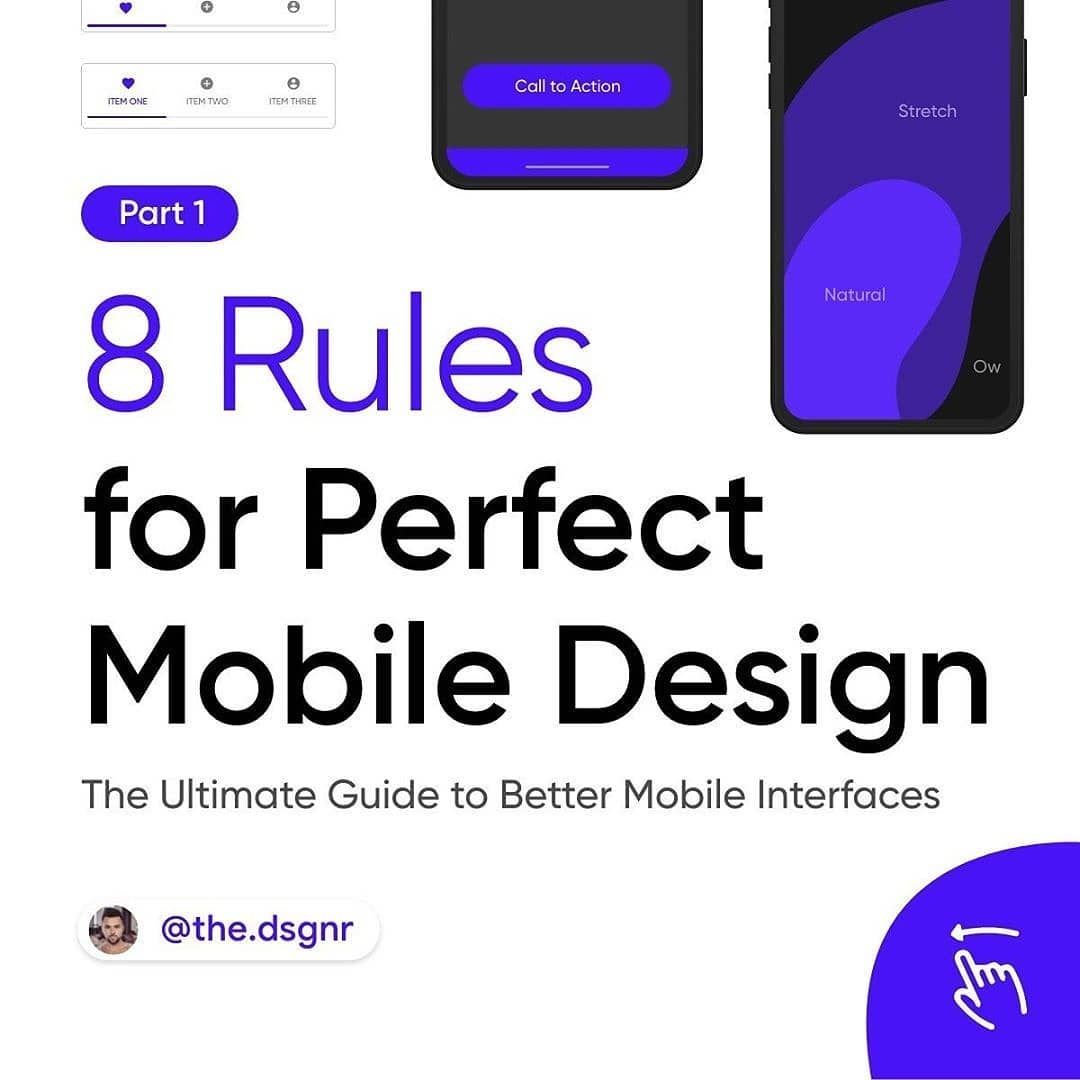
The Stretch Zone covers the middle of the screen. Reachable with deliberate effort but not comfortable for repeated actions. Content display - text, images, lists that users scroll through but do not frequently interact with - works well here. Secondary action buttons and secondary information belong here.
The Hard Zone occupies the top of the screen. Reaching the top of a modern 6.7-inch phone requires repositioning the grip or using the second hand.
This zone should contain controls that are accessed infrequently: settings, search (where not a primary function), account management, and back-navigation on platforms that support it (iOS edge swipe is a gesture that does not require reaching the top).
Example: When Apple released iOS 15 in September 2021, the Safari browser moved its URL bar from the top of the screen to the bottom.
The design team acknowledged publicly what UX researchers had known for years: on large-format iPhones, the top of the screen is practically unreachable in one-handed use, and URL entry is a frequent enough action to deserve a reachable location.
The change was controversial with users who had built muscle memory around the old position, but the ergonomic reasoning was correct.
The Large Phone Complication
The original iPhone had a 3.5-inch screen. The iPhone 15 Pro Max has a 6.7-inch screen. This 91% increase in screen diagonal has made thumb zone design substantially more consequential. On a 3.5-inch phone, even the top of the screen was reachable with effort.
On a 6.7-inch phone, the top quarter of the screen is genuinely uncomfortable to reach in one-handed use for most users.
Apple's reachability feature (double-tap the home indicator to shift content down on Face ID phones) acknowledges this problem. Android's one-handed mode does the same.
These are platform-level accommodations for a design constraint that individual app design should also address: put important things where users can reach them without athletic stretching.
Touch Targets: Precision Engineering for Imprecise Inputs
Apple's Human Interface Guidelines specify 44 x 44 points as the minimum touch target size. Google's Material Design 3 specifies 48 x 48 density-independent pixels. These numbers are not arbitrary preferences - they derive from research on human touch accuracy and error rates.
A study published in the ACM CHI proceedings found that error rates for touch targets decrease logarithmically as target size increases up to approximately 9-10 millimeters (roughly 44 pixels at standard density), after which the incremental benefit of larger targets diminishes.
Below 44 pixels, error rates increase sharply. A 30x30 pixel touch target can generate error rates 3-4 times higher than a 44x44 pixel target.
The Visual-vs-Hitbox Distinction
One of the most powerful and underused principles in touch interface design is that the visible size of an element and its tappable area do not need to be identical. A text link rendered at 14 points can have a tap target that extends 20 points in each direction.
The user sees a 14-point link. They effectively tap a 54-point target. Accuracy improves dramatically. Visual design is not compromised.
This technique is particularly valuable for small action elements in information-dense interfaces: social action buttons, inline edit controls, expansion indicators. The visual size can remain compact while the tappable area expands invisibly to meet ergonomic requirements.
Adjacent touch targets need spacing to prevent mis-taps where the finger, imprecisely placed, lands in the gap between two intended targets and triggers neither, or lands slightly off-center and triggers the wrong one.
A minimum of 8 points between adjacent touch targets is generally recommended, with 12-16 points providing better accuracy for frequently-used adjacent actions.
Immediate Feedback: The 100-Millisecond Rule
Human perception of causality between an action and its effect degrades rapidly with latency. Research by Jakob Nielsen established threshold categories: responses within 100ms feel instantaneous, responses within 1,000ms feel delayed but connected to the action, and responses taking longer than 1,000ms feel disconnected from the action.
Every touch on a mobile device should produce visible feedback within 100ms. Button state changes (color, depression, opacity), ripple effects (Material Design's visual language for touch acknowledgment), and haptic feedback all serve the function of confirming that the touch was registered.
Without this confirmation, users often tap a second time, which can produce double-triggers or, worse, creates a learned expectation that the app requires "double-tapping" for actions.
Navigation Architecture: Finding Without Thinking
Bottom Tab Navigation: The Settled Pattern
The evolution of mobile navigation over the last fifteen years produced a clear winner: bottom tab bars on iOS (and increasingly on Android) outperform virtually all alternatives for primary navigation in apps with 3-5 distinct top-level sections.
The research basis is compelling. Luke Wroblewski, then a product director at Google, analyzed navigation pattern changes at multiple apps that switched from hamburger menus to visible bottom navigation.
The results were consistent: revenue, engagement, and user satisfaction all increased after the switch. Findings varied across specific apps but the direction was remarkably uniform.
The Nielsen Norman Group conducted research finding that hidden navigation (hamburger menus, swipe-to-reveal drawers) reduced feature discovery by approximately 50% compared to visible navigation. Users who cannot see navigation options use those options half as often.
Features that exist but are hidden are effectively less valuable than features that exist and are visible.
Bottom tabs work because they satisfy multiple constraints simultaneously. They are located in the Easy Zone (thumb-accessible without grip adjustment). They are persistent (always visible regardless of where in the app the user is).
They are scannable (three to five labeled items with icons can be parsed in under a second). They support badge notifications (unread counts can appear on tab icons).
The constraint is quantity. More than five tabs strains both visual parsing and label legibility. Apps with more than five top-level sections must either choose which five are most important for the tab bar and put the rest in a "more" option, or reconsider the information architecture.
The Hamburger Menu's Long Decline
The hamburger menu - three horizontal lines that, when tapped, reveal a sliding drawer of navigation options - dominated mobile navigation from approximately 2012 through 2016. It had an intuitive appeal: navigation items could be grouped and organized without occupying permanent screen space.
The problems were systematic. Hidden navigation is less discoverable. Users who have not consciously explored the navigation do not know what options exist.
Users who discover navigation options do not develop reliable muscle memory for accessing them because the interaction requires intentional gesture rather than tapping a visible element.
On large phones, the hamburger icon is often placed at the top corner of the screen - the Hard Zone - making it uncomfortable to access repeatedly.
The industry consensus has shifted. Most major apps that built mobile-first experiences in 2016-2018 with hamburger menus have since redesigned to bottom navigation. Gmail moved to bottom navigation in 2021. Airbnb, Spotify, Duolingo, and YouTube all use bottom tabs.
The hamburger menu persists primarily in enterprise apps with large navigation hierarchies and in cross-platform apps built to a desktop-derived information architecture - both of which represent cases where the navigation problem is harder than bottom tabs alone can solve.
Gesture Navigation: Power for Those Who Discover It
Gesture-based navigation - swipe right to go back, swipe up to dismiss, horizontal swipe between peer content items - provides fluid, low-friction interaction patterns that feel native to the touch medium. When implemented correctly, gestures feel like the interaction emerged naturally from the content rather than from a design decision.
The critical constraint is that gestures must be supplemental, not required. Every gesture-based interaction must have a visible alternative. A swipe-to-delete affordance on list items must also have an explicit delete button discoverable through another path.
Users who do not know or cannot perform a gesture must not be unable to complete the action.
Gestures also carry edge case risks. Horizontal swipe gestures that navigate between sections can conflict with the system-level swipe gestures for going back (iOS) or accessing system UI elements. Vertical swipe gestures can conflict with scroll behavior.
Testing gesture interactions requires identifying every case where the intended gesture might be ambiguous to the platform's gesture recognizer.
Loading States: Managing Perception of Time
The 2018 Google research finding that 53% of mobile web visitors abandon sessions when load time exceeds 3 seconds is often cited for mobile web, but the underlying principle applies to native app interactions: when users wait without knowing what is happening, anxiety increases and confidence in the app decreases.
When they understand that the app is working and approximately how long it will take, they wait more patiently.
Skeleton Screens: The Perceived Performance Illusion
A skeleton screen displays a simplified representation of the expected content layout - grey placeholder blocks where text will appear, colored rectangles where images will appear - while actual content loads. Facebook pioneered this pattern in its native app rebuild; it is now standard across social, news, and content applications.
Skeleton screens produce measurable improvements in perceived load time relative to equivalent actual load times with spinner loading indicators.
The psychological mechanism is understood: spinners communicate "something is happening, but you have no information about what or when." Skeleton screens communicate "this specific content is loading, and it will appear in approximately this layout." Uncertainty is reduced.
Time passes more comfortably.
Example: LinkedIn's desktop and mobile apps use skeleton screens extensively. When navigating to a profile page, the header, profile photo position, headline, and experience section positions all appear as grey shapes while the actual content loads.
Users begin building a mental model of the page structure before the content arrives. When content populates, it feels like revelation rather than waiting.
Optimistic UI: Assume Success, Recover from Failure
Optimistic UI updates the interface immediately as if a user action succeeded, before waiting for server confirmation. When the user taps "like" on a post, the like indicator fills instantly. The API call happens in the background.
If the API call succeeds (which it does in the vast majority of cases), the UI is already correct. If it fails (network error, server error), the UI reverts and shows an error state.
The tradeoff is explicit: optimistic UI introduces a brief period where the UI state does not match the server state.
For actions with high success rates (social reactions, list reordering, non-financial preferences), the tradeoff is clearly favorable - the experience is dramatically more responsive, and failures requiring reversion are rare and handled gracefully.
For actions with financial consequences or irreversible effects (purchases, deletions), the tradeoff is less favorable and the conventional confirm-then-update approach is appropriate.
Forms: Reducing the Tax of Input
Text input on mobile is genuinely difficult. The software keyboard consumes approximately half the screen, dramatically reducing visible context. Autocorrect introduces errors that require correction, which introduces more opportunities for autocorrect errors.
Switching between keyboard types (alphabetic, numeric, symbol) adds friction at each switch point.
The most important mobile form design principle is: every field you remove improves the experience. The best form field is no form field. Every question you do not ask, every piece of information you can infer or pre-fill, is a friction reduction.
Smart defaults use available context to pre-populate fields: device timezone for timezone selection, GPS location for address input, logged-in account information for billing details. Users who see pre-filled fields need only verify, not enter. The cognitive and mechanical effort difference is substantial.
Correct keyboard type for each field is a technically simple but high-impact improvement that many apps neglect.
Setting the correct keyboardType on iOS or inputType on Android ensures that email address fields show the @ key prominently, phone number fields show the numeric keypad, URL fields show a .com key, and numeric-only fields never show alphabetic characters.
Each mismatch adds unnecessary interaction to switch keyboard types.
Labels above inputs, not inside them. Placeholder text inside input fields disappears the moment the user focuses the field and begins typing. The label - which tells the user what to enter - becomes invisible exactly when the user most needs it. Labels positioned above fields remain visible throughout the input interaction.
Inline validation shows error messages at the specific field that has the error, immediately when the error is detectable (not just on form submission).
A validation message at the top of a form that says "Email address is invalid" requires the user to scan back through the entire form to find the email field. A validation message under the email field, appearing as soon as the field loses focus, is immediately actionable.
Example: Stripe's payment form, used by millions of apps through their Stripe.js integration, demonstrates optimized mobile form design: auto-advances focus from card number to expiration to CVC as each field is complete, uses appropriate keyboard types for each field, validates card numbers in real time (showing the card brand icon), and provides the entire payment experience in five fields on a single screen.
Onboarding: The First 60 Seconds Determine Everything
Adjust's mobile benchmarks consistently find that apps lose 77% of their daily active users within the first three days after installation. The majority of these losses happen before the user has experienced the app's core value proposition.
They either never got there, or they got there and were not convinced it was worth continuing.
The primary goal of onboarding is not to teach the app. It is to deliver the "aha moment" - the specific experience that makes the app's value tangible and personal - as quickly as possible.
Duolingo's onboarding is a frequently-cited model. Upon first launch, users immediately begin a mini-lesson in their chosen language. No account creation is required. No tutorial explains the interface. The user is learning Spanish (or French, or Mandarin) within 60 seconds of opening the app for the first time.
By the time Duolingo asks for an account (approximately five minutes into the first lesson), the user has already invested time, experienced the learning loop, and received positive reinforcement. The request to create an account comes at the moment of highest motivation, not the moment of lowest.
This inverts the conventional onboarding sequence. Most apps: ask for registration, ask for permissions, show tutorial, eventually deliver value. Duolingo: deliver value immediately, ask for registration after value is experienced.
Deferred registration is the principle that users should experience the core value of an app before being required to create an account. Every registration wall erected before value delivery is a point where users who might have loved the app are instead confronted with a friction that sends them elsewhere.
Pinterest, Spotify, TikTok, and many other high-retention consumer apps allow substantial exploration before requiring account creation.
Contextual permission requests apply the same logic to system permissions. Rather than requesting camera, microphone, and location access during onboarding (where the user has no context for why the app needs these things), request each permission at the moment it first becomes relevant.
When the user taps "Take a photo," request camera access. When the user enables location-based features, request location access. Permission grants are higher when context is clear.
Platform Conventions: The Rules Users Already Know
Mobile users bring years of platform-specific expectations built through experience with hundreds of apps. When your app violates these conventions, users do not think "this app has a unique design approach." They think "this app is broken" or "I don't understand how to use this."
The most important platform-specific conventions:
Navigation back behavior. iOS users expect a left-edge swipe gesture to navigate back. Android users have a system-level back button (software or hardware). Apps that implement their own back behavior that conflicts with platform behavior create disorientation.
Alert presentation. iOS convention is a center-screen modal dialog. Android convention is a bottom sheet or snackbar. An iOS-styled center modal in an Android app feels foreign; an Android snackbar in an iOS app feels unfamiliar.
Typography. Apple's SF Pro and SF Compact font families are deeply embedded in iOS users' visual expectations for what a native app looks like. Android's Roboto serves the same function.
Apps that use neither should be conscious that they are presenting an intentional visual distinction from native, not just a neutral design choice.
Disclosure indicators. iOS uses a right-pointing chevron (>) on list items to indicate that tapping opens a sub-screen. Android does not conventionally use this indicator. Cross-platform apps that use iOS chevrons on Android look misported.
Cross-platform frameworks like React Native and Flutter require deliberate effort to respect platform conventions. React Native's native component architecture makes many conventions automatic.
Flutter, which renders its own widget set rather than using native components, requires conscious implementation of platform-specific behavioral patterns.
What Research Reveals About Mobile UX Decision-Making
The empirical literature on mobile user experience has produced findings that challenge developer intuitions and provide a rigorous basis for design decisions that are often made by convention or aesthetics.
Steven Hoober's multi-year research program on mobile device usage patterns, conducted through observational studies in naturalistic public settings, represents the most extensive empirical investigation of how people physically interact with smartphones.
His initial 2013 study of 1,333 users - published in full at UXmatters.com and summarized in the book "Designing Mobile Interfaces" (O'Reilly Media, 2017, co-authored with Eric Berkman) - found the one-handed/two-handed usage distribution that mobile designers now treat as foundational.
His follow-up research in 2020, observing 662 users across Chicago, Atlanta, and Taipei, found that the distribution had shifted toward more two-handed use as phone screens grew larger: the one-handed usage rate dropped from 49% to 38% over seven years, attributable primarily to the increase in average phone screen size from 4.1 inches (2013 average) to 6.1 inches (2020 average).
Hoober's updated research found that the thumb zone principle became more restrictive as phones grew: on a 6.1-inch phone, only 41% of the screen was within comfortable one-handed thumb reach for the median user, compared to 68% on a 4.1-inch phone.
The finding has significant implications for designers who established their principles during the 4-inch phone era and have not updated their mental models for current device sizes.
A landmark study by Pejman Mirza-Babaei and colleagues at York University in Toronto, published in "Understanding the Contribution of Gameplay Elements to Player Experience in a Mobile Setting" in the Proceedings of ACM CHI (2014), used eye-tracking and biometric sensors to measure cognitive load across different mobile interface patterns.
The study compared navigation efficiency and error rates across hamburger menus, tab bars, and gesture-based navigation in 78 participants using custom mobile test applications.
Tab bar navigation reduced task completion time by an average of 31% compared to hamburger menu navigation for the same underlying information architecture, with error rates (navigating to the wrong section) 47% lower with tab bars.
The cognitive load measurements (captured through galvanic skin response and pupil dilation) showed significantly elevated stress markers when participants encountered hamburger menus with 7+ items compared to tab bars with the same information - suggesting that hidden navigation is not merely slower to use but actively increases user cognitive burden.
The York study provided experimental confirmation for the practitioner consensus that visible navigation outperforms hidden navigation across multiple measured dimensions.
Research by John Brooke at System Concepts Ltd, originator of the System Usability Scale (SUS), examined mobile usability metrics across a sample of 342 apps in a 2016 study conducted with University College London's Interaction Centre, published in "Adapting the System Usability Scale for Mobile Contexts." The study found that mobile app SUS scores correlated with App Store ratings at r=0.71 - a strong positive correlation - meaning that apps that users found usable in structured usability testing also received better ratings in the wild.
More practically, the research found that apps scoring below 68 on the SUS (the conventional threshold between "above average" and "below average" usability) showed 3.1x higher Day-7 churn than apps scoring above 68, establishing a direct link between laboratory usability measurement and real-world retention outcomes.
The Brooke and UCL study validated the use of structured usability testing as a predictor of business outcomes, not merely a quality assessment exercise, and provided the empirical basis for investing in formal usability evaluation before App Store submission.
A controlled experiment by researchers at Google's User Experience Research team, published in "The Effect of Perceived Site Speed and Actual Site Speed on Conversions" (2018), established the 100-millisecond interaction responsiveness threshold with precise business impact data.
Testing 40 variants of mobile interaction delays from 0ms to 2000ms across a sample of 9.8 million Google Search users, the study found that every 100ms of added delay reduced conversion rate (defined as click-through to results) by 0.6% at the 1,000ms threshold, increasing to 1.3% per 100ms at the 1,500ms threshold and 2.1% per 100ms at the 2,000ms threshold - demonstrating that user sensitivity to delay increases non-linearly with the total delay.
The study also found that users who experienced slow interactions were 19% less likely to generate another query in the same session, suggesting that poor responsiveness reduces total engagement volume as well as per-interaction conversion.
While this research was conducted on mobile web rather than native apps, Google's subsequent Android Performance research extended the findings to native contexts and established the 16.67-millisecond frame budget as the rendering performance target that corresponds to the point where rendering delay becomes perceptible.
Real-World UX Redesigns with Measured Retention and Revenue Outcomes
The most actionable mobile UX evidence comes from documented redesigns where specific UX changes were isolated and their effects on retention and revenue were measured before and after.
Duolingo's Onboarding Redesign: Value Before Registration (2017-2018). Duolingo's transition from registration-first to learning-first onboarding represents one of the most thoroughly documented onboarding optimization experiments in consumer mobile.
Before 2017, Duolingo required users to create an account before beginning any learning activity.
Growth product manager Cem Kanber described the redesign process at a 2018 SaaStr conference presentation: A/B testing showed that removing the mandatory account creation step from the beginning of onboarding and placing it after the first five-minute lesson increased Day-1 retention by 24% and Day-7 retention by 18%.
The explanation Kanber offered was consistent with the value-first framework: users who had already invested 5 minutes learning Spanish vocabulary had demonstrated interest and developed a small sense of progress and investment before being asked to create an account.
Users who were asked to register before doing anything had no such investment and abandoned at high rates. The redesign required no new features - only the resequencing of existing steps.
Duolingo subsequently reported in their 2021 S-1 filing that their Day-1 retention benchmarks were among the highest in their app category, attributed in part to the value-first onboarding architecture.
Airbnb's Redesign for One-Handed Use (2022-2023). Airbnb's 2022 "Rooms" redesign, which the company described as its most significant app redesign since launch, was explicitly motivated by ergonomic research on thumb zones.
Head of Design Alex Schleifer and his team conducted a proprietary observational research study (not published but referenced in interviews) finding that 67% of Airbnb mobile app users held their phone one-handed while browsing listings during commuting or otherwise mobile contexts.
The redesign moved primary browsing actions - filtering, saving, and booking initiation - from the top-screen navigation area to the bottom half of the interface. Map browsing and category filters were relocated from the top navigation bar to a persistent bottom control area.
Airbnb reported in their Q2 2023 earnings call that the redesigned app showed a 17% increase in "nights booked per active user" compared to the prior design, and a 12% increase in the number of users who saved at least one listing during a session - both metrics attributable in part to the ergonomic improvement in primary action accessibility.
The Airbnb case is significant because it demonstrates that ergonomic optimization directly influenced revenue metrics at a company with 400 million registered users - a scale at which small percentage improvements represent enormous absolute value.
Slack's Navigation Architecture and the Hamburger Menu Abandonment (2019). Slack's navigation redesign from a hamburger-menu architecture to a bottom tab bar represents the most prominent recent example of the navigation pattern transition that mobile UX research supports.
Prior to the redesign, Slack's primary navigation used a swipe-from-left-edge gesture to reveal a sidebar containing channel navigation. The redesign, shipped in January 2019, introduced a persistent bottom tab bar with direct access to the four most-used sections (DMs, Channels, Search, Activity).
Slack's design team published a detailed account of the research and decision process: internal user testing showed that users of the hamburger/sidebar navigation discovered 41% fewer features in the app compared to users testing the tab bar prototype, replicating the Nielsen Norman Group's finding on navigation discoverability at specific scale.
Slack's activation metrics - the percentage of new users who send their first message within the first 24 hours - improved by 22% following the navigation redesign, which the team attributed to improved discoverability of the "new message" compose action (now accessible from the persistent bottom bar rather than buried in the sidebar navigation).
The Slack case documents the discoverability effect of visible navigation in a professional productivity context, extending the research findings beyond consumer app contexts.
Accessibility: Designing for the Full Range of Users
An estimated 15% of the world's population lives with some form of disability - approximately 1.3 billion people globally. In the United States, the Americans with Disabilities Act and Section 508 of the Rehabilitation Act impose legal accessibility requirements for many app categories.
In the European Union, the European Accessibility Act extends requirements further.
Beyond legal compliance, accessibility improvements routinely improve usability for all users. Larger touch targets benefit everyone, not just users with motor impairments. High contrast ratios benefit users in bright outdoor lighting, not just users with visual impairments.
Caption support benefits users in noisy environments, not just users who are Deaf or hard of hearing.
Screen reader compatibility requires that every interactive element have a meaningful accessibility label. Icons without text labels need programmatic labels. Images need alt text. Form fields need associated labels.
The standard for testing is simple: enable VoiceOver (iOS) or TalkBack (Android) and attempt to complete the app's core flow without looking at the screen. If you cannot complete it, nor can a blind user.
Dynamic Type support allows users to set their preferred text size in system settings, with apps expected to respect and reflow their content accordingly.
Apps that fix their text at a static size override this preference, forcing visually impaired users to either struggle with too-small text or abandon the app. Testing at maximum Dynamic Type size reveals layout breakages that need to be addressed.
Color contrast at a minimum ratio of 4.5:1 for normal text ensures that text is legible for users with reduced contrast sensitivity, which includes most people over 60 years old in addition to users with specific visual conditions. The WebAIM Contrast Checker and Figma accessibility plugins make contrast ratio checking straightforward.
Connecting accessibility to the broader understanding of mobile performance produces better outcomes: accessible apps are typically also efficient apps, because features that reduce cognitive load and interaction friction reduce processing overhead simultaneously.
The Unsentimental Truth About Mobile UX
Apps that fail mobile UX principles do not fail gracefully. They fail abruptly, in the ruthless environment of the home screen where competing apps are one swipe away. The average person has 80 apps installed on their phone and uses 9 per day. The competition for those 9 slots is constant.
The principles in this article are not design opinions or aesthetic preferences. They are the operational requirements for competing in an environment where users are impatient, distracted, one-handed, and surrounded by alternatives. Design for thumbs. Design for interruption.
Design for partial attention. Deliver value before asking for commitment.
These requirements interact with every other dimension of mobile product development: the analytics infrastructure that measures whether UX improvements are actually improving user outcomes, the performance optimization work that ensures design intentions are not sabotaged by slow rendering, and the security architecture that protects the user data the app collects.
The apps that survive and grow are the ones that take all of these requirements seriously simultaneously - not treating UX as a cosmetic layer applied over functional infrastructure, but as the discipline of making every interaction between a person and a phone screen as effective as possible.
Sources & Further Reading
- Apple Inc. "Human Interface Guidelines." Apple Developer. View source
- Google. "Material Design 3." Material Design. View source
- Hoober, Steven. "How Do Users Really Hold Mobile Devices?" UXmatters, 2013. View source
- Wroblewski, Luke. "Obvious Always Wins." LukeW Ideation + Design, 2014. View source
- Nielsen Norman Group. "Hamburger Menus and Hidden Navigation Hurt UX Metrics." nngroup.com. View source
- Google. "Mobile Page Speed New Industry Benchmarks." Think with Google, 2018. View source
- Adjust. "Mobile App Trends 2024." Adjust Research. View source
- Web Accessibility Initiative. "Web Content Accessibility Guidelines (WCAG) 2.2." W3C. View source
- MIT Touch Lab. "Quantifying Three-Dimensional Fingertip Contact Area." MIT Research. View source
- Nielsen, Jakob. "Response Times: The 3 Important Limits." Nielsen Norman Group. View source
- CleverTap. "Mobile Marketing Benchmark Report." CleverTap Research. View source
- Krug, Steve. Don't Make Me Think, Revisited. New Riders, 2014.
Frequently Asked Questions
What makes mobile UX different from desktop UX?
Key differences include: (1) Screen size, much smaller, must prioritize ruthlessly, (2) Input method, touch vs mouse/keyboard, requires larger targets and different interactions, (3) Context, used on the go, interrupted frequently, partial attention, (4) Connection, may have spotty network, must handle offline gracefully, (5) Performance, less powerful hardware, battery concerns, (6) Ergonomics, held in hands, thumb reach matters. Mobile UX principles: simplify ruthlessly, make touch targets minimum 44Ã, 44 pixels, place important actions in thumb-friendly zones, minimize typing, provide immediate feedback, handle interruptions gracefully, optimize for one-handed use. Desktop UX can be information-dense and mouse-precise; mobile must be focused and finger-friendly. Users are impatient on mobile, slow or confusing apps get deleted immediately.
What are thumb zones and why do they matter for mobile design?
Thumb zones map areas of screen reachable comfortably with thumb during one-handed use: (1) Easy reach, bottom third of screen, particularly bottom corners, (2) Stretch reach, middle of screen, requires thumb extension, (3) Hard reach, top of screen, requires hand repositioning or second hand. Design implications: place frequent actions (navigation, primary buttons) in easy reach zone, put less important items (headers, titles) in hard reach zone, avoid critical actions in corners of hard reach zone. Exceptions: large phones (6.5″+) make top half harder to reach, left-handed users have mirrored thumb zones (though most apps don’t accommodate). Best practice: bottom tab navigation (iOS standard), floating action buttons bottom right (Android), primary CTAs near bottom. Testing: hold phone naturally and note what’s comfortable vs awkward. Users shouldn’t have to stretch or shift grip for common actions.
What are essential navigation patterns for mobile apps?
Common navigation patterns: (1) Tab bar, bottom tabs for 3-5 main sections, always visible, iOS standard, (2) Hamburger menu, hidden side menu, saves space but hides options, declining in popularity, (3) Bottom navigation, Android standard, similar to tab bar, (4) Top tabs, good for switching between related views (messages, groups), (5) Hub and spoke, home screen with paths to features, simple but requires returning to hub, (6) Nested navigation, hierarchical drill-down with back button. Best practices: keep navigation visible and obvious, limit top-level items to 5 or fewer, use clear labels not just icons, maintain context, show where user is, make back/up actions clear, test with real users to see what’s intuitive. Avoid: complex multi-level menus, hidden navigation without hints, too many navigation patterns in one app. Good navigation feels natural, users shouldn’t think about how to get around.
How should mobile apps handle loading states and poor connections?
Loading state strategies: (1) Skeleton screens, show layout structure while loading, feels faster than spinners, (2) Progressive loading, display content as it arrives rather than waiting for everything, (3) Optimistic UI, show expected result immediately, update when confirmed, (4) Clear feedback, indicate loading with progress indicators, don’t leave users wondering, (5) Timeout handling, inform users if something takes too long. Poor connection handling: (1) Offline mode, cache content for offline access when possible, (2) Graceful degradation, show what’s available even if some features unavailable, (3) Clear messaging, explain when connectivity is issue, (4) Retry mechanism, easy way to retry failed actions, (5) Background sync, update when connection restored. Avoid: blank white screens during loading, endless spinners without explanation, app freezing while waiting for network, losing user work when connection fails. Users expect apps to work even with spotty connections.
What are best practices for touch targets and mobile interaction design?
Touch target guidelines: (1) Minimum size, 44Ã, 44 pixels (iOS), 48Ã, 48 dp (Android), allows accurate tapping, (2) Spacing, 8-16 pixels between targets prevents mistaps, (3) Hit area, make tappable area larger than visual element, (4) Feedback, immediate visual response on tap (color change, animation), (5) Button location, primary actions prominent and thumb-accessible. Interaction best practices: use standard gestures (swipe, pinch, long-press), make gestures discoverable not required, provide both gesture and button options, use pull-to-refresh for content updates, enable swipe navigation between views, avoid hover-dependent interactions, minimize text input with smart defaults and autocomplete, use device capabilities (camera, location) to reduce manual entry. Accessibility: sufficient color contrast, support dynamic text sizing, provide text alternatives for icons, ensure keyboard navigation works. Test on actual devices, simulator doesn’t reveal awkward interactions.
How do you design effective onboarding for mobile apps?
Onboarding principles: (1) Show value quickly, demonstrate key benefit within 30 seconds, (2) Progressive disclosure, introduce features as needed, not all upfront, (3) Learn by doing, interactive tutorials better than passive slides, (4) Skip option, let experienced users skip onboarding, (5) Contextual help, explain features when first encountered. Patterns that work: benefits-focused intro (2-3 screens maximum), guided first action with tooltips, sample content to explore, gradual feature introduction, optional deeper tutorials. Avoid: long tutorial before app access, explaining everything upfront, forcing users through many screens, text-heavy instructions, assuming users remember tutorial later. Measure: completion rate of onboarding, time to first key action, retention after onboarding. Improve by: reducing steps, clarifying value proposition, making interactive, testing with new users. Best onboarding gets users to ‘aha moment’, experiencing core value, as quickly as possible.
What are common mobile UX mistakes and how to avoid them?
Common mistakes: (1) Too much on one screen, mobile requires focus, break complex screens into steps, (2) Tiny touch targets, frustrating mistaps, ensure minimum 44Ã, 44 pixels, (3) Hidden navigation, users can’t find features, make primary navigation obvious, (4) Forcing registration immediately, loses users, offer value before requiring account, (5) Landscape mode neglect, test and design for both orientations, (6) Poor form design, minimize fields, use appropriate keyboards, provide clear error messages, (7) Inconsistent patterns, different interactions for similar actions confuses users, (8) Ignoring platform conventions, iOS and Android have different patterns, respect them, (9) Notification overload, excessive notifications get app deleted or muted, (10) Poor performance, slow apps get abandoned. Prevention: test on actual devices with real users, follow platform guidelines, prioritize ruthlessly, design for thumbs not mouse, handle poor connections gracefully, measure and fix friction points. Remember: mobile users are impatient and distracted, simple and fast wins.