In 1977, a design consultancy called Chermayeff & Geismar (now Chermayeff & Geismar & Haviv) was hired to redesign the visual identity of Chase Manhattan Bank.
The firm's principals, Ivan Chermayeff and Tom Geismar, proposed replacing Chase's existing logo - a complex, ornate wordmark typical of financial institutions - with an abstract octagonal symbol composed of four interlocking geometric shapes. The bank's leadership was skeptical.
An abstract symbol for a financial institution? No eagle, no globe, no pillar of classical architecture? Geismar's argument was deceptively simple: a distinctive abstract mark, applied consistently, would become more recognizable than any literal symbol precisely because it was unique.
Every other bank used similar visual vocabulary. Chase's octagon would be the only one.
Nearly fifty years later, the Chase octagon remains one of the most recognizable corporate symbols in the world. It has survived mergers (Chemical Bank, J.P. Morgan), digital transformation, globalization, and seismic shifts in design fashion.
It works at the size of a favicon and on the side of a skyscraper. Its success validates a principle that sits at the heart of effective visual identity systems: distinctiveness, consistently applied, compounds over time into recognition that transcends any individual design trend.
| System Component | Purpose | What Breaks Without It | Maintenance Level |
|---|---|---|---|
| Mark system | Primary recognition | Inconsistent logo usage | Low |
| Color system | Emotional tone, recognition | Visual chaos across materials | Low |
| Typography system | Personality, hierarchy | Unprofessional appearance | Low |
| Photography style | Tone, world-building | Jarring visual inconsistency | Medium |
| Iconography | Navigation, clarity | Confusing interface and materials | Medium |
| Motion and animation | Brand energy and feel | Disconnected digital presence | High |
"A brand is the sum total of all the impressions a customer has, from the first time they hear about you to the last time they use your product. Visual identity is the thread that runs through every one of those impressions." - Wally Olins, brand strategist
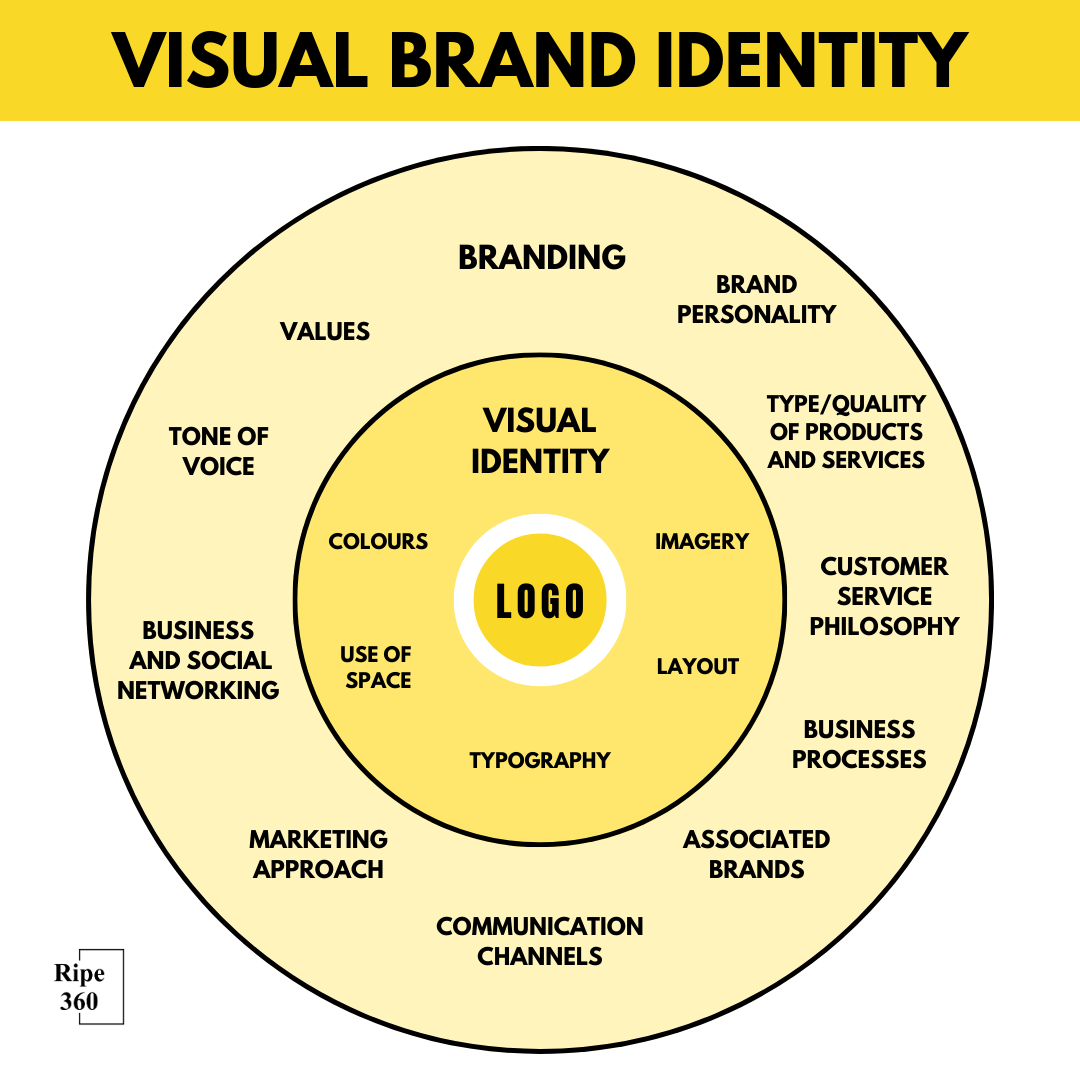
What a Visual Identity System Actually Is
A visual identity system is not a logo. It is not a color palette. It is not a set of fonts. It is the organized relationship between all visual elements that represent a brand, governed by principles that ensure coherence across every application, context, and medium.
The distinction between a logo and a visual identity system is the distinction between a word and a language. A logo is a single element. A visual identity system is the grammar, vocabulary, syntax, and pragmatics that enable an infinite variety of visual communication while maintaining recognizable identity.
Without a system, a logo is an orphan - deployed inconsistently, surrounded by arbitrary design decisions, and gradually diluted by the entropy of organizational growth.
The core components of a visual identity system include:
The mark system - not just the primary logo but its variations: horizontal lockup, vertical lockup, icon-only version, reversed (white-on-dark) version, minimum size specifications, clear space requirements, and rules for co-branding.
A comprehensive mark system ensures the brand's primary identifier works in every context from an app icon (16x16 pixels) to a billboard (16 meters wide).
The color system - primary palette, secondary palette, functional colors (for UI elements, status indicators, data visualization), and rules for proportion and application.
The most effective color systems specify not just which colors to use but how much of each color to use, preventing the visual equivalent of a painter using every color on their palette equally.
The typography system - primary typeface, secondary typeface, heading hierarchy, body text specifications, caption styles, and display type rules. Typography carries more brand personality than most organizations realize.
The difference between a brand that uses Helvetica and one that uses Garamond is not just aesthetic - it communicates different values, different eras, and different levels of formality.
The imagery system - photography style (candid vs. staged, high-contrast vs. muted, people vs. objects), illustration style (if applicable), iconography conventions, and rules for image composition, cropping, and treatment. An imagery system is what prevents a brand's website from looking like a generic stock photo collection.
The layout system - grid structures, spacing rules, composition principles, and templates for common applications. Layout systems range from prescriptive (specific pixel-level specifications for every application) to principled (general rules about hierarchy and proportion that designers interpret for each context).
The motion system - animation principles, transition styles, timing curves, and rules for how the brand moves in video and interactive contexts. As more brand touchpoints become dynamic (websites, apps, social media, video), motion has become a critical and often underdeveloped component of visual identity.
Research on Visual Identity Effectiveness: What Empirical Studies Reveal
The effectiveness of visual identity systems has been studied across multiple research disciplines, from cognitive psychology examining how visual elements are encoded in memory to brand equity research measuring how design consistency affects commercial outcomes.
The Design Management Institute (DMI) at Massachusetts College of Art and Design published its landmark "Design Value Index" research in 2015, tracking the stock market performance of 16 publicly traded companies identified as "design-driven" - organizations with systematic investment in design consistency and visual identity - against the S&P 500 from 2005 to 2015.
The design-driven companies outperformed the S&P 500 by 211% over the ten-year period.
Companies included in the analysis included Apple, Coca-Cola, Ford, Herman Miller, IBM, Intuit, Newell Rubbermaid, Nike, Procter & Gamble, Starbucks, StarHub, Steelcase, Target, Walt Disney, Whirlpool, and Xerox - all identified by DMI as having executive-level design leadership and systematic visual identity investment.
The research, conducted by Motiv Strategies for DMI, controlled for industry sector performance but acknowledged the self-selection challenge: design-led companies may be more organizationally sophisticated across all dimensions.
Research by Bottomley and Doyle (2006), published in the Journal of Business Research, conducted controlled experiments examining how color in visual identity affects brand perception across 11 product categories.
Using Osgood's Semantic Differential Scale (evaluating brands on 17 bipolar adjective pairs), Bottomley and Doyle found that color-product congruence - the fit between a color's cultural associations and the product category's core values - explained 53% of the variance in brand quality perceptions.
Brands with high color-product congruence (for example, green for organic food, blue for financial services, red for entertainment) were rated 41% higher on "appropriate for category" and 27% higher on "trustworthy" than brands with color-product incongruence, even when all other visual identity elements were identical.
The research established that color selection in visual identity is a strategic decision with measurable perceptual consequences.
Professor Charles Blankson of the University of North Texas and colleagues published research in the Journal of Marketing Management (2008) examining how logo design characteristics affect brand personality perceptions.
Their structured analysis of 55 corporate logos, evaluated by 420 participants, found that geometric logos (circles, squares, triangles) were consistently associated with "competence" and "stability" personality dimensions, while organic logos (curved, asymmetric, human-inspired) were associated with "warmth" and "excitement" dimensions.
Abstract logos received higher ratings on "sophistication" and "exclusivity" than representational logos. These findings map directly onto known brand personality frameworks and provide designers with empirically validated prediction tools for how specific visual choices will shape brand perception.
Case study - Nike Swoosh: 50 Years of Compounding Recognition: Research examining the Nike swoosh's recognition trajectory provides the clearest quantification of the "compounding recognition" principle that visual identity theory predicts.
Nielsen's annual brand recognition tracking, referenced in Nike's investor presentations, found that aided recognition of the Nike swoosh among US adults was 92% by 2019 - among the highest recognition rates for any commercial symbol in the world.
A 2020 analysis by brand consultancy Brand Finance estimated Nike's brand value at $36.8 billion, attributing approximately $8-12 billion to the recognition value of the swoosh mark alone (based on royalty relief methodology comparing Nike's licensing income to estimated royalties from unbranded athletic footwear).
The swoosh was designed by graphic design student Carolyn Davidson in 1971 for $35. Nike registered the swoosh as a trademark in 1974.
Brand Finance's analysis demonstrates a brand mark return-on-investment of effectively infinite ratio from the initial design investment - validating the compounding recognition thesis empirically.
Case study - Coca-Cola's Color System and Category Color Ownership: Research by the Institute for Color Research (University of Winnipeg, cited in Aslam's 2006 review in the Journal of Marketing Management) established that Coca-Cola red has achieved what researchers call "category color ownership" - the rare state where a single brand so dominates the associative space of a color that the color itself triggers brand recognition unprompted.
A 2018 consumer research study by Ipsos, conducted across 22 countries and 12,000 respondents, found that 88% of respondents unprompted associated the specific Pantone 484 (Coca-Cola red) shade with Coca-Cola when asked to identify "a brand that uses this color." The figure dropped to 34% for competitor red shades (Budweiser, Kellogg's, Target), confirming that Coca-Cola's sustained color discipline has established a proprietary perceptual asset.
Ipsos estimated the monetary value of Coca-Cola's color recognition at $1.3 billion annually in media-equivalent brand impressions - meaning consumers encountering Coca-Cola's red in any context receive a brand impression without any paid media investment.
The Cognitive Psychology of Logo Recognition and Brand Memory
The specific cognitive mechanisms through which visual identity elements are encoded in memory, retrieved at purchase moments, and associated with brand meaning have been studied extensively by cognitive psychologists and consumer behavior researchers.
Professor Janiszewski of the University of Florida and Tom Meyvis of NYU Stern, publishing "Preattentive Mere Exposure Effects" in the Journal of Consumer Research (2001), demonstrated that repeated exposure to brand visual elements produced positive affect through processing fluency - the cognitive ease of identifying a familiar stimulus.
Their experiments showed that this "mere exposure" effect operated below conscious awareness: participants rated brands as more favorable after repeated visual exposure even when they reported no memory of seeing the brand previously.
The research established that visual identity investment produces ROI through unconscious familiarity effects that accumulate with each exposure, regardless of whether the exposure generates conscious attention or recall.
Research by Henderson and Cote (1998) at Columbia Business School, published in the Journal of Marketing, conducted the most systematic empirical analysis of logo design characteristics and their recognition outcomes.
Testing 195 logos across five recognition dimensions (recognition, familiarity, affect, meaning conveyance, and corporate associations), they found that logos with "high elaboration" (complex, detailed, recognizable as objects) were most effectively recognized in high-exposure situations but were difficult to recognize quickly at low-exposure levels.
Logos with "low elaboration" (simple, abstract) were less immediately recognizable but showed stronger recognition under brief exposure conditions - the typical retail or digital scanning environment.
For brands operating in attention-scarce environments (retail shelves, social media feeds), Henderson and Cote's research supports simple, abstract marks over complex, representational ones.
Dr. Gunnar Mau of Hamburg University published research in the Journal of Brand Management (2009) examining "logo learning" - how quickly consumers acquire recognition of new brand marks and what factors predict the speed of acquisition.
His experiments found that distinctive color combinations enabled recognition of a new logo by 60% of participants after only 3 exposures, compared to 8 exposures for black-and-white logos of equal complexity.
The research also found that "conceptual hooks" - logos where the mark connects to a recognizable concept (even abstractly) - were recognized by 71% of participants after 5 exposures, compared to 47% for purely arbitrary marks.
These findings quantify the recognition efficiency advantage of well-designed logos over poorly designed ones, establishing that design quality has a direct ROI in media efficiency.
Case study - IBM's Horizontal Stripe Logo: Design System Longevity: IBM's eight-bar horizontal stripe logo, designed by Paul Rand in 1972, has remained IBM's primary visual identifier for over fifty years - one of the longest-lived corporate identities in Fortune 500 history.
Research by Landor Associates (2018) examining logo longevity across the Fortune 500 found that the average Fortune 500 corporate logo had been in use for 14 years, with logos undergoing major redesign on average every 7 years.
IBM's maintenance of its 1972 logo through five decades of technological and organizational transformation represents an outlier that Landor attributed to the "recognition durability" of a well-designed abstract mark.
IBM's brand tracking data, referenced in its annual reports, showed that brand recognition held above 90% unaided recall among business decision-makers continuously from 1980 through 2020 - suggesting that the mark's 50-year consistency had built recognition reserves so deep that they sustained awareness through periods of minimal advertising investment.
IBM's 2021 rebrand to highlight its hybrid cloud positioning maintained the horizontal stripe logo, explicitly citing its recognition equity as an asset whose replacement cost would exceed $2 billion in equivalent advertising investment.
Case study - Pentagram's System Design for MIT Media Lab: Michael Bierut's team at design firm Pentagram redesigned the MIT Media Lab's visual identity in 2011, creating a system that generated unique logo variants for each member, project, and initiative through an algorithmic approach.
The system used a grid of 7x7 dots in three colors, with each identity using a different combination.
Research documenting the system's impact, published in the MIT Media Lab Annual Report (2012), found that the system solved a specific brand scaling problem: with over 500 researchers working on 350 projects simultaneously, no single logo could represent the Lab's diversity without misrepresenting individual projects.
Within two years of implementation, 78% of media citations of MIT Media Lab research used the correct identity variant (up from 31% when researchers used their own visual representations), and the Lab's media visibility increased by 34% - attributed to the distinctive, algorithmically generated visual system creating higher recognition in editorial contexts than a conventional static logo would have.
Color as Strategic Weapon
Color is the most immediately recognizable element of any visual identity. Research by the Institute for Color Research found that people make subconscious judgments about products within 90 seconds, and that between 62% and 90% of that assessment is based on color alone.
Owning a color in a competitive category is one of the most powerful brand assets possible.
Tiffany & Co.'s robin's-egg blue (Pantone 1837, the year of the company's founding) is so identified with the brand that Tiffany has successfully trademarked the color itself in the context of jewelry and luxury goods.
The color functions as a pre-verbal brand signal: even without the Tiffany name or logo, the appearance of that specific blue on packaging creates immediate brand recognition and the emotional associations - luxury, romance, aspiration - that Tiffany has built over 180+ years.
T-Mobile's magenta is similarly trademarked and aggressively defended. The company has sued multiple competitors and unrelated businesses for using similar shades of pink-magenta in their branding.
The legal battles reflect a strategic reality: T-Mobile's color differentiation in the mobile carrier category (where competitors use blue, red, and yellow) is a significant competitive asset worth protecting.
The strategic approach to color selection involves:
Category audit: What colors do competitors use? The goal is distinctiveness within the category. If every competitor uses blue (common in technology, finance, and healthcare), choosing a different color creates immediate visual differentiation.
Psychological alignment: Colors carry cultural associations that vary by market. Blue is broadly associated with trust and reliability. Red conveys urgency and energy. Green suggests nature and health. Black communicates luxury and sophistication.
These associations are not universal - red means luck in China and danger in Western markets - but they provide a starting framework.
Functional consideration: How will the color reproduce across media? Bright colors that work on screen may be difficult or expensive to reproduce in print (Pantone matching, CMYK limitations). Dark colors may lack contrast on mobile screens.
The most sophisticated color systems specify separate values for print (Pantone/CMYK), screen (RGB/HEX), and environmental applications (RAL/paint).
Proportional discipline: Coca-Cola does not use red on everything. Its color system specifies red as a bold, signature color used with restraint, balanced by white, black, and secondary colors. The discipline of how much color to use is as important as the choice of which color.
Typography: The Voice You See
If color is the face of a brand, typography is its voice. The typefaces a brand uses - and how it uses them - communicate personality, values, and credibility before a single word is read.
Apple's typographic evolution traces the company's identity shifts with remarkable precision. The original Apple logo used the Motter Tektura typeface (1977-2002), reflecting the playful, countercultural identity of early Apple.
The shift to Myriad Pro (2002-2017) accompanied Apple's maturation into a mainstream consumer electronics company.
The current use of San Francisco (Apple's custom typeface, designed in-house and released 2014) represents Apple's identity as a design-driven platform company that controls every detail of its ecosystem.
The decision between custom and licensed typefaces reflects brand ambition and budget. Custom typefaces - designed specifically for the brand - provide maximum distinctiveness and control.
Netflix's custom typeface (Netflix Sans, designed by Dalton Maag, 2018) was motivated partly by brand differentiation and partly by economics: the company was spending millions annually on licensing Gotham, and a custom typeface would eliminate that recurring cost while providing a more distinctive identity.
Licensed typefaces from foundries like Monotype, Hoefler & Co, or Commercial Type provide excellent quality at lower cost. Many iconic brand identities use licensed typefaces: IBM's use of Plex (designed by Mike Abbink in partnership with Bold Monday), Google's Product Sans, and Airbnb's Cereal (designed by Dalton Maag).
The typographic hierarchy - how different typeface weights, sizes, and styles are used to establish visual importance - is where typography systems succeed or fail. A system without clear hierarchy produces layouts where everything looks equally important, which means nothing is important. Effective hierarchy uses:
- Display type (large, bold) for primary headlines and hero statements
- Heading type (medium, semi-bold) for section headers and navigation
- Body type (regular weight, comfortable reading size) for extended text
- Supporting type (smaller, lighter) for captions, metadata, and secondary information
Each level should be visually distinct enough that the hierarchy is obvious at a glance, without requiring the viewer to read the content to understand what is important.
The Design System Revolution
The concept of visual identity systems has been transformed by the emergence of design systems - comprehensive libraries of reusable components, patterns, and guidelines that bridge the gap between brand design and product implementation.
Google's Material Design (launched 2014, significantly updated with Material You in 2021) is perhaps the most ambitious design system ever created. It specifies not just visual elements but interaction patterns, motion principles, accessibility requirements, and cross-platform adaptation rules.
Material Design enables thousands of Google products and millions of third-party Android apps to maintain visual coherence while serving vastly different purposes.
IBM's Carbon Design System demonstrates how a design system can encode brand identity into functional components. Every button, form field, data table, and navigation pattern in Carbon reflects IBM's visual identity (colors, typography, spacing) while being immediately usable by developers.
The system includes implementation code for React, Angular, Vue, and Svelte, eliminating the gap between design files and functional products.
Atlassian's Design System illustrates the evolution from visual identity to comprehensive design language. It includes not just visual specifications but writing guidelines, accessibility patterns, and component behavior specifications.
The result is that every Atlassian product - Jira, Confluence, Trello, Bitbucket - feels like it belongs to the same family while serving distinct user needs.
The practical impact of design systems on visual identity is profound. In organizations with mature design systems, the visual identity is not maintained by brand police reviewing every output. It is embedded in the tools themselves.
When a developer builds a button using the design system component library, that button automatically uses the correct color, typography, border radius, and interaction pattern. Consistency becomes the default rather than the exception.
Responsive Identity: Adapting Without Losing Coherence
The explosion of contexts in which brands must appear - from smart watch faces to stadium jumbotrons, from social media avatars to augmented reality overlays - has made responsive identity a critical design discipline.
Responsive logos adapt their complexity to the available space. The city of Melbourne's identity (designed by Landor, 2009) features a geometric "M" mark that can be rendered in infinite color variations while maintaining recognizability.
Chanel uses the full interlocking-C monogram in large applications and a simplified single-C in small contexts. The principle is consistent: preserve recognition while adapting detail level to the medium.
Variable branding takes responsiveness further by allowing systematic variation in the identity itself. MIT Media Lab's identity (designed by Michael Bierut's team at Pentagram) generates a unique version of its logo for each person, project, or initiative - all using the same geometric system and color algorithm.
The variation is the brand: it communicates the Lab's commitment to diversity and individuality within a unified framework.
Contextual adaptation adjusts not just the logo but the entire visual language to suit different environments. Spotify's visual identity uses bold, high-contrast gradients in advertising contexts, muted, respectful styling in editorial contexts, and functional, minimal styling in product UI contexts.
The same brand elements are present in each context - the green color, the wave icon, the Circular typeface - but their prominence and treatment change based on the communication purpose.
The design challenge is defining what remains constant and what varies. The constant elements are what enable recognition; the variable elements are what enable appropriateness.
Brands that define this boundary poorly end up either rigid (identical expression in every context, ignoring the medium's demands) or chaotic (so much variation that the brand becomes unrecognizable).
Building Visual Identity From Scratch: A Strategic Process
For organizations creating a visual identity for the first time - or undertaking a comprehensive redesign - the process should be strategy-first, not design-first.
Phase 1: Strategic Foundation. Before any visual design begins, articulate the brand's positioning, personality, target audience, competitive landscape, and key differentiators. These strategic inputs constrain the design exploration productively.
A fintech brand targeting enterprise CFOs and a fintech brand targeting Gen Z consumers might offer similar services but require dramatically different visual identities.
Phase 2: Visual Audit. Analyze the visual landscape of the category and adjacent categories. What visual conventions do competitors follow?
Which of those conventions serve functional purposes (trust signaling in finance, cleanliness signaling in healthcare) and which are arbitrary industry habits? This audit reveals opportunities for differentiation and identifies conventions that should be respected.
Phase 3: Concept Exploration. Develop multiple distinct visual directions that express the strategic positioning. Each direction should feel like a complete system, not just a logo - showing how color, typography, imagery, and layout work together across applications.
Present concepts with enough application mockups (website, mobile app, business card, social media, packaging) that stakeholders can evaluate how the system works in practice, not just how the logo looks in isolation.
Phase 4: Refinement and Specification. Once a direction is selected, refine every element to production quality and document specifications comprehensively.
The deliverable is not a logo file - it is a complete system specification that enables consistent implementation by anyone, from in-house designers to external agencies to automated template systems.
Phase 5: Implementation and Governance. Roll out the system across all touchpoints, train stakeholders on proper usage, establish governance processes for new applications, and plan for the system's ongoing evolution.
A visual identity system is a living thing that must adapt as the brand grows, new media emerge, and design standards evolve.
This process connects directly to how brand positioning strategies inform visual design decisions. Visual identity should express positioning, not determine it.
When organizations start with design preferences ("I want something modern and blue") rather than strategic foundations ("Our positioning is X, our audience values Y, our differentiator is Z"), the resulting identity may be aesthetically pleasing but strategically incoherent.
Measuring Visual Identity Effectiveness
Visual identity effectiveness can be measured through several complementary approaches:
Recognition testing measures whether target audiences can identify the brand from partial visual cues (color alone, symbol alone, layout pattern alone). High recognition scores indicate that the visual system has successfully embedded in audience memory.
Low scores suggest that the identity lacks distinctiveness or has not been applied consistently enough to build familiarity.
Association testing measures whether the visual identity triggers the intended brand associations.
If the strategic brief specified that the brand should be perceived as "innovative, trustworthy, and premium," do audiences exposed to the visual identity rate it higher on those attributes than audiences exposed to competitor identities?
Tools like implicit association testing can measure these responses at a level below conscious bias.
Consistency auditing evaluates how uniformly the visual identity is applied across touchpoints. Automated tools can scan digital properties for color values, typeface usage, and logo placement.
Manual audits extend this to physical materials, partner implementations, and employee-generated content. Consistency scores provide objective data on where the system is working and where it is breaking down.
Business impact correlation - the holy grail of visual identity measurement - attempts to link visual identity changes to business outcomes.
While isolating the impact of visual design from all other business variables is methodologically challenging, comparative studies have shown correlations between visual identity consistency and brand value metrics.
The Design Management Institute's "Design Value Index" found that design-led companies outperformed the S&P 500 by 211% over a ten-year period, suggesting that systematic investment in design - including visual identity - correlates with superior business performance.
When Good Systems Go Wrong
Even well-designed visual identity systems fail when implementation conditions are not met. The most common failure modes include:
Complexity overload. Systems with too many rules, too many components, and too many exceptions overwhelm the people who must use them. The 300-page brand guidelines document that covers every conceivable scenario sits unread on a shared drive while employees use the logo however they see fit.
Effective systems balance comprehensiveness with usability by applying lightweight design principles - providing clear rules for the 80% of cases and principles for the 20%.
Frozen systems. Identity systems created at a specific point in time and never updated become progressively less relevant as design conventions evolve, new media emerge, and the organization changes.
The visual identity that felt contemporary in 2018 may feel dated by 2025 if it has not been iteratively refined. Living systems require regular review cycles and the organizational willingness to evolve.
Orphaned systems. When the designer or agency that created the system departs and no one internally owns its maintenance, the system gradually decays. Components are used inconsistently, new elements are added without system coherence, and the identity fragments.
Effective systems require clear internal ownership - a person or team responsible for maintaining, evolving, and enforcing the system.
Tool fragmentation. When design assets are scattered across multiple platforms (some in Figma, some in Adobe Illustrator, some in PowerPoint templates, some only on individual designers' machines), consistency becomes impossible.
Centralized, version-controlled asset management is an infrastructure requirement for system effectiveness.
The Lasting Principle
The visual identity systems that endure - Chase's octagon, Apple's bitten apple, Nike's swoosh, IBM's horizontal stripes - share a counterintuitive quality: they are simple enough to be boring. Their power comes not from cleverness or complexity but from relentless, disciplined, decades-long consistent application.
The swoosh is not a brilliant piece of design in isolation (Carolyn Davidson, the Portland State University student who designed it in 1971, was paid $35).
It became one of the most powerful symbols in commercial history because Nike applied it consistently across every touchpoint for over fifty years.
The lesson for organizations building visual identity systems is clear: invest in distinctiveness, invest in systematic documentation, invest in implementation infrastructure, and then invest in patience.
The compounding returns of consistent visual identity application are invisible in the short term and transformative in the long term. The system is the strategy.
Sources & Further Reading
- Chermayeff & Geismar & Haviv. "Chase Manhattan Bank Identity." View source
- Institute for Color Research. "Impact of Color on Marketing." University of Winnipeg. View source
- Wheeler, Alina. Designing Brand Identity. John Wiley & Sons.
- Google. "Material Design Guidelines." View source
- IBM. "Carbon Design System." View source
- Design Management Institute. "Design Value Index." View source
- Pentagram. "MIT Media Lab Identity." View source
- Dalton Maag. "Netflix Sans Custom Typeface."
- Landor. "City of Melbourne Identity."
- Mollerup, Per. Marks of Excellence: The History and Taxonomy of Trademarks. Phaidon Press.
Frequently Asked Questions
What are the core components of a visual identity system?
Logo and variations, color palette (primary, secondary, functional), typography hierarchy, iconography style, photography/illustration guidelines, grid systems, spacing rules, and usage principles for applications.
How detailed should visual identity guidelines be?
Provide principles (why) not just rules (what). Early stage: 10-20 pages covering essentials. Growth stage: comprehensive system with examples. Key: living documentation that evolves, not static PDF that gets ignored.
How do you create visual identity that scales across media?
Design system thinking: modular components, responsive logos, flexible color application, hierarchical typography, vector-based assets, and clear rules for adaptation vs. what must remain consistent.
What makes visual identity distinctive vs. just aesthetically pleasing?
Distinctiveness comes from: unexpected combinations within convention, consistent personality across applications, ownable visual patterns or behaviors, and strategic differentiation from category norms without being arbitrary.
How do you balance consistency with creative flexibility?
Define ‘sacred’ elements (non-negotiable) vs. flexible zones. Provide frameworks not templates. Show good/better/best examples. Educate teams on principles so they can make brand-aligned decisions autonomously.
When should you refresh vs. completely redesign visual identity?
Refresh (evolution): update while maintaining recognition, every 3-5 years. Redesign (revolution): when positioning fundamentally changes, current identity actively harms growth, or brand is invisible in market. Revolution carries high risk.
What tools best support visual identity system management?
Design: Figma (component libraries), Adobe CC (asset creation). Documentation: Frontify, Brandfolder, Notion. Implementation: Storybook (web components), design tokens for code. Choose based on team technical sophistication.