Understanding: Every time you try to cancel a subscription and encounter a maze of confirmation screens, or discover that a "free trial" has auto-enrolled you in a paid plan, or notice that the "Accept All" cookie button is large and green while "Manage Preferences" is grey and small - you are experiencing dark UX.
These are not accidents. They are deliberate design choices engineered to exploit cognitive vulnerabilities and override user intention.
Dark UX patterns represent one of the most consequential ethical issues in digital product design. They generate revenue for companies in the short term while eroding trust, creating regulatory exposure, and causing real harm to users.
Understanding what they are, how they work, who is responsible, and what is being done about them is essential knowledge for anyone who uses digital products - which is to say, nearly everyone.
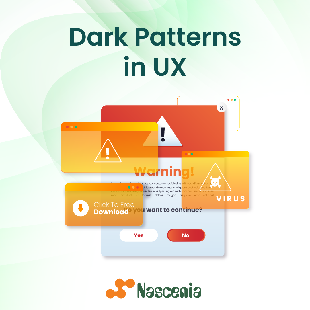
What Are Dark UX Patterns?
Dark UX patterns (also called dark patterns or deceptive design) are user interface design choices that deliberately mislead, manipulate, or coerce users into taking actions they did not intend.
Unlike bad design - which produces poor user experience through incompetence or neglect - dark patterns produce poor user experience through deliberate exploitation.
The term was coined by British UX designer Harry Brignull in 2010. Brignull, frustrated by the proliferation of deceptive interfaces he was observing, launched deceptive.design (later renamed deceptive.design) to catalogue and name specific manipulation tactics.
His work transformed a set of loosely observed practices into a defined, documented field of concern - with direct legal and regulatory implications.
Brignull defined dark patterns as "tricks used in websites and apps that make you do things that you didn't mean to, like buying or signing up for something."
The definition has since expanded. Academic researchers, regulators, and consumer advocates now use the term to cover any design choice that systematically works against users' interests, regardless of whether active trickery is involved.
The Princeton Web Transparency and Accountability Project (Mathur et al., 2019) systematically analyzed over 11,000 shopping websites and found dark patterns in 11.1% of them - and that was a conservative methodology that only counted clear, unambiguous instances.
The Norwegian Consumer Council has also documented dark patterns across major consumer apps, finding manipulative design used across multiple categories of services.
The 12 Types of Dark Patterns
Brignull's original taxonomy identified 12 distinct pattern types. Each exploits a specific cognitive vulnerability.
1. Trick Questions
A form field or checkbox that appears to mean one thing but actually means the opposite, relying on careless reading.
Classic examples: a checkbox labeled "Uncheck this box if you do not wish to receive promotional emails" - the double negative ensures most users will get the intended result wrong regardless of which option they choose.
Trick questions exploit inattentional blindness - the well-documented cognitive phenomenon, first named by researchers Simons and Chabris (1999), in which people fail to notice unexpected information when their attention is directed elsewhere.
During a checkout flow, attention is focused on completing the transaction; secondary form fields are processed with minimal cognitive resources.
2. Sneak into Basket
An item - typically an insurance product, warranty, or add-on - is added to a shopping cart without the user's explicit action. The user must actively notice and remove it to avoid the charge.
The Princeton study (Mathur et al., 2019) found this pattern on 1.5% of major retail sites - a small percentage that nonetheless translates to millions of deceptive transactions given the scale of e-commerce.
Ryanair was among the first major documented cases of sneak-into-basket at scale, pre-checking travel insurance on ticket purchases so that users who did not carefully read every step were automatically charged for insurance they had not affirmatively selected. European regulators eventually forced a change.
3. Roach Motel
Named after the pest-control product with the slogan "You can check in but you can't check out." The roach motel pattern makes it easy to enter a situation and extremely difficult to exit.
Signing up for a subscription takes 30 seconds; canceling requires a phone call during business hours, a form submission, a waiting period, a retention offer, and multiple confirmation screens.
Examples documented in regulatory actions include Amazon Prime (required phone call to cancel until regulatory pressure changed this in 2022), various gym membership chains, and numerous SaaS subscription products.
The FTC's 2022 "Click to Cancel" rule proposal was specifically designed to address roach motel patterns in subscription services, requiring that cancellation be as easy as signup across digital products.
4. Privacy Zuckering
Named after Facebook founder Mark Zuckerberg (though the pattern is not unique to Facebook), this involves tricking users into sharing more personal data than they intended through confusing privacy settings, opaque defaults, or multi-step processes that default to maximum data sharing at each step.
A landmark 2018 study by researchers at Carnegie Mellon University (Acquisti, Brandimarte, and Loewenstein) found that users systematically underestimate how much data they share and how it is used, in part because privacy interfaces are designed to obscure rather than illuminate data practices.
The researchers described this as "privacy paradox" behavior - users saying they care about privacy while taking actions that undermine it - and attributed it largely to interface design that makes sharing easy and restriction difficult.
5. Misdirection
Directing user attention away from a key element of the interface - typically the element that would allow them to make a different, less profitable-for-the-company choice - through visual hierarchy manipulation, color contrast, animation, or prominent placement of the desired action.
Color is a primary misdirection tool. Research in cognitive psychology (Elliot and Maier, 2014) on color-in-context effects documents that color choices systematically direct attention and emotional response.
Cookie consent popups routinely use high-contrast, high-saturation colors for the "Accept All" option and muted, low-contrast colors for "Manage Preferences" - a design choice that is functionally equivalent to putting a thumb on the scale.
6. Hidden Costs
Failing to reveal the full cost of a transaction until the checkout stage - after the user has invested time and cognitive effort in the purchase process. Hidden fees (booking fees, service charges, processing fees) are revealed only at the final confirmation step, exploiting sunk cost psychology to reduce abandonment.
Ticketmaster became the most scrutinized example of hidden costs in consumer technology. Tickets advertised at one price routinely arrive at checkout with added service fees that can represent 30 to 50% of the face value.
A 2022 US Senate hearing on the issue cited complaints from millions of consumers, and Congressional bills were proposed to require all-in pricing disclosure at the point of first advertisement.
Similar regulatory pressure in the EU has produced "total price display" requirements under the Consumer Rights Directive.
7. Bait and Switch
Advertising one action or price, then substituting a different, worse one after the user has committed to the process. The bait could be a low introductory price, a specific product, or a specific feature set.
A documented example: Microsoft attempted to use Windows 10's upgrade dialog as a bait-and-switch mechanism, changing the behavior of the "X" (close) button in the upgrade prompt from "decline" to "accept" without user awareness, resulting in many users unintentionally scheduling upgrades they had intended to decline.
In one documented instance, a California woman (Teri Goldstein) was awarded roughly $10,000 in small-claims court in 2016.
8. Confirmshaming
Wording the option to decline an offer in a way designed to make the user feel ashamed, stupid, or guilty for refusing. Instead of neutral opt-in/opt-out language, the decline option becomes a self-deprecating statement: "No thanks, I don't want to save money" or "I prefer to remain uninformed."
Confirmshaming exploits identity threat: users who experience social identity as rational, informed, or thrifty face a mild identity violation when they choose the decline option. The discomfort nudges compliance.
Social psychology research on self-affirmation theory (Steele, 1988) helps explain why this works - people are motivated to maintain a consistent self-image, and choosing an option framed as inconsistent with a positive self-description generates cognitive dissonance that drives behavior change.
9. Disguised Ads
Advertising content formatted to look like editorial content, navigation elements, or organic search results. Native advertising that lacks clear labeling, sponsored content indistinguishable from journalistic articles, and "recommended articles" that are actually paid placements all fall into this category.
A 2019 study by researchers at Stanford (McGrew et al.) found that 96% of high school students shown a native advertising example on a news site failed to identify it as advertising. Adults performed only marginally better.
This represents a near-total failure of the labeling conventions designed to distinguish paid content from editorial content - a failure that benefits advertisers at the direct expense of reader trust.
10. Forced Continuity
Providing a free trial that automatically converts to a paid subscription without any reminder notice - and making the card details collected during signup a sufficient authorization for the automatic charge.
Consumer-survey research has estimated (2021) that Americans spend approximately $348 per year on forgotten subscriptions - services they signed up for through free trials and continued paying for without active awareness.
This is not a rounding error; it represents billions of dollars annually transferred from consumers to companies through the mechanism of forced continuity.
11. Friend Spam
Obtaining access to a user's contact list (typically during an app's onboarding) and sending unsolicited messages to those contacts in the user's name without clear disclosure. The user believes they are sharing the app with a few friends; the app bulk-messages their entire address book.
LinkedIn's 2015 class action settlement for $13 million arose from exactly this pattern. Users who imported contacts and sent a connection request found that LinkedIn sent multiple follow-up emails to those contacts - including non-users who had never agreed to any LinkedIn communication - in the user's name.
The settlement included payment to affected parties and required LinkedIn to disclose the full behavior of contact import features.
12. Difficult Cancellation (extended from roach motel)
Requiring excessive effort to exercise rights that should be simple - canceling a subscription, deleting an account, exercising a GDPR data deletion request, opting out of data sharing. The effort required is not technically necessary; it is deliberate friction designed to increase abandonment of the legitimate user action.
The illusion of choice is a related concept: providing settings that appear to give control but are designed so that exercising control is so time-consuming or opaque that most users give up.
A 2020 study by Lorrie Faith Cranor at Carnegie Mellon found that fully reading all the privacy policies a typical US internet user encounters in a year would require approximately 76 work days - making genuine informed consent structurally impossible under current design norms.
The Psychology of Why Dark Patterns Work
Dark patterns are not random annoyances. Each is engineered to exploit a specific, well-documented feature of human cognition.
The foundational research on cognitive biases - Kahneman and Tversky's decades of work on heuristics and biases, summarized in Kahneman's "Thinking, Fast and Slow" (2011) - provides the theoretical basis for understanding why these patterns are so effective.
Human cognition operates in two modes: fast, automatic, associative processing ("System 1") and slow, deliberate, analytical processing ("System 2").
Dark patterns are designed to intercept System 1 processing before System 2 can intervene - to create conditions under which users act on impulse, inertia, or default rather than deliberate choice.
| Dark Pattern | Cognitive Vulnerability Exploited |
|---|---|
| Roach motel | Loss aversion; sunk cost fallacy |
| Hidden costs | Sunk cost fallacy; commitment and consistency |
| Confirmshaming | Identity threat; self-consistency |
| Trick questions | Inattentional blindness; cognitive load |
| Sneak into basket | Inattentional blindness; default effect |
| Misdirection | Visual attention and salience effects |
| Forced continuity | Inertia; status quo bias |
| Privacy zuckering | Complexity overload; choice architecture defaults |
The power of these patterns comes from the fact that users cannot simply "be more careful" to avoid them. The cognitive vulnerabilities being exploited are not failures of intelligence - they are features of efficient information processing systems that work well in most contexts. Dark patterns weaponize those features.
Research on choice architecture (Thaler and Sunstein, "Nudge," 2008) showed that default settings, the order of options, and the framing of choices systematically and predictably influence behavior. Ethical applications of choice architecture nudge people toward beneficial defaults.
Dark UX patterns represent the same mechanisms applied in reverse - nudging people toward outcomes that benefit the company at the user's expense.
Real-World Documented Cases
LinkedIn's "Add Connections" Feature
In 2015, LinkedIn settled a class action lawsuit for $13 million over a feature that sent multiple waves of invitation emails to users' contacts - including repeated follow-up emails - after users uploaded their address books or entered email credentials.
Users who thought they were adding a few connections had their entire contact lists messaged multiple times without their understanding.
Amazon Prime Cancellation
Amazon Prime's cancellation flow became one of the most documented examples of the roach motel pattern. Users who attempted to cancel encountered up to six screens - each offering a retention incentive or adding friction - before reaching an actual cancellation option.
Following attention from the US Federal Trade Commission and regulatory bodies in Europe (the Italian competition authority fined Amazon 1.13 billion euros in 2021 for separate but related consumer protection issues), Amazon simplified the cancellation flow in 2022 to comply with emerging "click to cancel" regulatory norms.
Cookie Consent Popups
Following GDPR implementation in the EU in 2018, websites were required to obtain consent for non-essential cookies.
Many responded not by building transparent consent mechanisms but by engineering dark-pattern consent UIs: large, highlighted "Accept All" buttons contrasted with grey, small, multi-step "Manage Preferences" options.
The French data protection authority (CNIL) fined Google 150 million euros and Facebook 60 million euros in 2022 for these consent design practices. The CNIL explicitly cited the visual design disparity between consent options as evidence of manipulative intent.
Subscription Box Services
Multiple subscription box companies (for cosmetics, food, clothing) have faced FTC actions for roach motel and forced continuity patterns: making free trial enrollment a single click while making cancellation require calling customer service during specific hours, mailing a letter, or navigating hidden account settings.
The FTC's enforcement actions against NatureSlim, Vonage, and ABCMouse in 2022-2023 explicitly cited dark pattern design as evidence of unfair and deceptive practices under Section 5 of the FTC Act.
Hotel and Travel Booking
The hotel and airline booking industry has been extensively documented in dark pattern research. A 2021 EU enforcement sweep of 408 hotel booking sites found that 235 of them (57.6%) contained at least one dark pattern.
The most common were: false scarcity claims ("Only 2 rooms left!"), false urgency countdown timers, hidden fees revealed late in checkout, and pre-selected add-ons for insurance and seat upgrades.
Regulatory Responses
The regulatory environment around dark patterns has shifted significantly since 2020. What was once primarily an ethical concern has become an active enforcement priority for regulators in the United States, European Union, and dozens of national jurisdictions.
United States: FTC Enforcement
The Federal Trade Commission published "Bringing Dark Patterns to Light" in September 2022, identifying dark patterns as a priority enforcement area and documenting how deceptive interface design violates Section 5 of the FTC Act (which prohibits unfair or deceptive acts or practices).
The FTC has pursued enforcement actions against companies using dark patterns for:
- Auto-enrollment without clear disclosure
- Deceptive cancellation flows
- Manipulative negative option marketing
- Hidden fees revealed only at checkout
FTC Chair Lina Khan described dark patterns as "digital age manipulation that undermines consumer choice." The FTC's 2023 proposed "Click to Cancel" rule would require that cancellation of any subscription be as simple as signup - one step if signup was one step - closing the most exploited roach motel design specifically.
The FTC also proposed prohibitions on manipulative upsell design for children's products, following research documenting that dark patterns targeting children are systematically more effective due to children's limited capacity to detect and resist manipulation.
European Union: GDPR and Digital Services Act
The EU's General Data Protection Regulation (GDPR), fully enforceable since 2018, established that consent for data processing must be freely given, specific, informed, and unambiguous - requirements that dark-pattern consent UIs systematically violate.
Multiple large fines have followed: Ireland's Data Protection Commission, which oversees most major tech companies operating in the EU, issued fines of over 1.3 billion euros in 2023 alone.
The Digital Services Act (DSA), which came into force in 2022-2024, explicitly prohibits dark patterns in online interfaces for very large platforms.
Article 25 of the DSA prohibits interface designs that "deceive, manipulate or otherwise impair or impair the ability of recipients of the service to make free and informed decisions."
The EU Consumer Rights Directive contains provisions against deceptive presentation of consumer choices, and the Omnibus Directive specifically updates consumer protection law to address digital-specific manipulation tactics including false scarcity, fake reviews, and personalized pricing opacity.
Norway, UK, and National Regulators
Norway's Consumer Authority (Forbrukertilsynet) published a landmark 2018 report documenting dark patterns in Snapchat, Facebook, Google, and Windows 10 interfaces. The report, titled "Deceived by Design," was one of the first government documents to systematically apply dark pattern taxonomy to major platform interfaces.
Norway subsequently fined Grindr 65 million Norwegian kroner for manipulative consent design that shared users' HIV status and precise location data with advertising partners without adequate disclosure.
The UK's Competition and Markets Authority (CMA) launched investigations into subscription traps and hidden costs, publishing a major report in 2022 on "online choice architecture" that recommended legislative action to prohibit the most harmful dark pattern categories.
The UK ICO (Information Commissioner's Office) published consent UX guidelines explicitly naming dark patterns as consent violations under UK GDPR.
Measuring the Harm: What Research Shows
The harms from dark patterns are not merely abstract. Research has begun to quantify the economic and psychological damage at scale.
A 2021 study by researchers at the University of Chicago (Luguri and Strahilevitz) used randomized controlled trials to measure the effect of dark patterns on subscription enrollment.
Users exposed to aggressive dark patterns were 200% more likely to subscribe to a service and reported significantly higher rates of feeling "tricked" in post-study surveys.
The same study found that when the dark patterns were removed, conversion rates fell but customer satisfaction and long-term retention improved substantially.
Research on the cognitive and emotional toll of dark patterns found that exposure increases user stress, distrust, and learned helplessness (Narayanan et al., Princeton, 2020). Users who repeatedly encounter manipulative design develop generalized suspicion of digital interfaces - a form of trust erosion with broad economic consequences.
Ethical Design Alternatives
"Dark patterns are not a design problem. They are a management problem. Every dark pattern was approved by someone, measured by someone, and defended by someone.
The design team that built it was just implementing a decision that came from above." - Harry Brignull, founder of deceptive.design, on the organizational accountability behind dark UX
Every dark pattern has an ethical equivalent that achieves legitimate business goals without manipulation:
| Dark Pattern | Ethical Alternative |
|---|---|
| Roach motel | Cancellation as simple as signup; no retention harassment required |
| Hidden costs | Total cost (including all fees) shown on first product page |
| Forced continuity | Clear reminder before trial expiry; simple opt-in to convert |
| Confirmshaming | Neutral, parallel language for accept and decline options |
| Sneak into basket | All add-ons explicitly presented and require affirmative selection |
| Privacy zuckering | Privacy settings default to minimum data collection; clear plain-language explanation |
| Trick questions | Simple, single-direction statements; consistent checkbox semantics |
The business case for ethical design is not merely moral. Long-term customer lifetime value is systematically higher when customers are retained by genuine satisfaction rather than friction-based lock-in.
Customers who feel manipulated are far more likely to publicize their experience (via reviews, social media, word of mouth) and far less likely to repurchase when they find an alternative.
Nielsen Norman Group research has found that conversion rates from genuinely good UX - clear value propositions, frictionless checkout, transparent pricing - consistently outperform conversion rates from dark patterns at the customer lifetime value level, even if they underperform on specific micro-conversion metrics.
A frequently cited counterexample is Duolingo's transparent, non-manipulative monetization model.
By making its core product genuinely useful for free and offering premium features as an honest upgrade, Duolingo reached 500 million users and a $3.7 billion IPO valuation - demonstrating that ethical design can produce durable business success at scale.
Who Is Responsible?
Understanding who creates dark patterns is essential to understanding how to reduce them. The answer is more organizational than individual.
Dark patterns rarely originate from UX designers acting autonomously. They typically emerge from A/B test cultures that optimize for short-term conversion metrics without accounting for user experience quality, trust, or long-term retention.
A designer who expresses concern about a manipulative design pattern and is told that "the data shows it converts better" faces institutional pressure that professional norms and individual ethics struggle to overcome.
Brignull's point about management accountability is empirically supported. A 2022 study by researchers at UC Berkeley (Gray et al.) interviewed designers who had been asked to implement dark patterns.
Many described feeling pressure from product managers and executives, being shown A/B test data justifying patterns they found unethical, and lacking organizational channels to escalate concerns. Several described leaving companies specifically over dark pattern practices.
This structural dynamic has implications for regulation: the most effective interventions target organizational accountability and economic incentives rather than individual designer behavior.
Prohibitions that create legal risk for companies - rather than design guidelines that can be ignored - have proven more effective at changing outcomes.
Dark Patterns in the Age of AI
The emergence of AI-powered personalization has added a new dimension to dark pattern concerns. AI systems can:
- Personalize dark patterns to individual users, applying maximum friction to users identified as most likely to try to cancel, and minimal friction to users who seem low-churn risk
- Optimize dark pattern design through A/B testing at scale, automatically discovering which deceptive elements produce the highest conversion without any human designer making a deliberate choice to deceive
- Generate synthetic reviews and social proof signals that create false impressions of product quality
- Predict emotional states through behavioral signals and time dark pattern exposures to moments of reduced cognitive resistance - for instance, showing retention offers when users are identified as fatigued or stressed
Regulators and researchers have noted that AI-optimized dark patterns may be significantly more effective than static ones, because they adapt to individual vulnerabilities in real time.
The FTC's 2022 report explicitly flagged AI-personalized manipulation as a category requiring regulatory attention that existing frameworks had not been designed to address.
The EU's AI Act, which came into force in stages from 2024, includes provisions specifically targeting AI systems that "exploit subconscious behaviors" or use "subliminal techniques" to manipulate users - language that encompasses AI-optimized dark patterns when they cross certain thresholds of harm.
The Future of Dark Pattern Regulation
The pace of regulatory development around dark patterns has accelerated significantly. In 2018, a handful of European decisions addressed cookie consent dark patterns. By 2024, over 40 national regulatory bodies had issued dark pattern guidance, enforcement actions, or proposed legislation.
The emerging consensus across jurisdictions includes:
- Cancellation must be as simple as enrollment
- All fees must be disclosed at the point of first advertisement, not at checkout
- Consent interfaces must give equal visual prominence to all consent options
- AI-personalized manipulation exceeds acceptable bounds under consumer protection frameworks
The trajectory is clear: the regulatory cost of dark pattern design is rising. Companies that continue to rely on manipulative design as a revenue mechanism face increasing fines, enforcement actions, and mandatory redesigns - costs that, when fully accounted for, often exceed the revenue those patterns generated.
Conclusion
Dark UX patterns are not the inevitable consequence of technology or market competition. They are deliberate design choices made by real people - product managers, UX designers, and executives who decide that short-term extraction is worth the long-term damage to trust and user wellbeing.
The regulatory environment is tightening. The reputational costs are rising. The empirical evidence that honest, user-centered design produces better long-term business outcomes is accumulating.
And the consumer awareness of manipulation tactics - boosted by regulatory attention, journalism, and the work of researchers like Harry Brignull, Mathur and colleagues at Princeton, and numerous academic and government research teams - is higher than it has ever been.
Understanding dark patterns is not only relevant for designers and product managers.
Every person who uses digital products benefits from being able to recognize when they are being manipulated - to pause when a checkout screen feels engineered to override their judgment, to question a subscription enrollment that seems designed to make opting out invisible, to understand that friction they encounter when trying to exercise their rights is a deliberate design choice, not a technical inevitability.
The future of digital product design does not belong to deception. It belongs to products that earn users' time and money by genuinely deserving them.
Frequently Asked Questions
What are dark UX patterns?
Dark UX patterns (also called dark patterns or deceptive design) are user interface design choices that deliberately mislead, manipulate, or trick users into taking actions they did not intend, such as signing up for subscriptions, sharing more data than intended, or making purchases they did not want. The term was coined by UX designer Harry Brignull in 2010, who began cataloguing examples on the website darkpatterns.org. Unlike poor design (which is accidental), dark patterns are intentionally engineered to exploit cognitive biases.
What is the roach motel dark pattern?
The roach motel is a dark pattern where a service is designed to be easy to enter but deliberately difficult to leave. The name comes from an old pest control advertisement: ‘You can check in, but you can’t check out.’ Examples include subscription services that require a phone call or multi-step online process to cancel while signup took seconds, gym memberships requiring certified letter cancellation, or streaming services that bury the cancel option deep in account settings behind multiple confirmation screens.
What is confirmshaming?
Confirmshaming is a dark pattern where the option to decline an offer is worded to make the user feel guilty, stupid, or ashamed for refusing. For example, a popup might offer a free newsletter with buttons reading ‘Yes, I want to save money’ and ‘No, I prefer to pay full price.’ The decline option is written to make the user internalize a negative self-characterization for saying no. It leverages guilt and identity threat to overcome rational decision-making.
How are regulators responding to dark patterns?
Regulatory action has accelerated significantly since 2020. The US Federal Trade Commission published a 2022 report identifying dark patterns as a priority enforcement area and has pursued cases against companies using manipulative cancellation flows. The EU’s Digital Services Act (2022) and its enforcement of GDPR have targeted deceptive cookie consent interfaces, with major fines issued against companies. Norway’s consumer authority fined Grindr for manipulative consent design. The EU’s Consumer Rights Directive also includes provisions against manipulative interfaces.
What are ethical alternatives to dark patterns?
Ethical design alternatives include transparent pricing with all costs shown upfront, frictionless cancellation that is as simple as signup, neutral opt-in/opt-out language that does not shame users for declining, clear and prominent settings for data and privacy choices, and default states that protect rather than exploit users. Research by the Nielsen Norman Group and others suggests that honest, user-centered design builds long-term trust and customer lifetime value that outweighs short-term conversion gains from manipulation.