Visual: When the statistician Hans Rosling stood on a TED stage in 2006 and presented global health data through animated bubble charts, he accomplished something that decades of published statistics in academic journals, policy reports, and international development publications had failed to do: he made the world's population data emotionally compelling to a general audience.
The numbers themselves were not new. Child mortality rates, life expectancy data, and income distributions had been available in databases and reports for years.
What Rosling transformed was the mode of presentation - from tables of numbers that required expert interpretation to animated visual narratives where bubbles representing countries moved across axes of income and life expectancy, making trends visible that data tables concealed.
The presentation has been viewed over 15 million times. It generated what Rosling called "Factfulness" - the ability to see the world as it actually is, rather than through outdated mental models. No written description of the same data has come close to that reach or that impact. The medium mattered as much as the message.
This illustrates what visual communication research has consistently demonstrated: the format in which information is presented fundamentally determines how well it is understood, how long it is retained, and whether it motivates action. Visual content is not decoration layered on top of substantive text.
It is a distinct mode of information transmission that processes differently in the brain, reaches through different channels, and serves purposes that text alone cannot fulfill.
The Cognitive Science of Visual Processing
The visual system is the brain's most extensive sensory processing system, dedicating a large share of cortical resources to interpreting what we see.
The visual system evolved over hundreds of millions of years before language appeared; the brain's capacity for rapid visual pattern recognition represents far more evolutionary optimization than its capacity for sequential text processing.
Research by MIT neuroscientist Mary Potter and colleagues (2014), published in SAGE Publications, found that the human brain can process images presented as rapidly as 13 milliseconds - detecting the semantic content of images (whether they contain an animal, a person, a natural scene) faster than any linguistic processing can occur.
This is not a marginal speed advantage; it reflects fundamentally different processing mechanisms.
"The eye is the fastest path to the brain. If you can show someone what you mean instead of telling them, you have multiplied the speed and accuracy of communication." - Edward Tufte
The retention advantage of visual information over text is substantial in educational research.
Richard Mayer's multimedia learning theory (documented across 15 years of research compiled in Multimedia Learning, Cambridge University Press, 2009) consistently finds that people learn better from words and pictures combined than from words alone.
The "dual coding" effect - where information encoded both verbally and visually creates more robust memory traces - explains why well-designed visual content produces retention rates 55-65% higher than equivalent text-only content.
For content marketers, the implication is not that all content should be visual, but that visual elements should be deployed deliberately where they serve genuine communication purposes - which is more situations than most content programs currently use them.
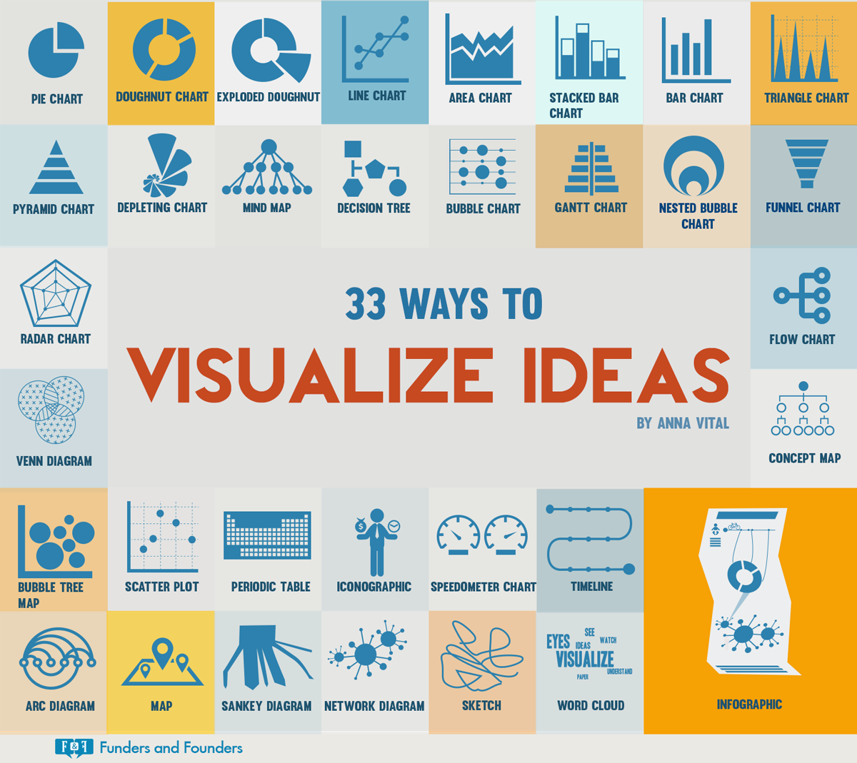
The Taxonomy of Visual Content Formats
Different visual formats serve fundamentally different communication purposes. Choosing between them requires understanding what type of information is being conveyed and what cognitive work the audience needs to do with it.
| Format | Primary Cognitive Function | Best Information Type | Production Investment |
|---|---|---|---|
| Process flowcharts | Sequential comprehension | Workflows, procedures, decision trees | Low-medium |
| Data visualizations | Pattern recognition | Statistics, comparisons, trends over time | Medium-high |
| Comparison tables | Evaluation against criteria | Feature comparisons, option analysis | Low |
| Conceptual diagrams | Spatial/relational understanding | Frameworks, models, system relationships | Medium |
| Annotated screenshots | Procedural instruction | Software tutorials, step-by-step guidance | Low |
| Infographics | Overview comprehension | Summaries, statistics collections, timelines | High |
| Video explainers | Complex process demonstration | Multi-step procedures, abstract concepts | Very high |
Process Diagrams: Making Sequences Visible
Process diagrams - flowcharts, workflow diagrams, decision trees - transform sequential information from prose that readers must hold in working memory into visual structures where the entire sequence is simultaneously visible.
A paragraph describing a five-stage content review process requires the reader to construct the mental model of the process from sequential text.
A flowchart presents the same process in a form where the structure, the branching points, and the overall shape are immediately apparent.
The working memory advantage is significant. Process comprehension requires holding earlier stages in mind while processing later stages - a demand that increases cognitive load and reduces comprehension accuracy for complex processes.
Process diagrams offload this working memory demand to the visual display itself, allowing the reader to focus cognitive resources on understanding the implications rather than on reconstructing the structure.
Design principles for effective process diagrams:
Ruthless simplicity. Include only the steps, decisions, and connections necessary to understand the process. Every additional element - decorative icons, unnecessary branching, redundant annotations - competes for visual attention and increases the cognitive load of interpretation.
The discipline is removing elements rather than adding them.
Functional use of color. Color should encode information, not aesthetics. Using blue for automated steps and orange for manual steps encodes meaningful distinctions. Using multiple colors because "it looks more professional" creates visual noise that impedes interpretation.
Consistent visual language. Standard flowchart conventions (rectangles for processes, diamonds for decisions, ovals for start/end) encode meaning that readers already know. Departing from conventions requires readers to learn a new visual language before they can interpret the content - unnecessary friction.
Appropriate detail level. A process diagram for executive communication shows major phases and key decision points. A process diagram for practitioner guidance shows specific steps, inputs, outputs, and responsible parties. The audience and purpose determine the appropriate level of abstraction.
Data Visualization: Transforming Numbers Into Patterns
Data visualization is the practice of encoding quantitative information in visual forms - charts, graphs, maps, and diagrams - that reveal patterns that tabular data conceals.
A column of 36 monthly revenue figures communicates that revenue varied over three years; a line chart of the same data immediately reveals seasonal patterns, growth trends, and anomalies that the numbers alone would require significant analysis to detect.
Alberto Cairo, one of the leading researchers and practitioners in data visualization design, describes the purpose of visualization as making data work for human perception: "The goal of visualization is insight, not pictures." Every design decision - chart type, axis scale, color choice, annotation - should serve the reader's ability to extract accurate insight from the visual.
The chart type selection problem. The most common failure in data visualization is mismatching chart type to data type:
- Bar charts compare discrete quantities across categories. Appropriate for: monthly sales by product line, support tickets by category, employee headcount by department.
- Line charts show trends over continuous time. Appropriate for: monthly revenue over three years, daily active users, temperature over seasons.
- Scatter plots reveal relationships between two continuous variables. Appropriate for: correlation between advertising spend and revenue, relationship between team size and productivity.
- Pie charts show proportions of a whole. Appropriate sparingly: market share among three or four competitors. Inappropriate for: comparing five or more categories, showing trends, or any comparison where magnitude differences between slices are meaningful.
"A good data visualization makes the important patterns obvious and the unimportant patterns invisible. A bad one does exactly the opposite." - Alberto Cairo
Annotation as interpretation guidance. The most effective data visualizations for content marketing include annotations that direct the reader's attention to the key insight the visualization is meant to convey.
A line chart showing five years of organic traffic growth becomes more useful with an annotation marking "content hub strategy launched" at the inflection point where growth accelerated.
The annotation converts a display of data into an argument about causation that the reader can evaluate.
Comparison Tables: Structuring Evaluation
Comparison content - evaluating products, approaches, or options against multiple criteria - is among the most commercially valuable content formats because it serves buyers actively making decisions.
Well-designed comparison tables accelerate the evaluation process and serve buyers who need to assess multiple options against their specific criteria.
The structural requirements for effective comparison tables:
Criteria selection is the critical editorial decision. The criteria chosen for comparison shape which option appears most favorable. Including criteria where one option excels and excluding criteria where it does not creates a misleading comparison that sophisticated readers detect.
Including every possible criterion creates information overload. The editorial discipline is including the criteria that genuinely matter for the decision being made, which requires understanding what buyers actually care about - not what vendors want to highlight.
Visual encoding should accelerate scanning. Checkmarks versus X marks for feature presence/absence. Color coding for performance levels (green/yellow/red or numerical scores). Icons that encode distinct types of information.
The goal is enabling a reader to scan the table and identify which option best matches their profile without reading every cell linearly.
Use-case framing outperforms global rankings. Rather than implying one option is simply "better," effective comparison content identifies which options are best for which types of users or situations.
"Option A is best for teams with fewer than 50 users who need quick setup; Option B is better for enterprises with complex compliance requirements" is more useful than "Option A scores 8/10 and Option B scores 7/10."
Infographics: When Integration of Multiple Elements Serves Comprehension
Infographics combine text, data, and visual elements to present complex information in a single, shareable visual asset.
They succeed when the integration itself provides comprehension value - when the combination of statistics, narrative context, and visual relationships reveals something that text and data separately could not convey as efficiently.
They fail when used as decorative containers: statistics displayed alongside irrelevant icons add production cost without adding comprehension value. The discipline is asking, for each element, whether removing it would reduce the reader's understanding. If not, it should be removed.
The shareability of well-designed infographics on social media and in newsletters provides genuine distribution value.
An infographic summarizing the key findings of an original research report can reach audiences who will never read the full report - serving as both a distribution mechanism and a summary that motivates reading of the underlying content.
Creating Visual Content Without Extensive Design Resources
The barrier to visual content production is lower than most content teams assume. The most valuable visual formats in content marketing are those that prioritize clarity over aesthetics, and clarity can be achieved with tools available to non-designers.
Annotated screenshots for software tutorials require only a screen capture tool and basic annotation capability (an arrow, a circle, a text label). Skitch, Snagit, and the built-in annotation tools in macOS and Windows are sufficient. The value comes from showing exactly what the reader needs to see - no design expertise required.
Process flowcharts can be created in Miro, Lucidchart, or even standard presentation software with adequate results. Excalidraw's hand-drawn aesthetic, while simple, communicates authenticity and is often more effective for conceptual communication than polished graphics.
Data visualizations for content are well served by tools like Datawrapper, Flourish, or Tableau Public - all available free - which handle the design of standard chart types automatically and produce clean, publication-ready outputs without requiring design expertise.
The principle that resolves the design expertise question: clarity is more important than polish.
A simple, accurate diagram created in fifteen minutes that unambiguously communicates a process provides more value than an elaborate, beautifully designed graphic that requires the reader to spend significant time decoding it.
The audience came to understand something; prioritize understanding over aesthetics.
Visual Content in SEO and Distribution
Visual content contributes to search performance and distribution effectiveness through multiple mechanisms:
Image search traffic. Well-optimized images - descriptive file names, accurate alt text, appropriate compression, structured data markup - can rank in Google Image Search, providing an additional discovery channel. For instructional and conceptual content, image search represents a meaningful supplementary traffic source.
Engagement signals. Content with well-integrated visual elements consistently shows higher time-on-page and lower bounce rates than equivalent text-only content. These behavioral signals correlate with search ranking improvements.
Featured snippet eligibility. Tables and structured lists have disproportionately high probability of being selected by Google for featured snippet positions - the prominent search result displayed above organic results. Structured visual content that answers a specific question directly often captures these high-visibility positions.
Social sharing amplification. Infographics, data visualizations, and conceptual diagrams that can stand alone as shareable assets generate social distribution that article text alone rarely achieves.
A compelling chart from a research article often reaches more people through social sharing than the article itself does through organic search.
For distribution strategies that work effectively in 2026, visual assets serve as distribution accelerators: a single compelling visualization shared as a standalone LinkedIn post or Twitter/X thread can drive significant traffic to the longer-form content it summarizes.
When Visual Content Adds Cost Without Value
The strategic discipline in visual content is knowing when not to use it. Several content situations are better served by text alone:
Nuanced argumentation. Complex analytical reasoning benefits from the linear, cause-and-effect structure of prose. Attempting to visualize a multi-step argument often oversimplifies it in ways that undermine the reasoning rather than clarifying it.
Simple information without structural complexity. A two-sentence answer to a direct question does not benefit from being converted into a diagram. The diagram would add visual complexity without adding informational value.
Emotional or narrative content. Content that relies on the reader's imagination and personal resonance is often constrained rather than enhanced by visual specification. Description that allows readers to form their own mental images can be more powerful than images that specify what they should picture.
Every visual element on a page competes for the reader's limited attention. Unnecessary visual elements dilute the impact of necessary ones and signal low editorial discipline.
The question for every proposed visual is not "would this look nice here?" but "would removing this reduce the reader's understanding of something that matters?"
What Research Shows About Visual Content
Richard Mayer, professor of psychology at the University of California Santa Barbara and leading researcher in multimedia learning theory, conducted over 15 years of controlled experiments examining how visual elements improve or impair learning outcomes.
His research program, synthesized in Multimedia Learning (Cambridge University Press, 2001; second edition 2009), established 12 empirically validated principles for effective multimedia design.
The most consequential finding for content marketers: people learn 55-65% more effectively from words and pictures together than from words alone - a finding Mayer replicated across 50+ experiments with students ranging from elementary school through university.
Critically, Mayer also identified that poorly designed visual content produced worse learning outcomes than text alone, establishing that visual design quality is not optional: irrelevant images, cluttered graphics, and poorly integrated visuals actively impair comprehension by consuming limited cognitive processing capacity without providing informational benefit.
Mary Potter, professor of psychology at MIT and cognitive neuroscience researcher, published research in Attention, Perception, and Psychophysics (2014, Vol.
76) demonstrating that the human brain processes images at 13 milliseconds - detecting semantic content (whether an image contains an animal, person, or object) faster than any linguistic processing occurs.
The study, which used Rapid Serial Visual Presentation (RSVP) methodology to display images at precisely controlled exposure durations, established that visual processing speed is not merely faster than reading but operates through fundamentally different neural mechanisms that evolved over hundreds of millions of years compared with language's relatively recent development.
For content distribution, Potter's research implies that visual content captures attention and conveys basic information through channels that text cannot access, making visual elements particularly effective in competitive attention environments like social media feeds where viewing time is measured in milliseconds.
Alberto Cairo, Knight Chair in Visual Journalism at the University of Miami School of Communication and author of The Truthful Art (New Riders, 2016) and How Charts Lie (W.W. Norton, 2019), has documented through research and professional practice the specific ways in which visual content either clarifies or distorts information.
Cairo's analysis of 1,000+ data visualizations published in major media outlets found that approximately 40% contained design elements that led readers to incorrect conclusions - not through intentional deception but through poor design choices including truncated axes, inappropriate chart types, misleading color scales, and missing context.
His research has direct implications for content credibility: brands whose visual content leads informed readers to correct conclusions build significantly more trust than those whose visuals appear polished but embed misleading representations.
Jakob Nielsen, co-founder of Nielsen Norman Group and pioneer of web usability research, conducted eye-tracking studies examining how readers interact with web content.
His foundational research, published in Eyetracking Web Usability (New Riders, 2010) and in ongoing Nielsen Norman Group reports updated through 2023, established the "F-pattern" reading behavior: web readers scan content in an F-shaped pattern, paying most attention to the first two lines of text and the left margin, with attention declining sharply through the remainder of the page.
Nielsen's research found that content with well-placed visual elements - particularly those appearing within the high-attention F-pattern zone - received 38% more time-on-page than equivalent text-only content. Images that appeared in the right margin or bottom of pages received minimal attention regardless of quality.
Real-World Case Studies in Visual Content
HubSpot's research team published a 2023 analysis of visual content performance across their blog, which receives approximately 7 million monthly visitors and publishes 400+ articles per month.
The analysis examined performance differences between articles with and without original visual elements (custom charts, process diagrams, and original illustrations as distinct from stock photography).
Articles containing at least three original visual elements showed 42% higher average time-on-page, 31% lower bounce rates, and 18% higher conversion rates to email subscription than articles relying on text and stock photography alone.
HubSpot's director of content Aja Frost attributed the performance difference to what she termed "visual credibility" - original visuals signal that the content team invested substantive effort, which correlates with perceived content quality even among readers who do not consciously notice the distinction between original and stock visuals.
The New York Times' data visualization team, led by graphics editor Mike Bostock and subsequently Amanda Cox (now with the US Census Bureau), documented the traffic and engagement performance of interactive data visualizations compared with equivalent text-only analytical content between 2012 and 2018.
The team's internal analysis, shared at the Tapestry Data Storytelling Conference (2019), found that interactive visualizations averaged 4.8x more unique visitors, 6.2x more social shares, and 3.1x more backlinks than text-equivalent articles on the same topics.
The "Upshot" section's interactive graphics - including visualizations on income mobility, housing affordability, and electoral geography - routinely became the most-visited content on the NYT website during their initial publication weeks, demonstrating that sophisticated data visualization could drive traffic on par with breaking news coverage.
Venngage, the infographic and visual content platform, published its annual "State of Visual Content Marketing" report in 2022 surveying 500 marketing professionals on the performance of visual content in their programs.
The research found that 49% of respondents reported visual content received more engagement than any other content type, and that 74% of marketers used visuals in more than 70% of their published content.
More specifically, the research found that branded data visualizations (original charts and infographics presenting proprietary or compiled data) were the visual format most frequently attributed to backlink acquisition, with 67% of respondents who created branded data visualizations reporting that they received backlinks from external sites within 30 days of publication - a backlink acquisition rate 4.3x higher than text-only content on equivalent topics.
BuzzFeed's editorial analytics team documented the performance characteristics of visual-heavy content formats across their platform in a 2016 analysis presented at the Interactive Advertising Bureau Annual Leadership Meeting.
At peak in 2015-2016, BuzzFeed was generating 9+ billion monthly content views, and their internal data showed that articles featuring custom original illustrations received 78% more Facebook shares than equivalent text-heavy articles, while listicles with integrated data visualizations had 234% higher Pinterest engagement than text-only equivalents.
The analysis established that visual format selection was not merely aesthetic but was the primary predictor of platform-specific distribution - different visual formats optimized for different algorithmic and sharing behaviors on different social platforms, confirming that effective visual content strategy required platform-specific visual format decisions rather than uniform visual treatment across channels.
Sources & Further Reading
- Tufte, Edward R. The Visual Display of Quantitative Information. Graphics Press, 2001. View source
- Cairo, Alberto. The Truthful Art: Data, Charts, and Maps for Communication. New Riders, 2016.
- Rosling, Hans, Rosling, Ola, and Rosling Ronnlund, Anna. Factfulness: Ten Reasons We're Wrong About the World - and Why Things Are Better Than You Think. Flatiron Books, 2018. View source
- Knaflic, Cole Nussbaumer. Storytelling with Data: A Data Visualization Guide for Business Professionals. Wiley, 2015. View source
- Mayer, Richard E. Multimedia Learning. Cambridge University Press, 2009. DOI: 10.1017/CBO9780511811678
- Potter, Mary C. et al. "Detecting Meaning in RSVP at 13 ms Per Picture." Attention, Perception, and Psychophysics, vol. 76, 2014. DOI: 10.3758/s13414-013-0605-z
- Few, Stephen. Show Me the Numbers: Designing Tables and Graphs to Enlighten. Analytics Press, 2012. View source
- Nielsen, Jakob. "How People Read on the Web: The Eyetracking Evidence." Nielsen Norman Group, 2020. View source
- Venngage. "The State of Visual Content in Marketing." Venngage Research, 2023.
- BuzzSumo. "Content Trends: The State of Content Marketing." BuzzSumo Research, 2022. View source
Frequently Asked Questions
Why does visual content outperform text-only?
Humans process visuals 60,000x faster than text, retention improves with visual + text combination, complex concepts become clearer through diagrams, and visual content gets shared more, particularly on visual platforms.
What visual formats work best for B2B content?
Process diagrams, data visualizations, comparison charts, framework illustrations, explainer videos, and annotated screenshots. B2B audiences value clarity and information density over aesthetic polish.
How do you create visual content without design skills?
Use templates (Canva, Figma), focus on clarity over beauty, keep designs simple, use tools like Excalidraw for diagrams, screenshot + annotate for how-tos, and outsource complex visuals to freelancers when ROI justifies.
What makes a good data visualization?
Clear main message, appropriate chart type for data, minimal decoration, readable labels, and context for interpretation. Bad visualizations confuse; good ones make insights obvious at a glance.
Should every article include visuals?
Not necessarily, but strategically: complex concepts need diagrams, data needs visualization, processes need flowcharts, and comparisons need tables. Add visuals where they clarify, not just decorate.
How do visuals improve SEO?
Images rank in image search, improved engagement signals (time on page), reduced bounce rate, featured snippet opportunities, and backlink attraction (people link to useful visuals). Optimize with descriptive alt text and file names.